Humana
A complete redesign of the experience and interface of the Medical Record Retrieval Platform
My role
Lead Product Designer
Responsibilities
Research, Strategy, Information Architecture, Design
Timeline
3 months (Feb - May ’22)
Tools
Figma, Miro
Overview
Humana, a leading health insurance provider in the nation, has a long history in the Risk Adjustment business. With its rapid expansion, Humana has outgrown its old current platform.
As the lead designer of the project, I interviewed 20+ Humana stakeholders and Cotiviti employees to learn about their pain points, strategized new user flows and features, and created 100 screens for wireframes and prototypes within 5 weeks. Humana was thrilled with the intuitive, one-of-a-kind experience we created for their Associates, as we have accomplished what was considered mission impossible.
Problem
In the past ten years, Humana had been using the retrievals platform provided by Cotiviti to support over 3500 Risk Adjustment Associates. However, the Associates were frustrated as the platform design was never user experience focused. The platform failed to support Humana’s unique and high-touch retrieval process. Associates often found themselves getting lost in an ocean of cases and they are unable to validate medical data, manage payment requests, and schedule onsite appointments.
As Cotiviti was unable to make drastic improvements to the platform, Humana reached out to us and gave us 5 weeks to discover the core problems and strategize design solutions.
Research
Market Research
Before stepping into this project, I have zero knowledge about risk adjustment in healthcare. I started by spending a few days doing intensive research about the industry and focusing on understanding why, what, and how health insurance providers do medical record retrieval.
WHY
Health insurance providers are required by the government to review members’ medical records to report complete and accurate diagnosis coding. Based on their reports, the government can provide appropriate funding to the health insurance providers like Huaman and monitor their performance for quality assurance purposes.
WHAT
There are different types of retrieval programs e.g. CRA, MRA, HEDIS and they are all seasonal.
HOW
Healthcare insurance companies usually send request letters to providers for obtaining medical records. Depending on the companies, providers would mail, email, fax, or submit the records through SFTP or EMR.
User Interviews
In the first two weeks, I met with 20+ Humana stakeholders and Cotiviti’s employees to learn about the types of users and their current retrieval processes.
Throughout the interviews, I learned Humana has more than 10 types of associates and they are classified by different retrieval methods. They all share similar needs in the retrieval process but there is something unique about each persona.
To identify and differentiate their needs and pain points, I used Miro to keep track of all my findings:
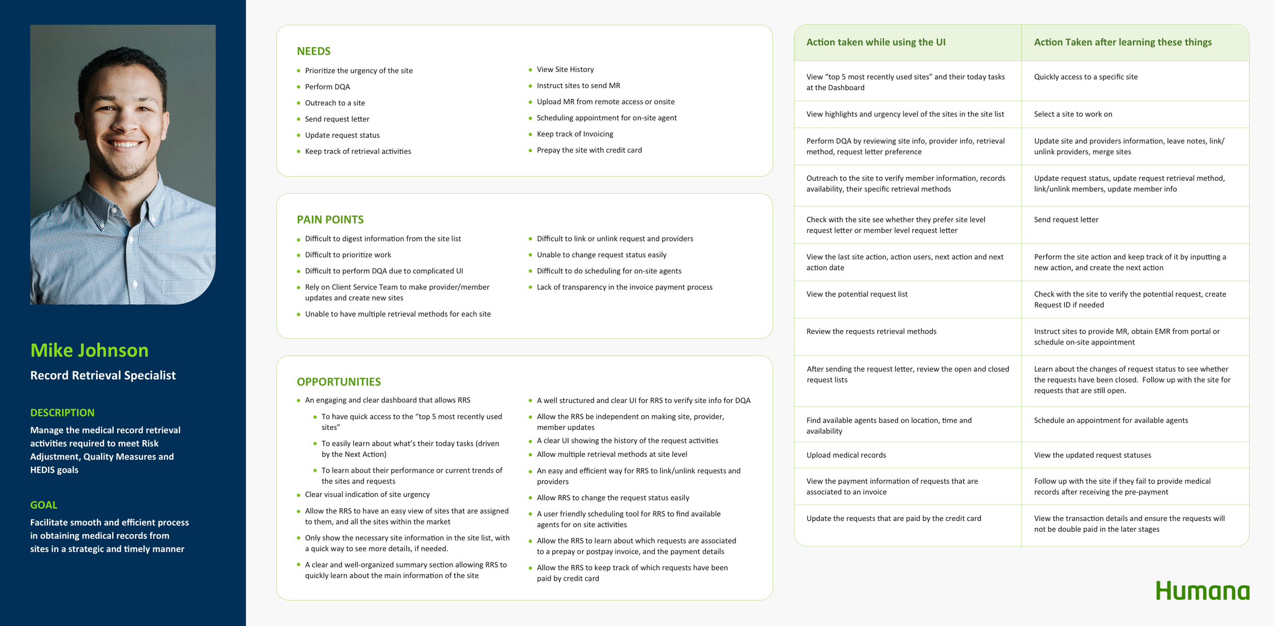
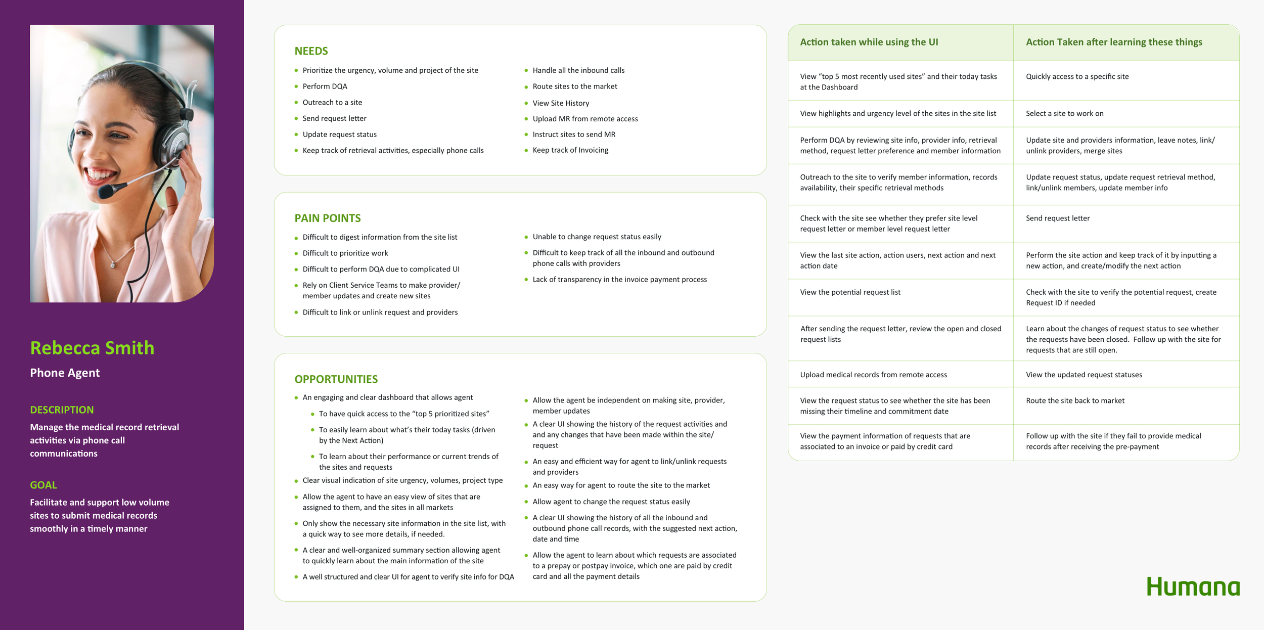
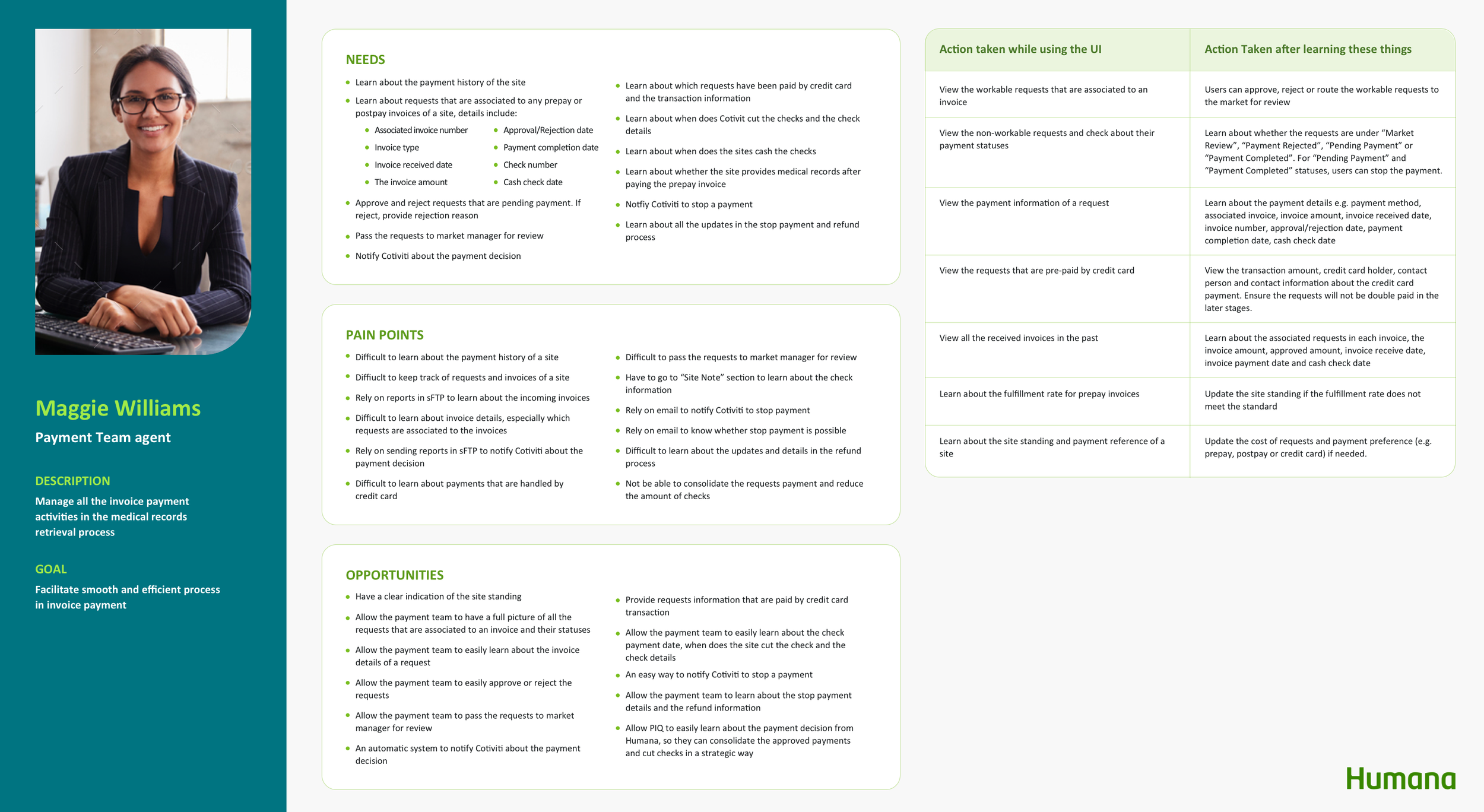
Personas
Among the 10+ personas, I focused on the Record Retrieval Specialist (RRS), Phone Agent and Payment Associate. The reasons are:
RRS is the most common associate and it covers the majority of the needs and pain points of other personas.
Phone agent works on sites under 50 requests, we can specifically learn about how an associate handles small sites.
The platform does not support Payment Associates’ day-to-day work. It is necessary to initiate design solutions to address their unique needs.
By creating the personas, I was able to have a thorough understanding of their pain points, examine their touchpoints, and brainstorm opportunities to enhance their experiences.
Design Goals
After analyzing all the opportunities, I prioritized 5 main features that are in greatest need of improving the user experience.
1. Site prioritization
Problem
After the associates log in, they land on a “Site Page” that lists out all the sites in the database. Associates don't know which sites are assigned to them and which sites they should work on first.
Design Goal
Support the Associate to easily learn about their assigned sites and the site urgency
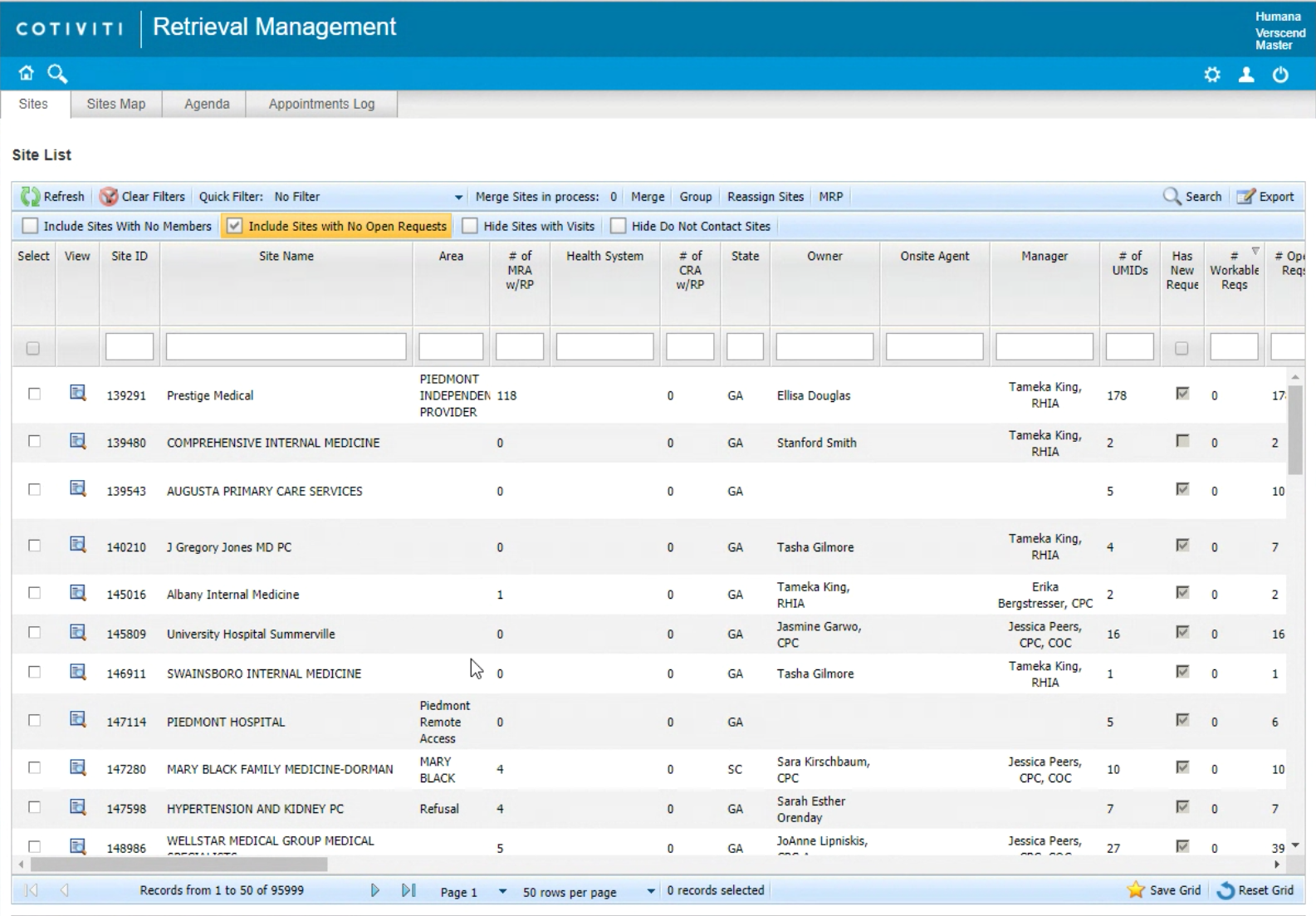
There are millions of sites on the site list
2. Data Quality Assurance (DQA)
Problem
The Associates are frustrated with jumping around different pages to validate the site information and they always miss information in the DQA process.
Design Goal
Guide the Associate to validate the site, provider and member information thoroughly and efficiently
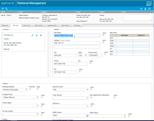
The associates have to select all the “Valid” checkboxes to complete DQA.
3. Unlink Request/Providers
Problem
The Associate always loses track of the unlinked requests/providers
Design Goal
Empower the Associate to bring the unlinked requests/providers to a new site effortlessly
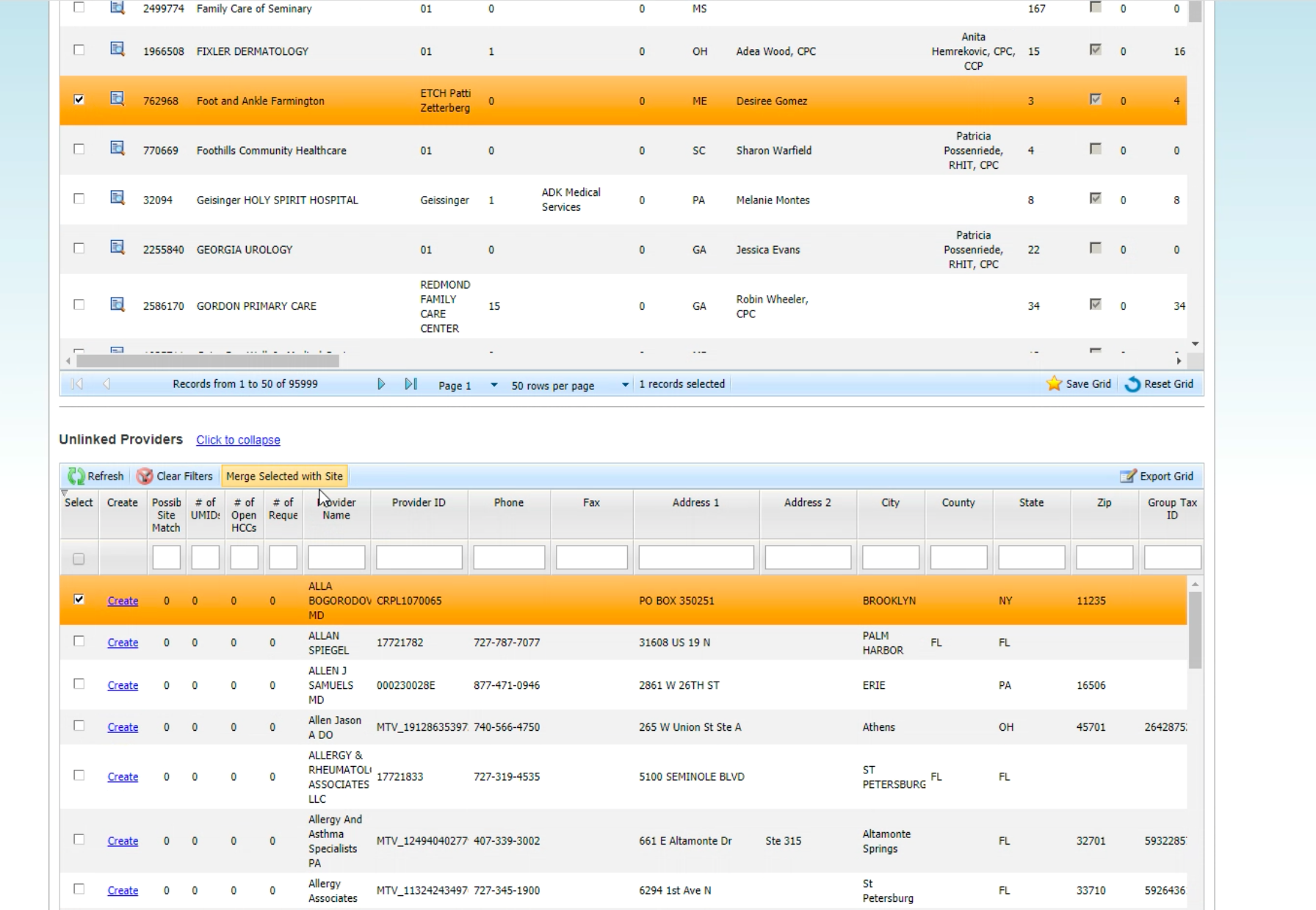
The unlinked requests/providers would be taken away from the current site and brought to a new table which holds thousands of other unlinked items. The associate needs to find the requests/providers again, select a site from the site list and bring the selected requests/providers to the new site.
4. Scheduling
Problem
Difficult to check the agent’s availability and rely on emails to set up appointments with the agents
Design Goal
Support the Associate to find available agents strategically
Allow Associate to schedule appointments on the platform and to easily learn about the appointment statuses
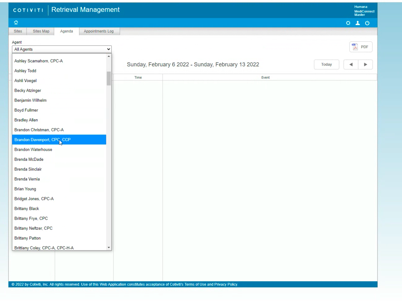
The Associates have to check the Agent’s schedule one by one to find available agents
After the Agent accepted the appointment invitation email, the Associates have to manually input the appointment details on the platform.
4. Payment
Problem
The platform does not provide payment management. The Associates rely on emails and Excel reports to approve requests and view the payment status.
Design Goal
Support the Associate to review payment requests and make payment decisions intellectually
Build a payment status system allowing the Associate to have a full picture of the payment process
Ideation
User Flow
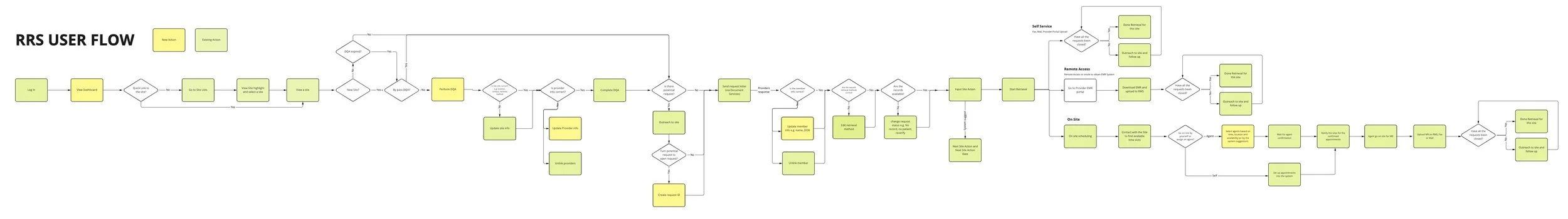
Record Retrieval
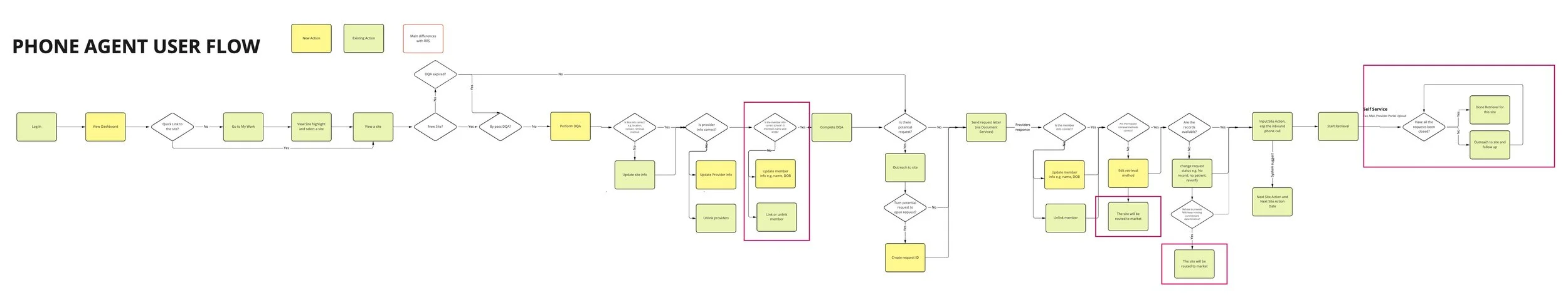
Next, I created the RRS and the Phone Agent’s user flows to learn about the complete retrieval process
New steps I added from the user flow include:
After login, Associates will land on a “Dashboard” instead of the “Site List” to get useful insights of their tasks and their performance
There will be a new, guided page for the Associates to complete DQA effortlessly.
Making sure the new platform would support the Associates to be self-sufficient, e.g. updating provider/member information, creating request ID and scheduling appointments.
Payment
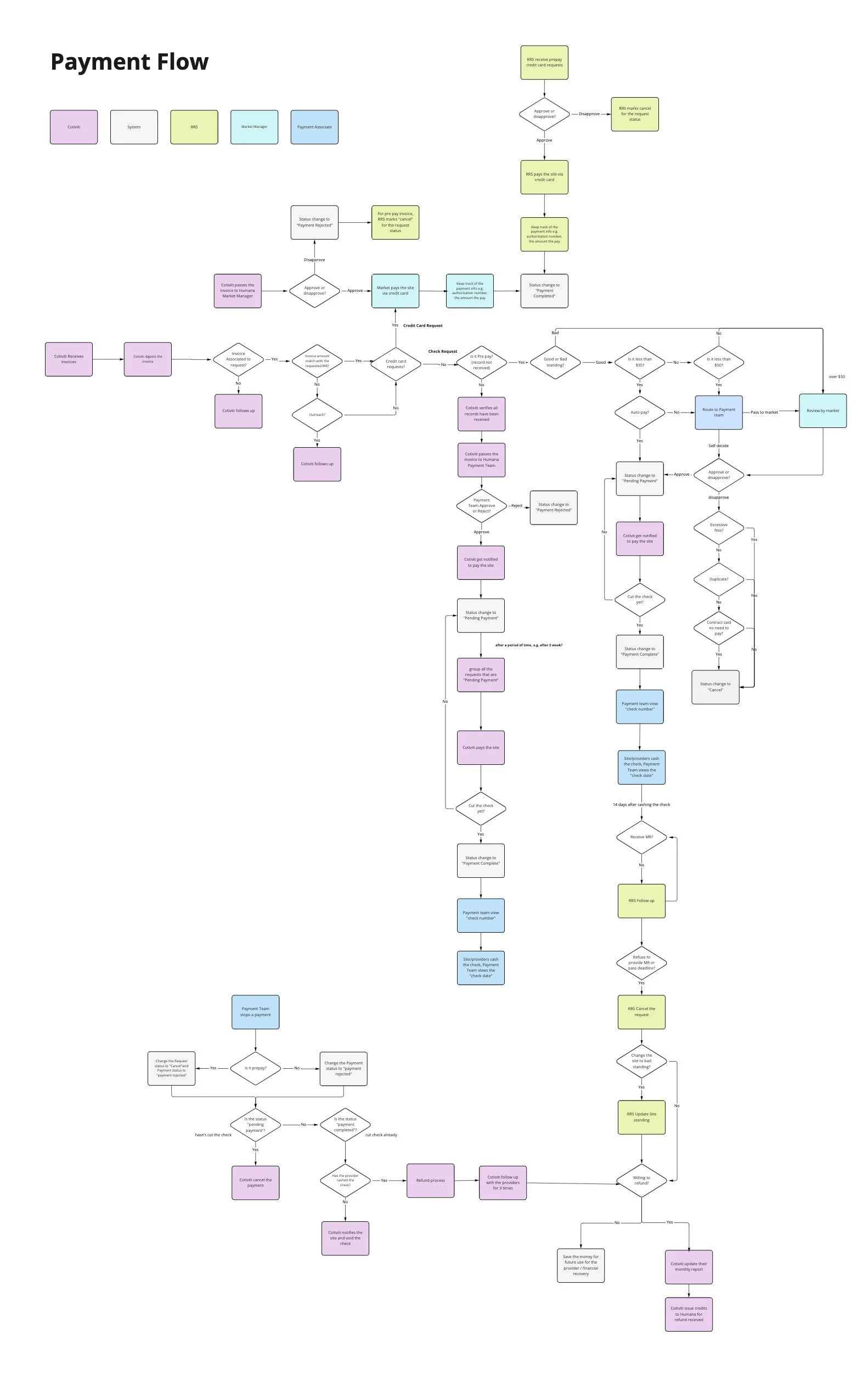
Processing a payment request is complex. I created a payment flow to fully understand how the payment requests get processed from end-to-end by different parties.
Information Architecture
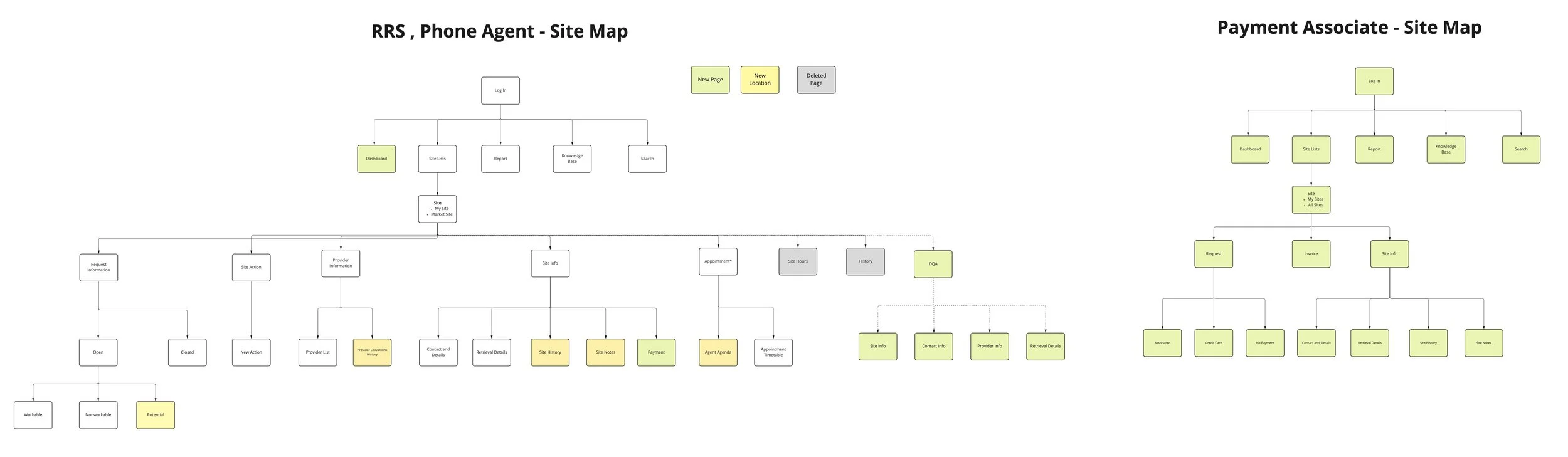
Site Map
With the new RRS and Phone Agent’s user flows, I restructured the site map by
Adding new pages e.g. Dashboard, Payment, DQA to support new features
Reducing the menu items from 7 to 5 on the site page to consolidate the sub-pages and maintain a simpler information hierarchy
I also drafted a new site map for the Payment Associate.
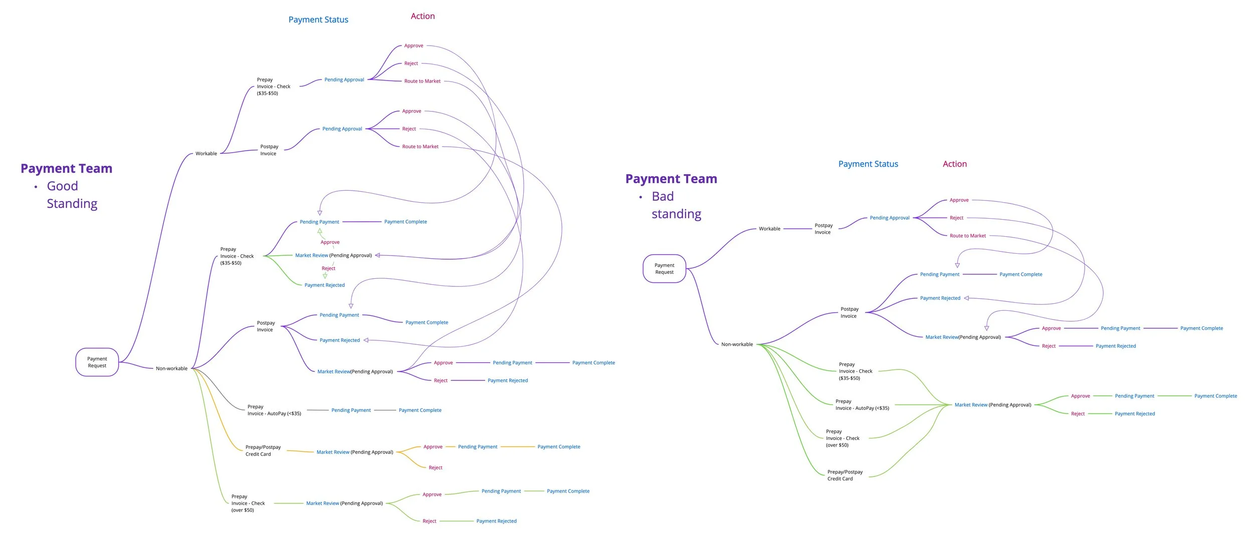
Payment Status System
Based on the payment flow, I created a payment status system for the Payment Associate. It defined what requests are workable/non-workable depending on the site standing and the payment statuses of different requests types.
Design
Mid-fidelity Wireframes and Prototype
To receive feedback from Humana, I designed over a hundred screens for the mid-fidelity wireframes and turned them into prototypes with 9 use cases.
Final Design
After revising the wireframes with the client’s feedback, I created a design system and turned all the mid-fidelity screens into high-fidelity mockups. Below are the final design of the 5 main features, along with other major screens.
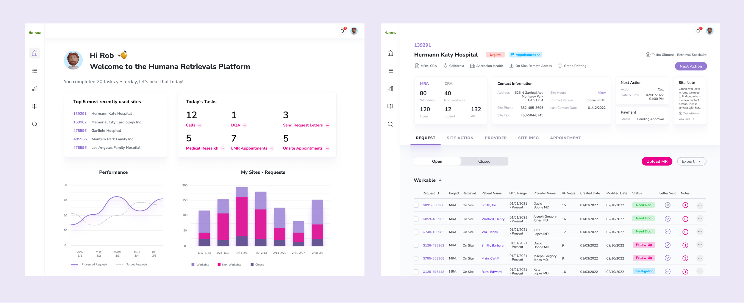
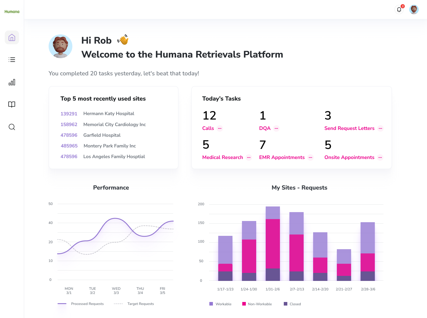
Dashboard
Empower the Associate to have quick access to the most recently used sites and to learn about their daily tasks and performance
Gamification to encourage the Associate to complete more tasks
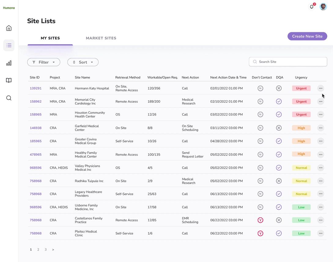
Site List
Instead of browsing millions of sites in a single table, now the Associate can easily learn about their assigned sites under “My Site” and the other sites in the same market under “Market Site”
Without scrolling through 80 columns, the Associate can find the most important site information in the table. They can also open a side panel to learn about the rest of the site information which is well organized into different sections.
A clear visual indication of the site's urgency. Now the users can easily know which site they should tackle first, which greatly enhances their working efficiency
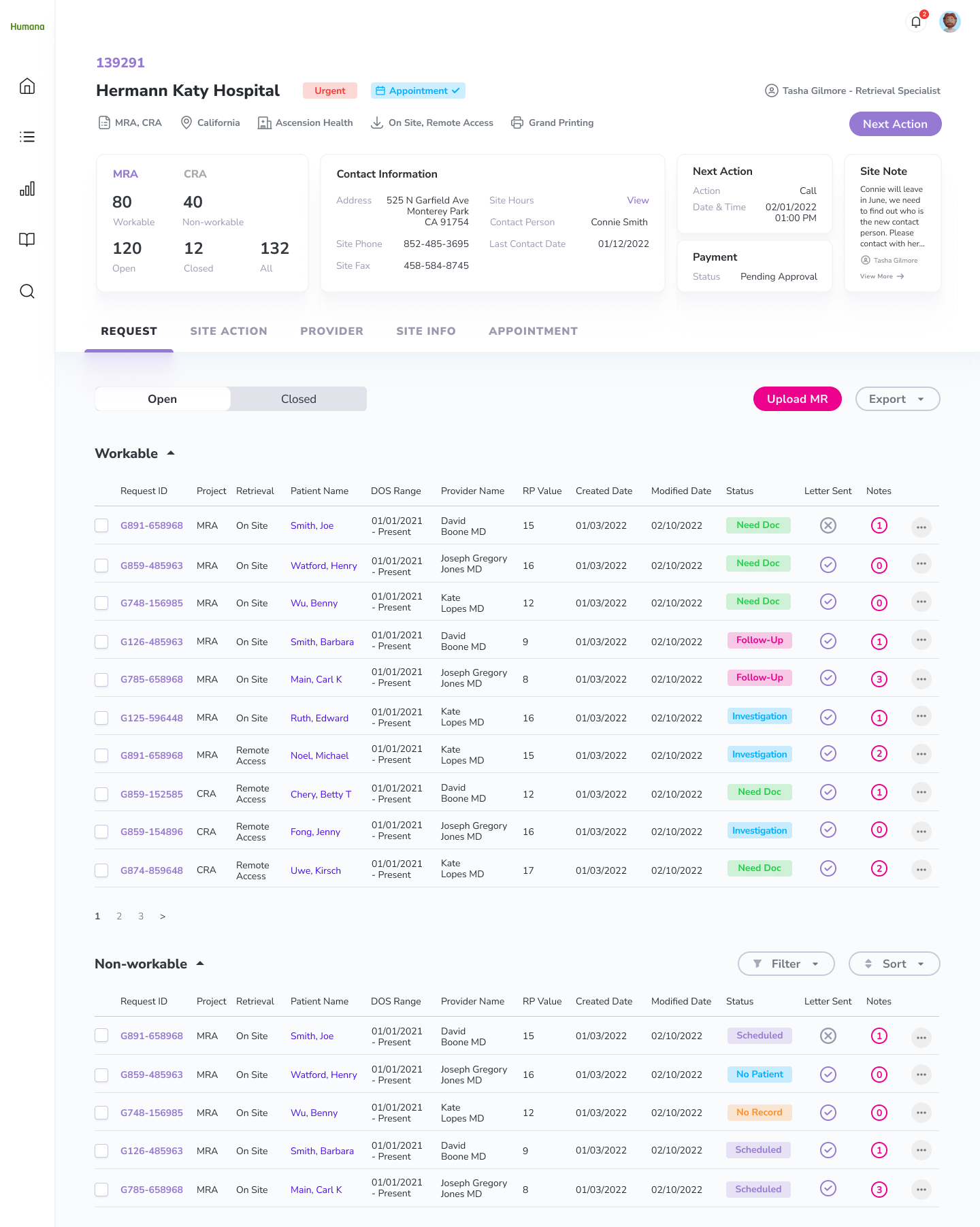
Site Page
A well-organized summary section for the Associate to quickly learn about the key information of the site
I separated the requests into “workable” and “non-workable”. The Associate can therefore quickly identify requests they need to review and take appropriate actions based on the request status
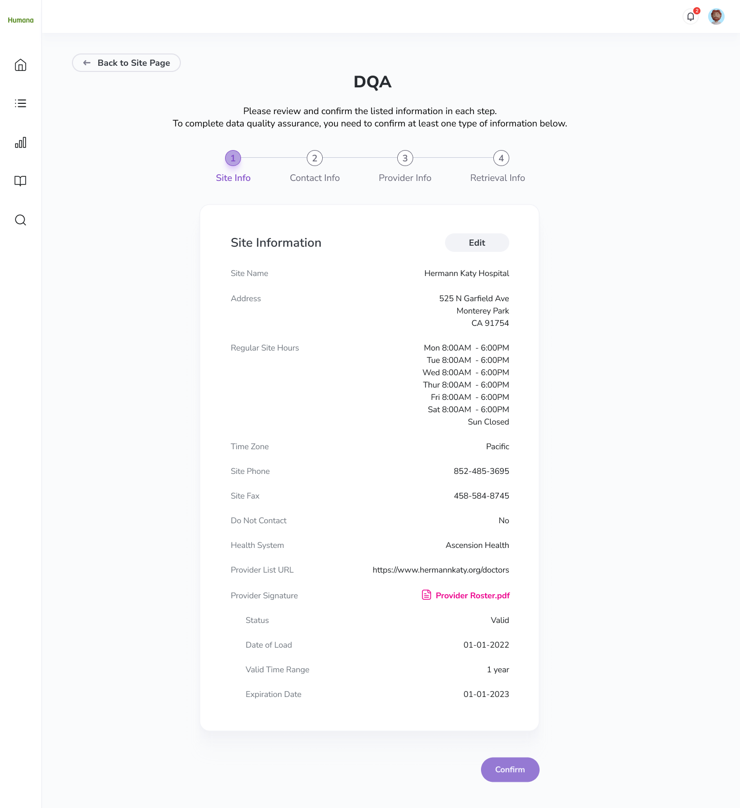
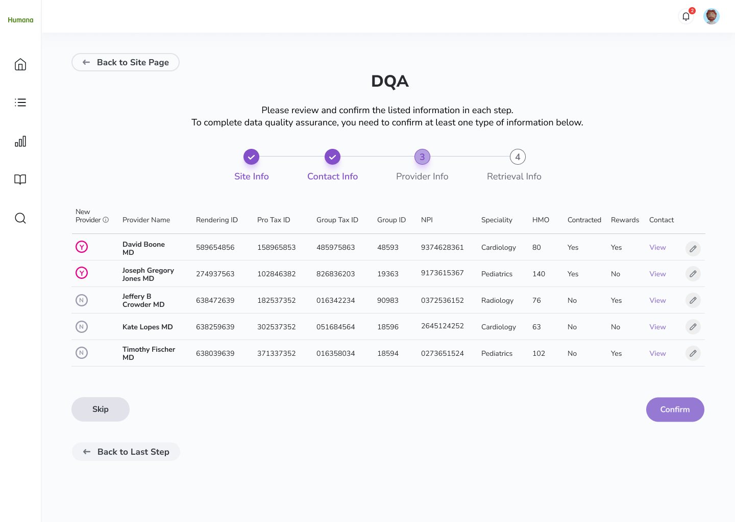
DQA
I consolidated all the fields that the Associate needs to verify with the site and created an all-in-one page for the Associate to perform data quality assurance, so they don’t have to jump around different pages to validate the site information.
I categorized the site information and displayed them in a progress bar, which created a seamless experience for users to review the site information effortlessly.
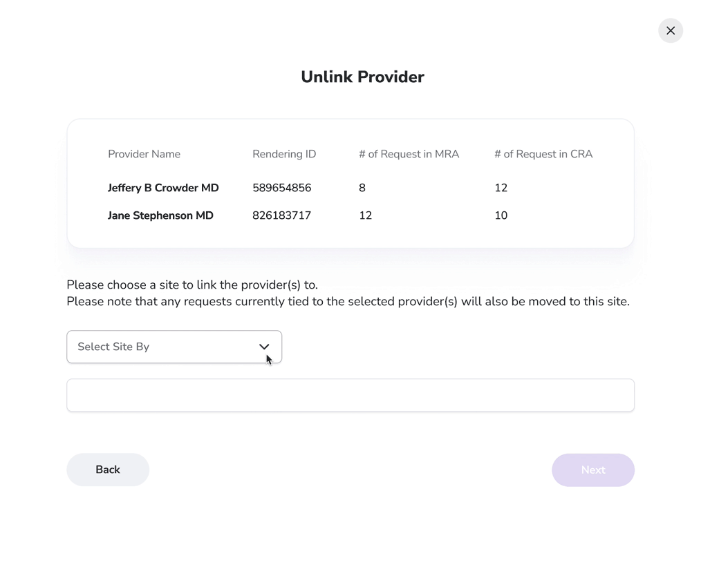
Unlink Requests/Providers
Before, the Associates often lose track of the unlinked requests/providers. To tackle this issue, I created a step-by-step flow guiding the users to bring the unlinked requests/providers to another site.
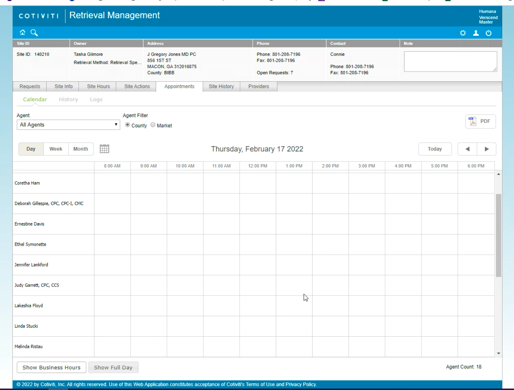
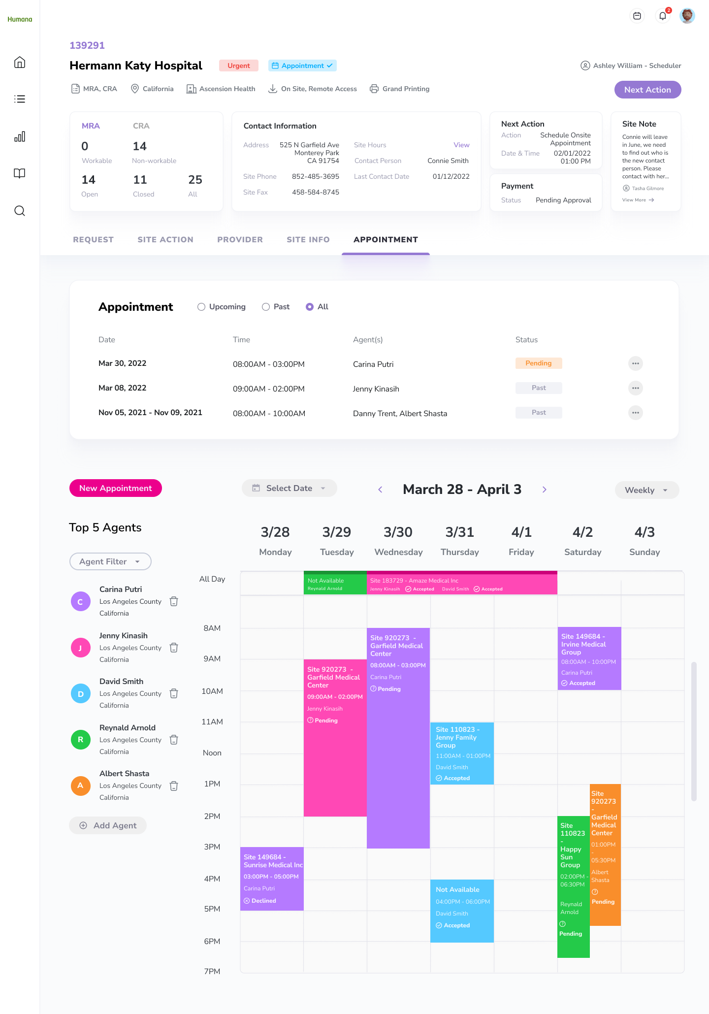
Scheduling Appointments
I created a new appointment summary section allowing the Associates to learn about the upcoming or past appointments of a site. Most importantly, they can view the appointment statuses to see whether the agents have accepted or rejected the invitation and arrange the appointment accordingly.
After exploring different ways to display the agent availability, I found out it’s best to adopt a calendar displaying the top 5 agents that are closest to the site. By showing no more than 5 agents, we can ensure the clarity of the calendar and allow the Associate to find available slots.
Features with the calendar include:
Filtering the agents by type, distance, and experience.
Select a specific date and the system will show agents who are available first
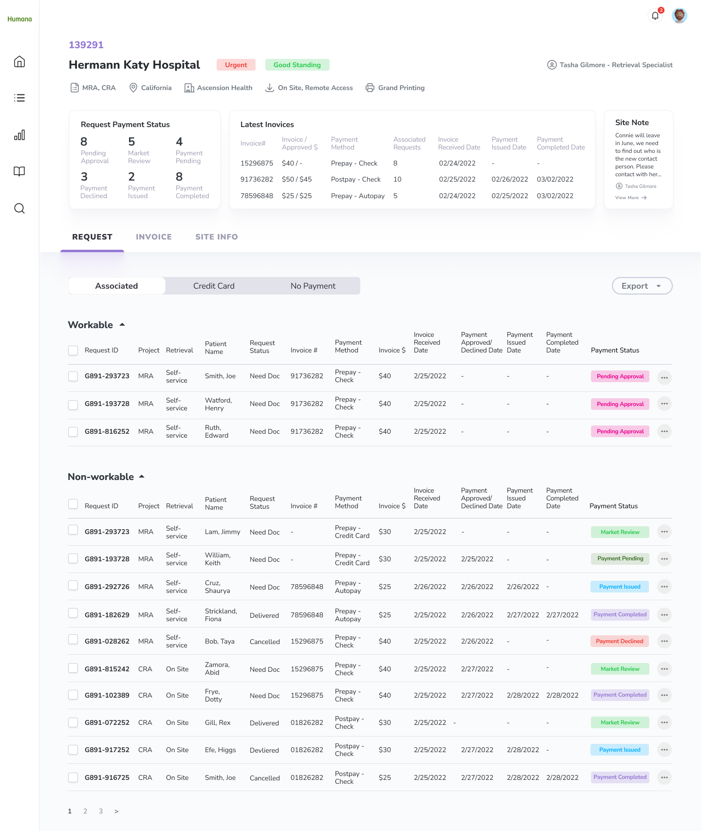
Payments
I built a clear payment status system allowing the Associate to have a clear picture of the payment process.
For requests that are “Pending Approval”, I placed them in the “Workable” table so the Associates can quickly identify requests they need to review.
Vision
In the future phases, we can focus on user testing to validate the design solutions. Also, to enhance the user experience, below are areas that we can explore to improve the efficiency and effectiveness of the retrieval efforts:
Automation
Can we automate the scheduling process? Without reaching out to the site by the Associate, the system can send out emails to learn about the site’s ideal appointment time and make suggestions to the Scheduler based on the agents’ availabilities.
Instead of having the Associate send out the request letter and follow-up letter manually, can we automate the process?
Site Urgency
Currently, the system defines the site urgency by the request volumes and the next action date, can we also put last year's success rate and retrieval time into consideration?
Conclusion
Initially, my team was doubtful that we would succeed. Cotiviti has been trying to redesign the platforms for years but they fail to bring satisfying solutions.
Therefore, I was excited but also nervous when the project started. I knew nothing about Risk Adjustment and there was no visibility into this project.
In the first two weeks, I pushed myself to learn as much as I can through intensive market research and user interviews. However, the learning process was not easy. The project was complex as there are many different retrieval methods and personas that I need to learn about in a short period of time.
Even though there was a very tight deadline, I was grateful to have the opportunity to identify problems with the platform, restructure its user flow and site map, and advocate design solutions through extensive wire-framing and prototyping. It was rewarding to adopt a user-centric design approach, and transform their platform which can finally meet Humana’s expectations.