myWAV
A personalized tool supporting XYWAV patients in their treatment journey
My Role
Product Designer
Scope
Responsive Website, Mobile App
Responsibilities
Strategy, Information Architecture, Design
Timeline
4 months (Aug’20 - Nov '20)
Overview
myWAV is a digital platform that supports patients who are prescribed XYWAV®, an FDA-approved drug that treats narcolepsy. It focuses on onboarding new patients and providing resources for users to manage their treatments.
With 4 other designers in this project, I created a comprehensive responsive website and mobile app for myWAV patients. The result was a 96.1% Sign-up Completion Rate and 67% Retention Rate after 60 days, which is 3 times the industry average.
See the live experience at mywav.com.
Problem
Complicated enrollment
To receive the medication, there are many required steps as the patients cannot prescribe XYWAV from a regular drugstore. They need to discuss with a Nurse Case Manager and a pharmacist to arrange shipment from the Central Pharmacy. Patients often feel nervous and confused in the onboarding process.
Anxiety about adapting to the new medication
The treatment process can be confusing with the complicated dosing requirements, lack of understanding of side effects, the refill process, and general fear of the unknown. Based on the research, patients often drop out of the program after 60 days.
Design Goals
Create a personalized and interactive experience that guides patients to onboard, refill prescriptions, and adapt their lives to the medication.
Design an information hub for users to learn all aspects of the treatment in order to drive adherence and compliance.
Create a simple and intuitive sign-up experience
Business Goals
Goals
Maximize account registration
Maximize retention of XYREM patients as they transition to XYWAV
Drive engagement with XYWAV patients from day 60
KPI
Number of account registration, both new and transitioning patients
Sign-up completion rate
Retention rate after 60 days
Ideation
Journey Map
Working with the researchers, I created a journey map to learn about all the touchpoints of the patients from enrollment, starting their treatment, to living with the medication in long term. Drafting the map not only allowed me to fully understand all the steps they need to take in the program, but also their expectations and emotions in the journey.

Site Map
To structure the information hub, I worked with UX Writers and Researchers to organize the content into three main sections allowing the users to find support easily throughout the journey. While displaying all the FDA-required content, I ensured the platform maintained a simple information hierarchy.

User Flow
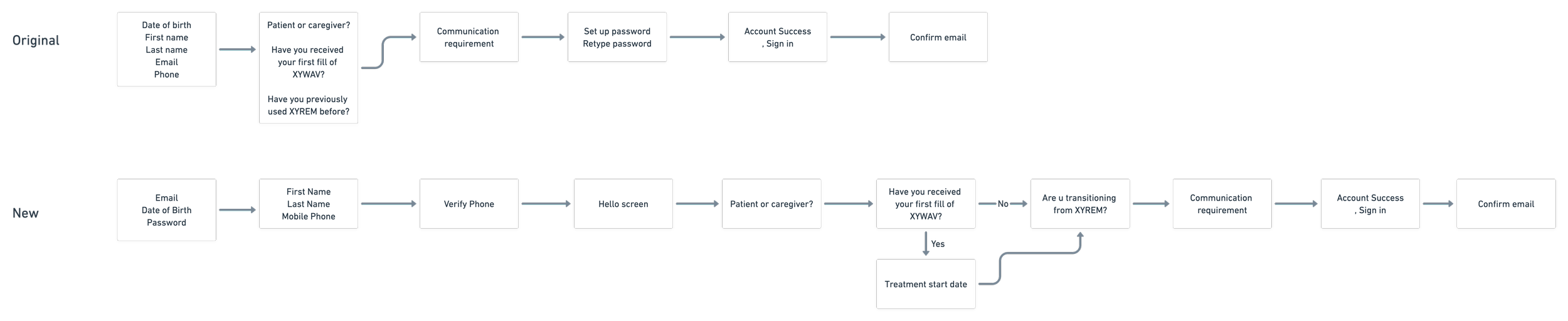
I went through different rounds of iterations to draft the sign-up experience.
Based on the business requirement, we need to obtain a good amount of personal and medical history information of the user in the account creation process.
Initially, I focused on efficiency by having many fields and questions on one page. However, I neglected the importance of simplicity and clarity. It is also essential to give users space to digest the questions and enter the fields easily.
Improvements I made:
Divide the personal information fields into two different screens to minimize the amounts of fields per screen
Make sure all the questions are straightforward and clear
Maintain one primary action per screen
Design
Mid-fidelity Wireframes
I created mid-fidelity wireframes to structure the layout of the major screens and get feedback from the client.
Design System
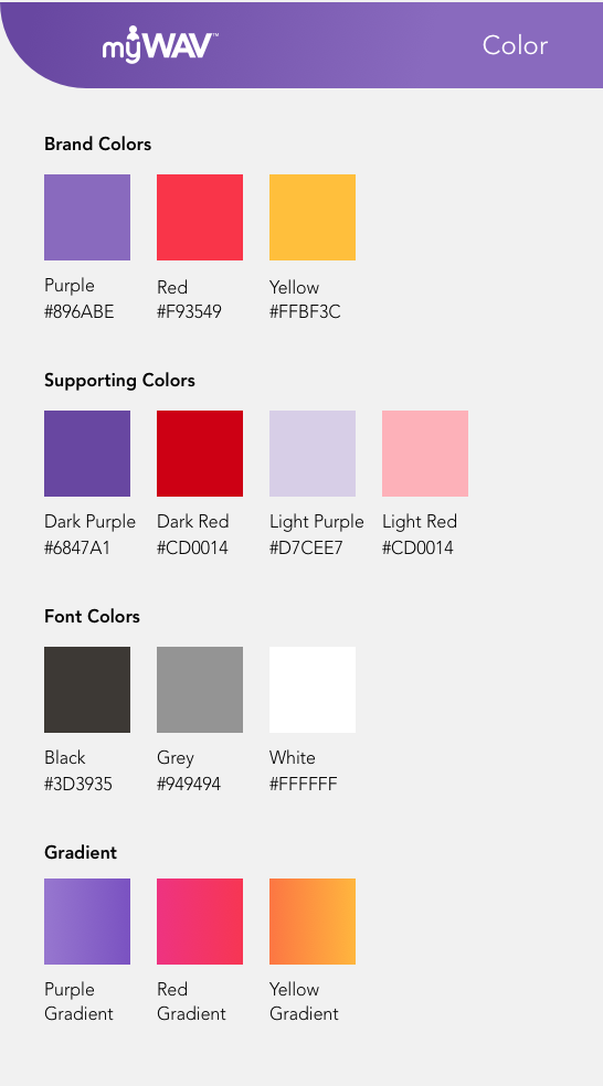
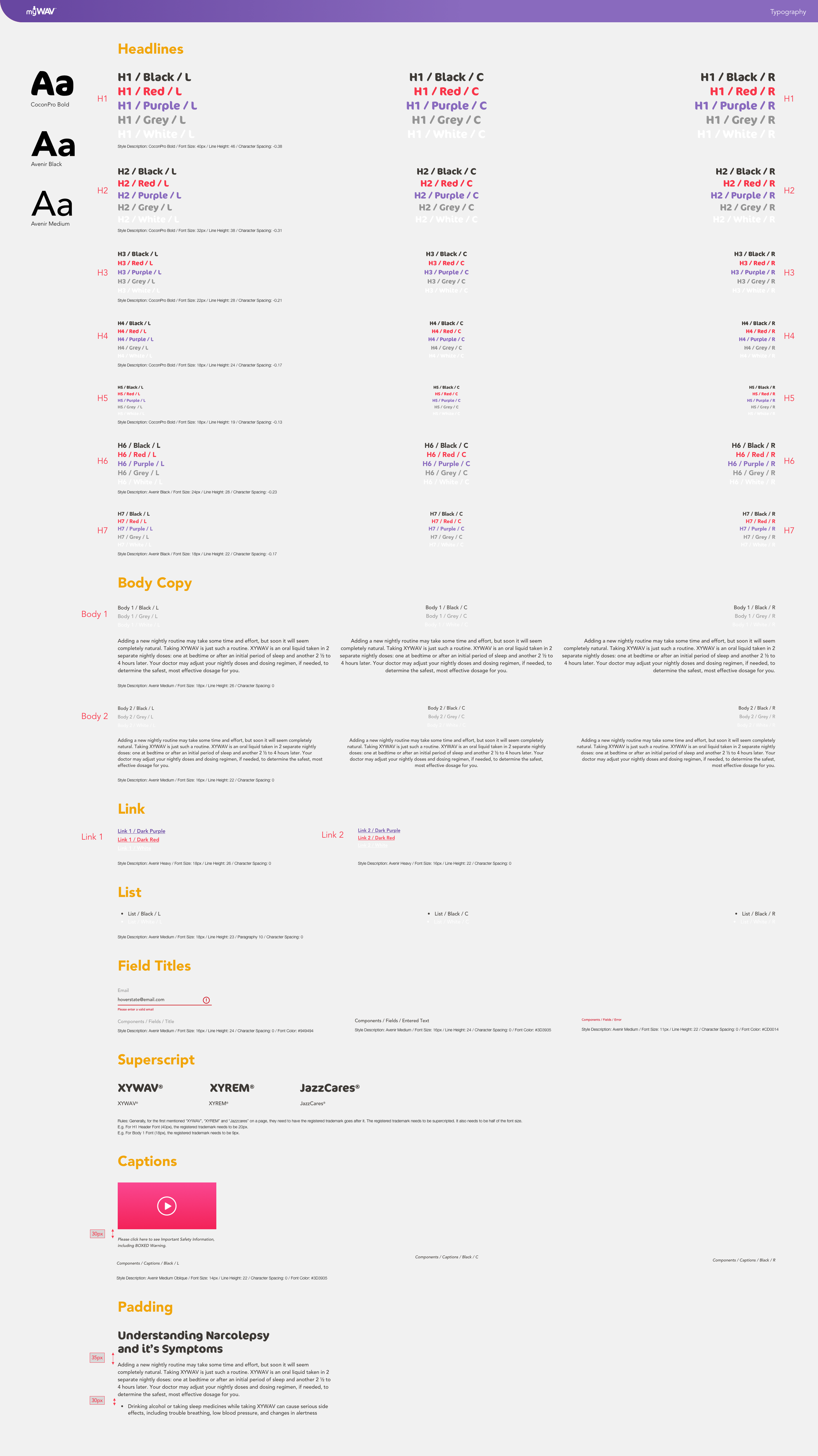
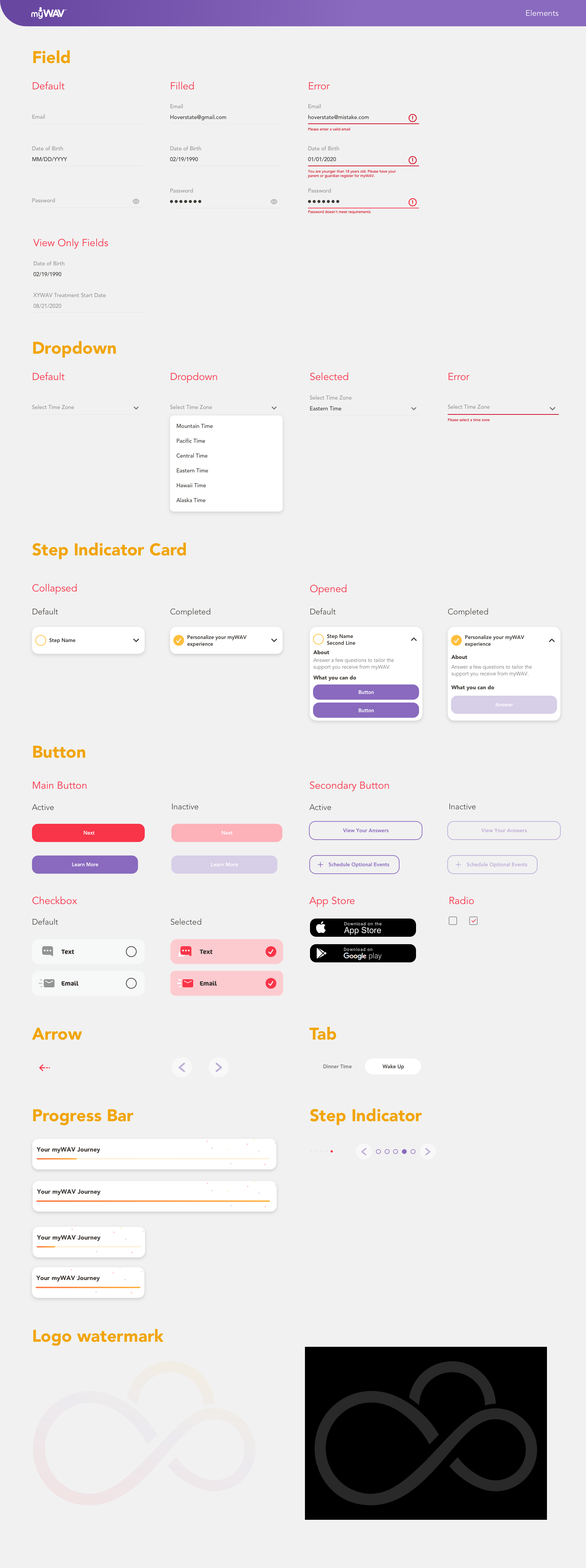
I developed a comprehensive design system to set up a foundation and ensure design consistency through the website and the app.
Final Design
After iterating the wireframes based on the feedback from the client and other agencies, below are the final design of the major screens:
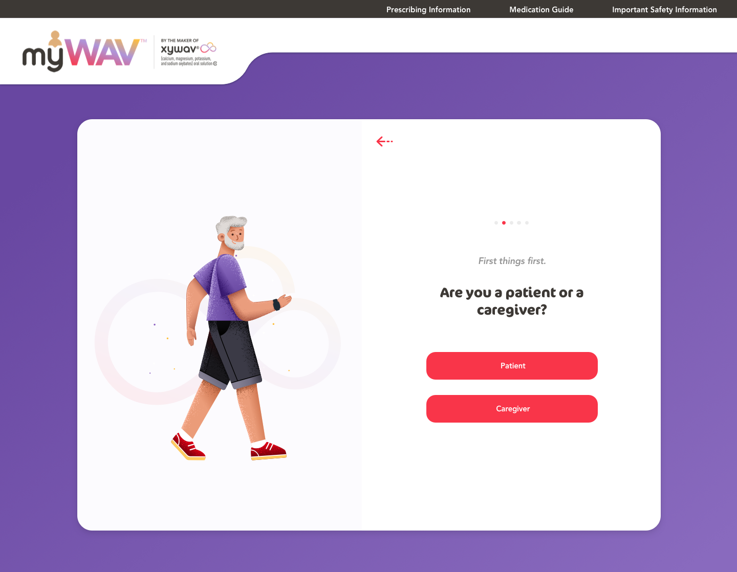
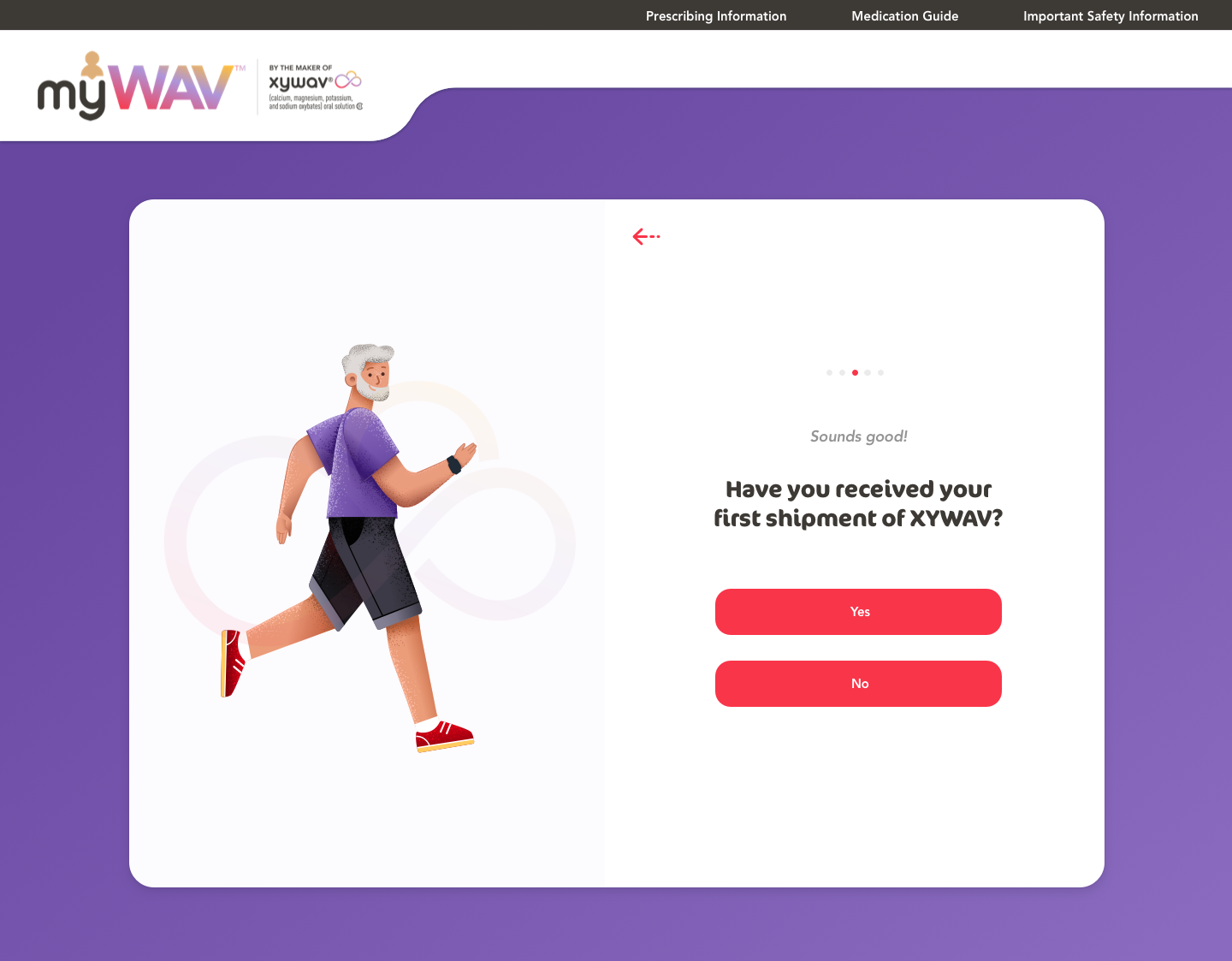
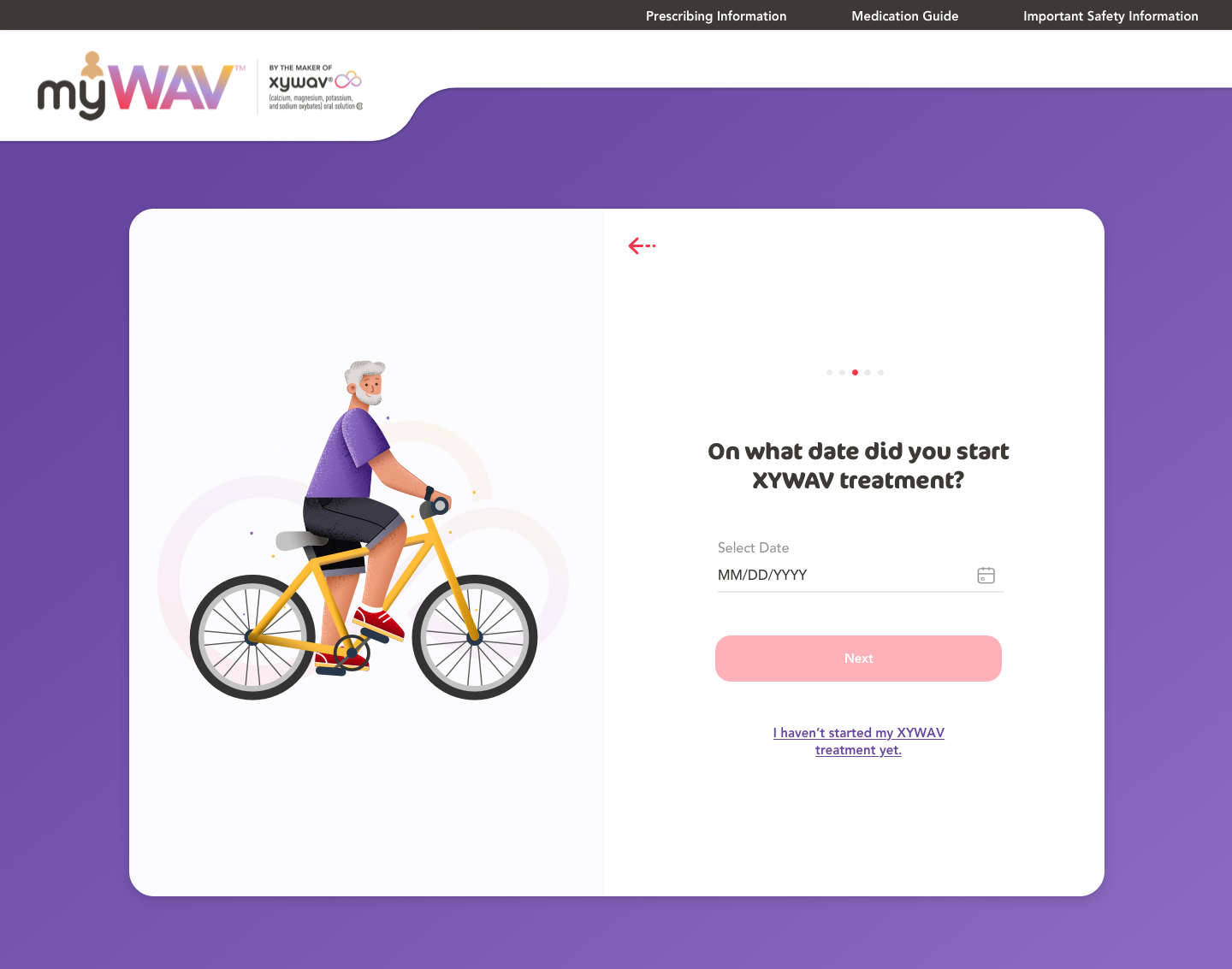
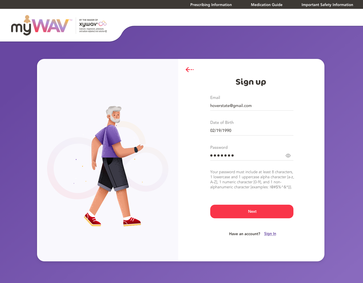
Account Creation
Gamification
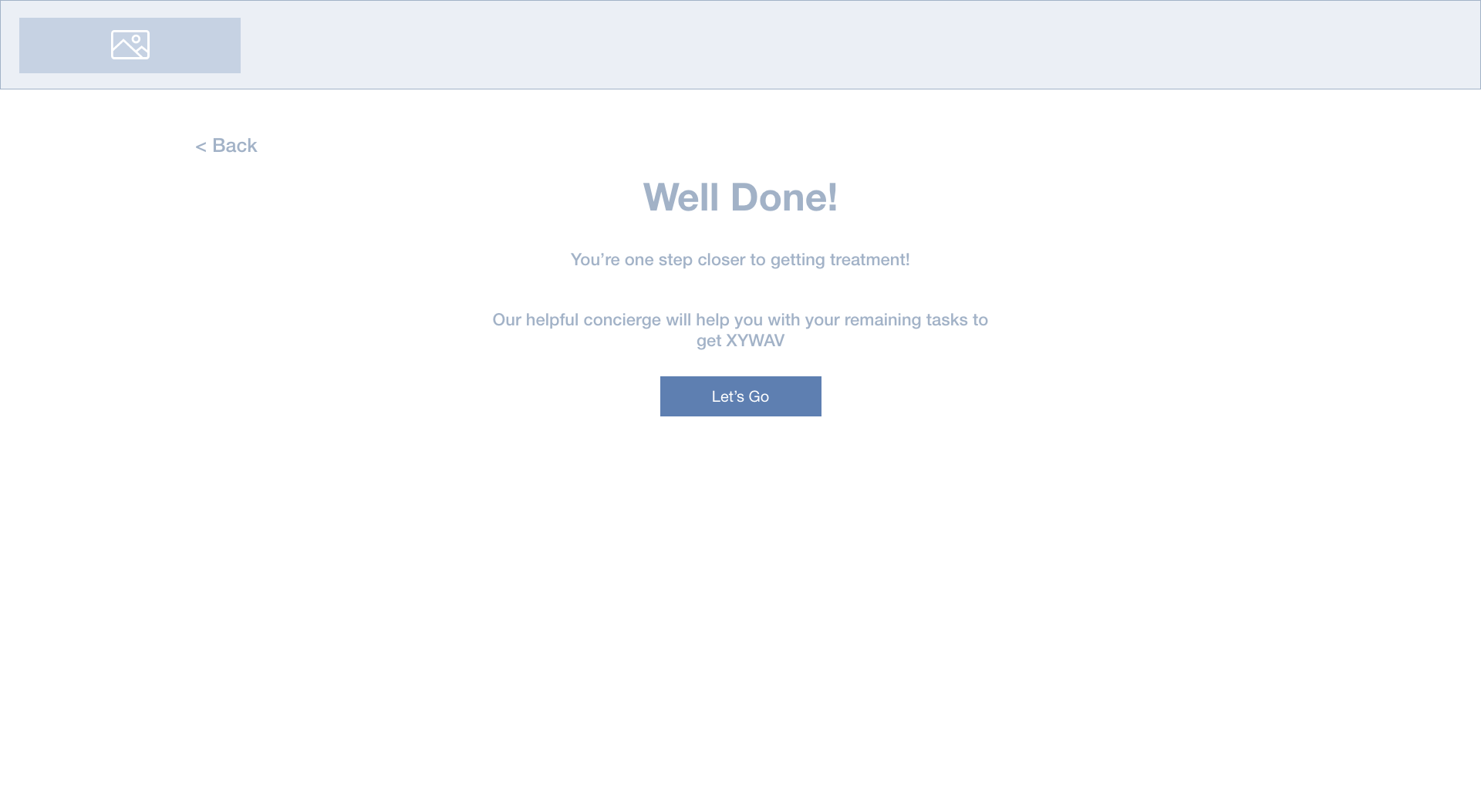
Instead of simply using a step indicator, I used illustrations to gamify the progress and motivate users to complete enrollment.
Where to set up a password?
Initially, I have the users set up the password in the end to avoid abandonment in the set-up process. However, for educational websites, it is more important to have the users set up the password upfront to filter out non-serious users and maintain a higher retention rate.
Engagement
After users filled out their personal information, I added a transition screen to welcome users and motivate them to finish the rest of the steps.
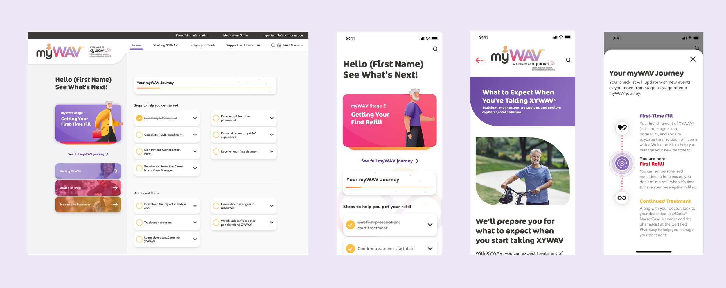
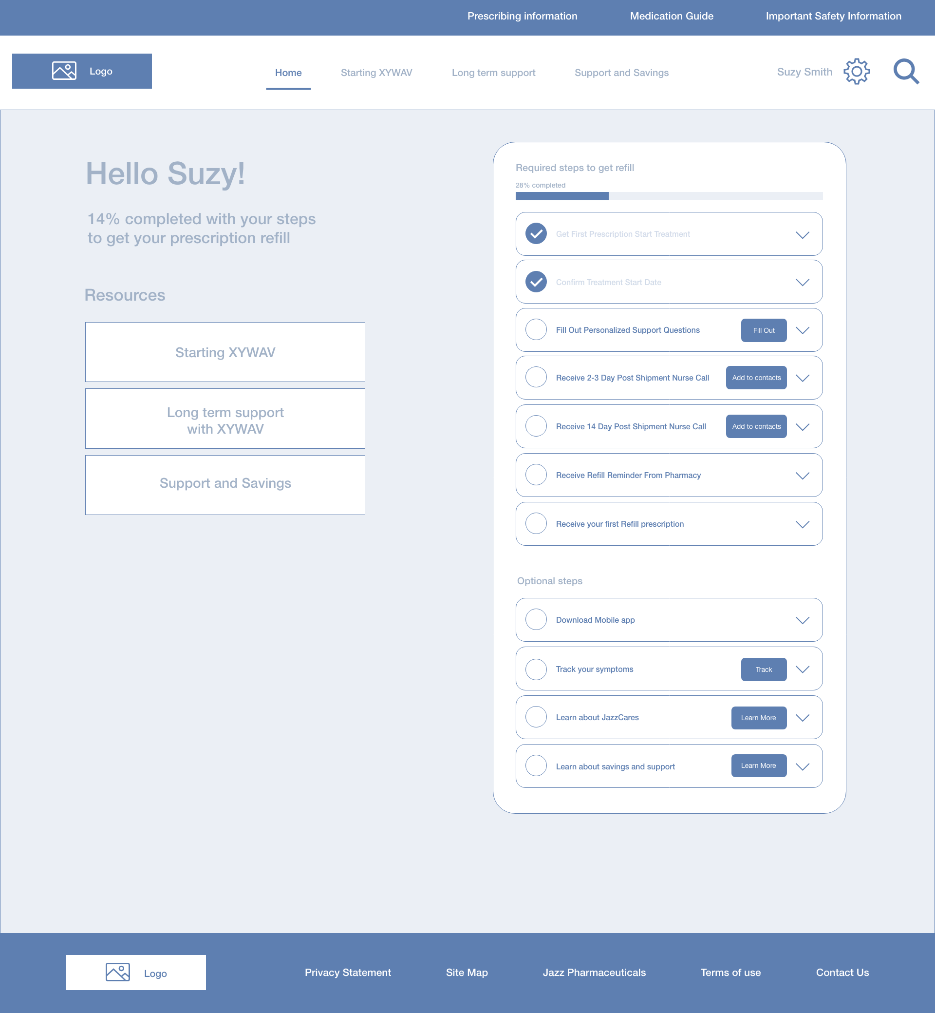
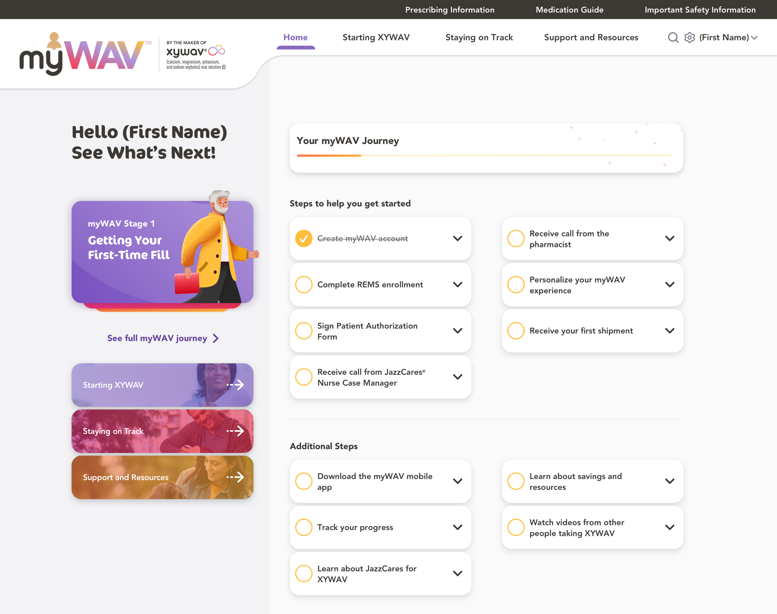
Dashboard
A personalized dashboard allowing users to learn about their progress, upcoming steps, and additional support resources.
Gamified the treatment journey to encourage users to complete the steps and advance to the next stage.

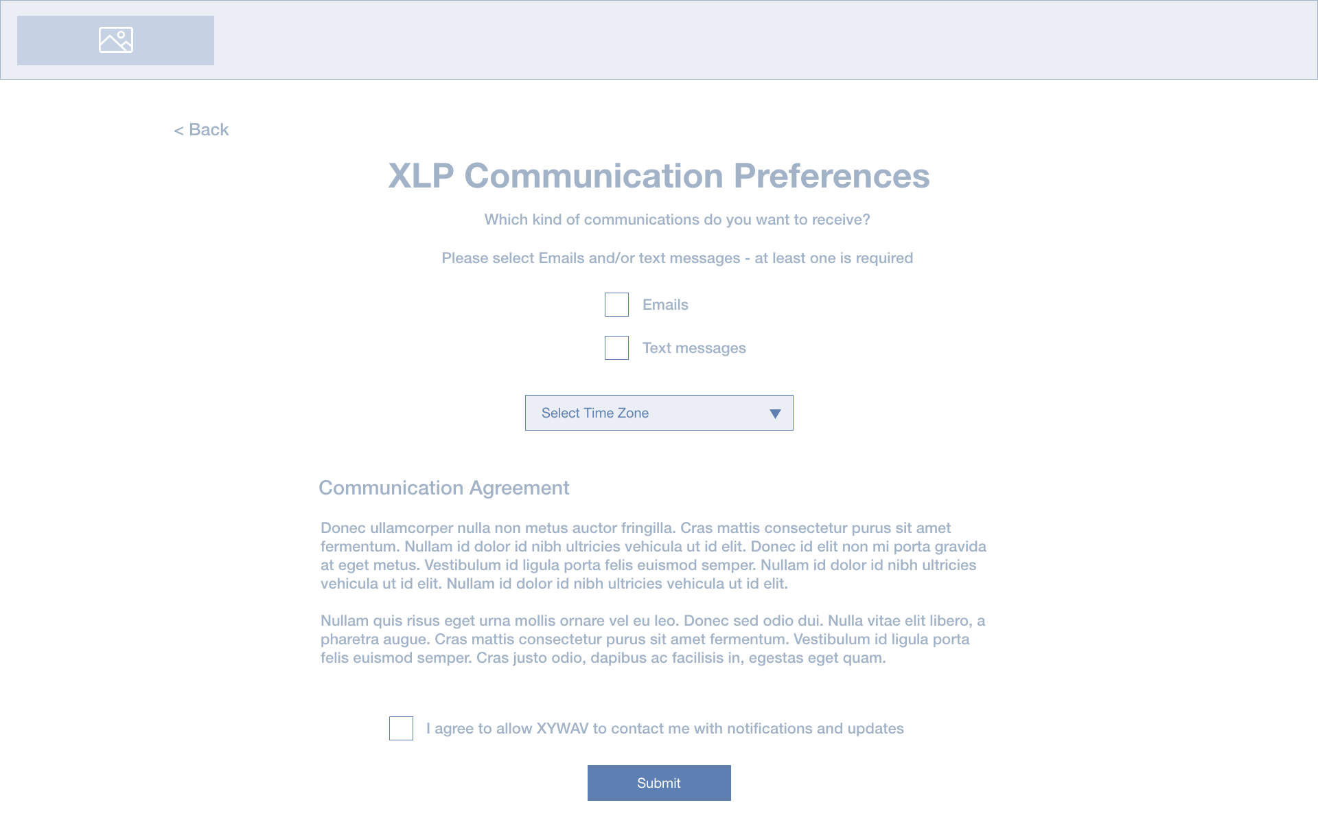
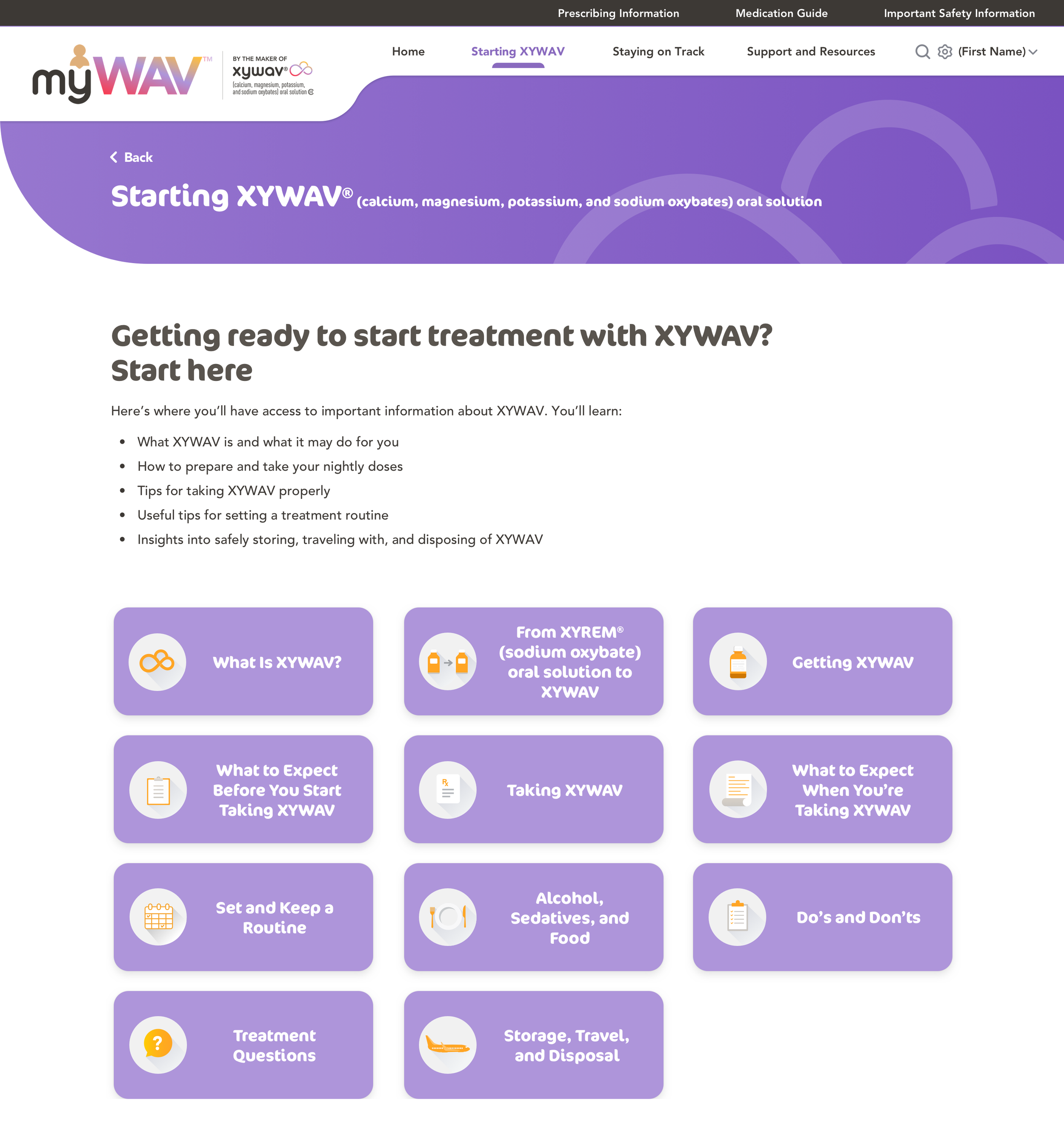
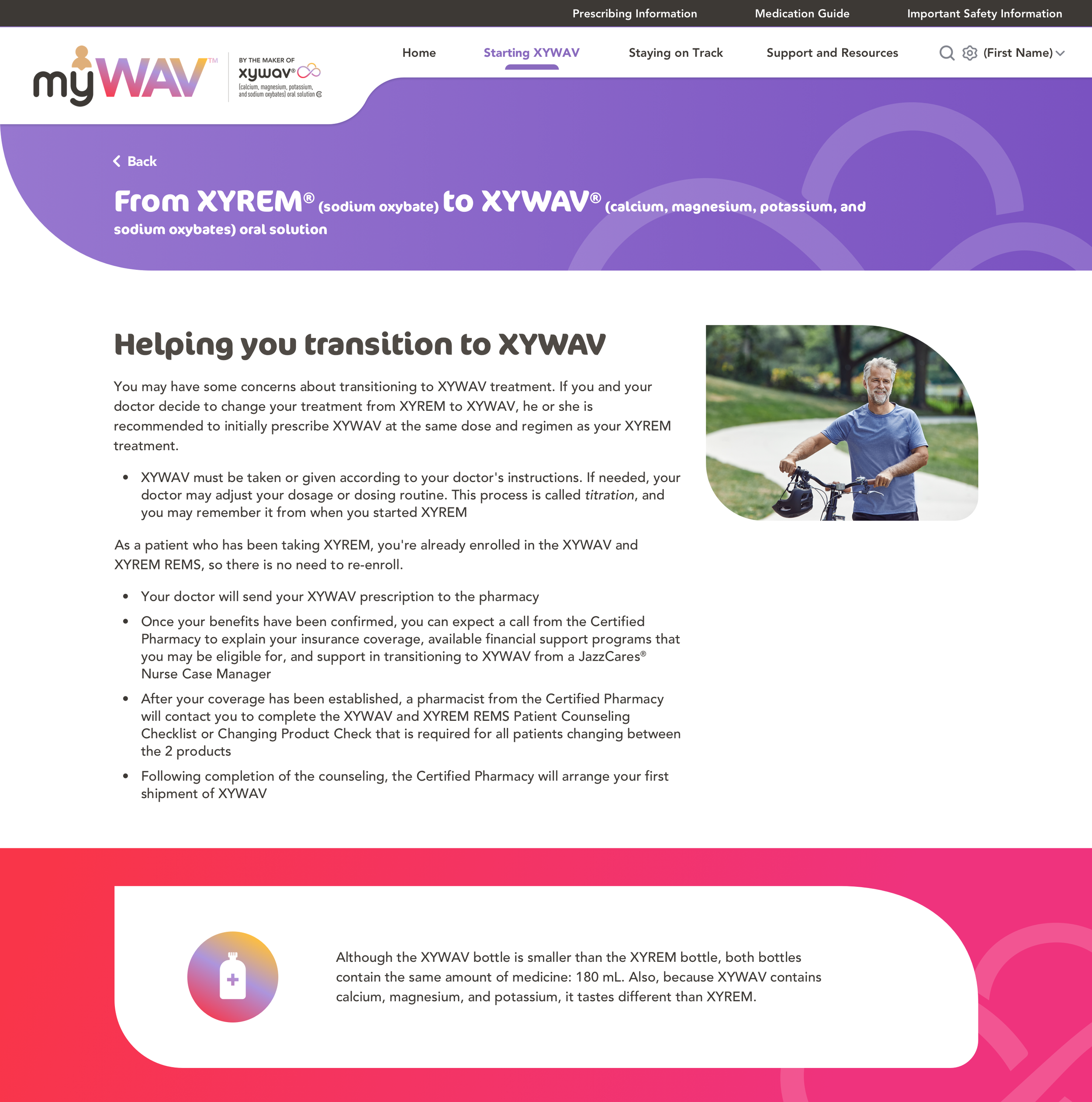
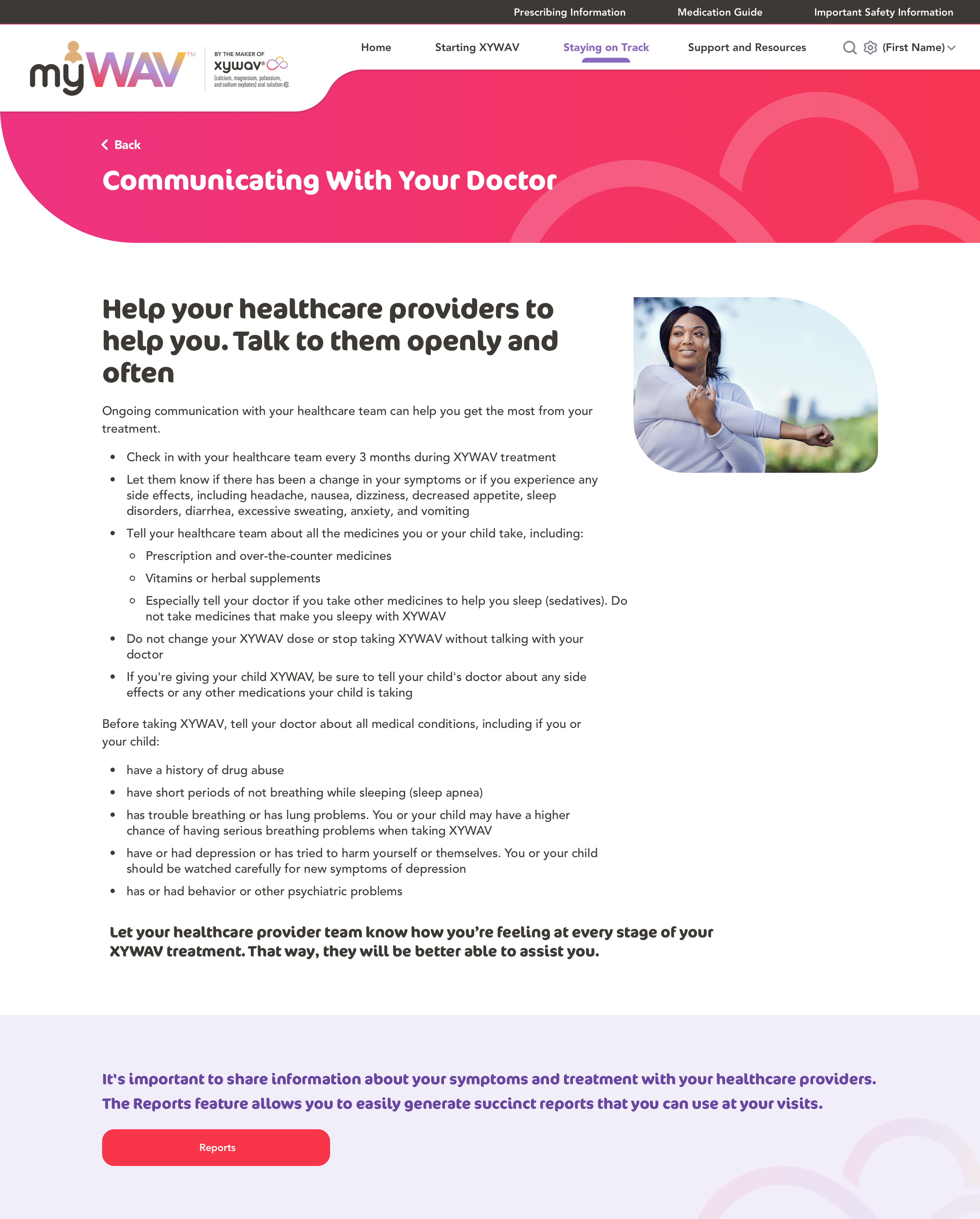
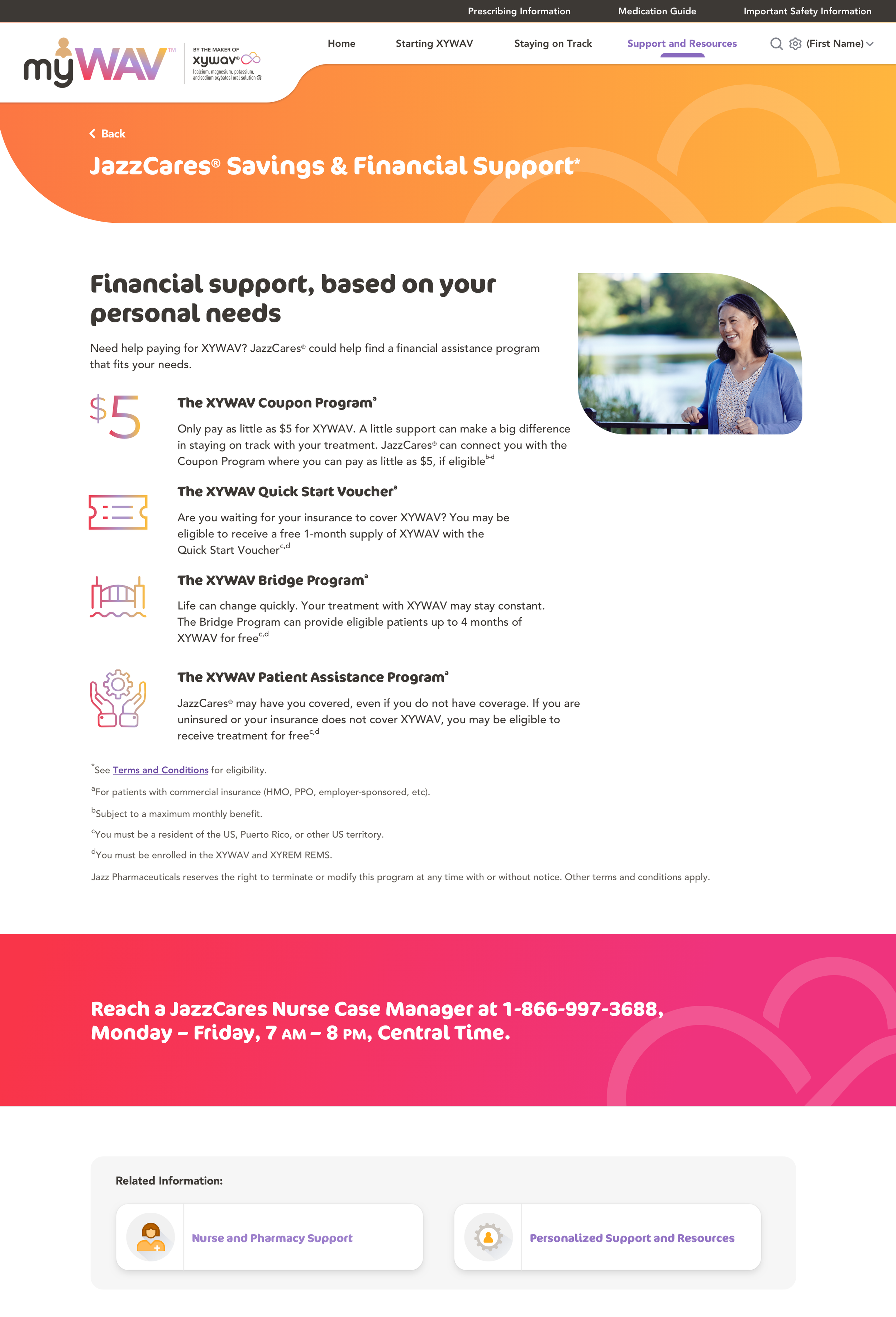
Content Pages
myWAV has a lot of text-heavy information to give patients all the important prescription details. Therefore, I used a variety of banner designs, interesting icons, and lively images to make sure the content is fun to read and easy to digest.
Result
Data from Launch (December 2020) to 60 Days after (February 2021):
412 Account Registrations
96.1% Sign-up Completion Rate
67% Retention Rate After 60 days (3 times industry average)
Conclusion
Creating an FDA-regulated website is an interesting challenge. There were many restrictions to the content and the layout but I kept pushing myself to find alternative solutions to create a user-friendly and aesthetically pleasing design.
Also, drafting the account creation process was a very rewarding experience. At first, I focused on maximizing the account registration rate. However, I learned it is more important to attract loyal users to boost the retention rate, which is essential to creating a sustainable platform.
Overall, it was amazing to have the opportunity to collaborate with four other designers to complete the full website and app design in a timely manner (we created over 500 screens within 4 months)!