Netsymm
A B2B eCommerce for small and medium-sized businesses to streamline their purchasing process
My role
Redesign their website by transforming their user flow and information hierarchy, Uplift their visual design
Scope
Responsive website (desktop, tablet, mobile)
Timeline
Aug - Oct 2019
Tools
Sketch and InVision
Overview
Netsymm is a cloud-based B2B platform that automates the purchasing processes for small and medium-sized businesses, allowing them to connect with their global suppliers.
I redesigned Netsymm’s eCommerce due to their customers’ complaints. Many Netsymm’s customers think the existing platform is:
Time consuming and inefficient for them to place and view purchase orders
Not visually appealing, looks outdated
The Design Challenge
How might we enhance the purchasing efficiency and effectiveness for SMB buyers while modernizing Netsymm’s user interfaces?
Research
Stakeholders’ Interview
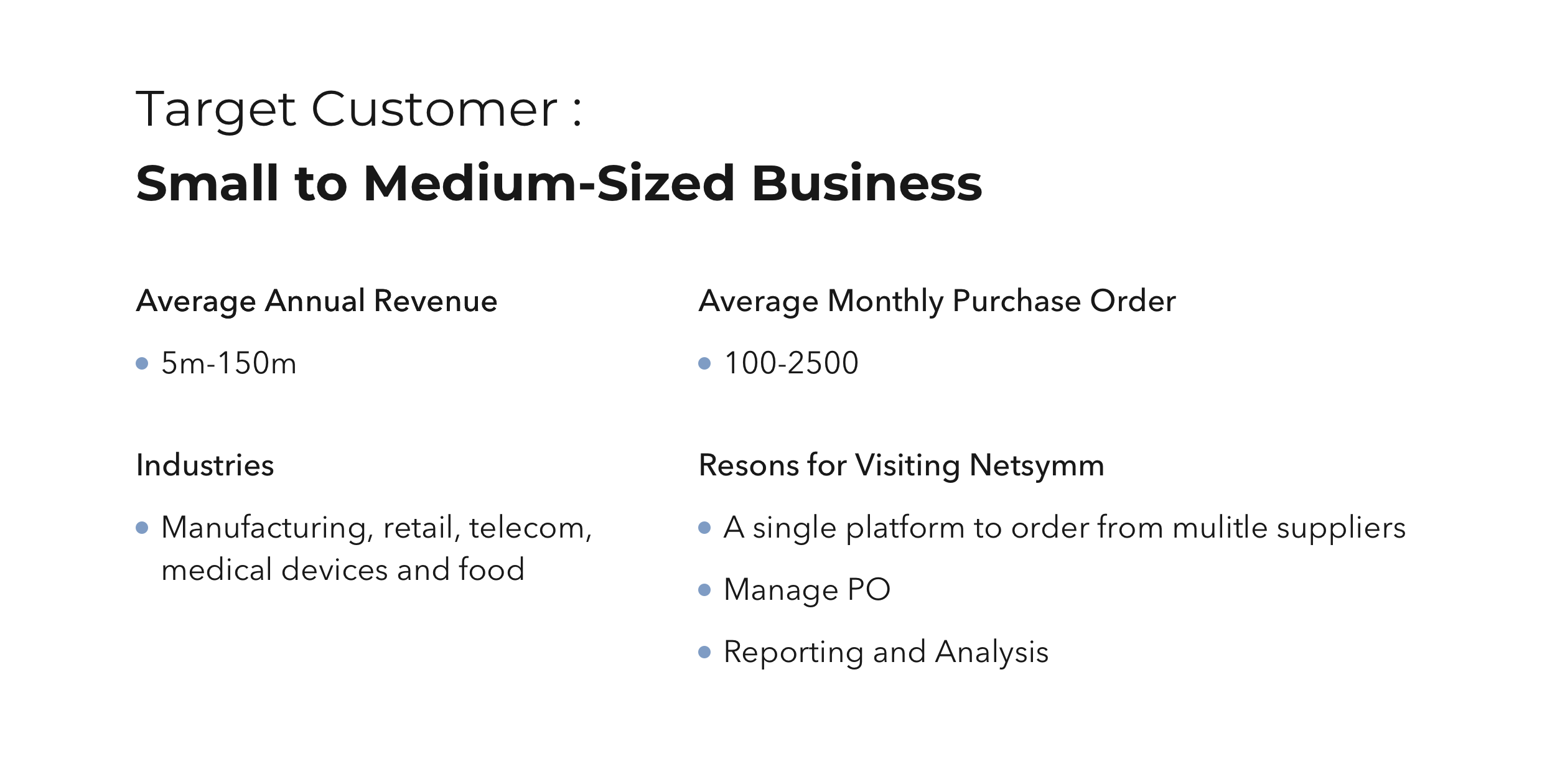
To start my research, I interviewed the Business Owners and Sales Director to learn about their business goals, target customers and problems the customers’ faced when they use Netsymm.
User Research
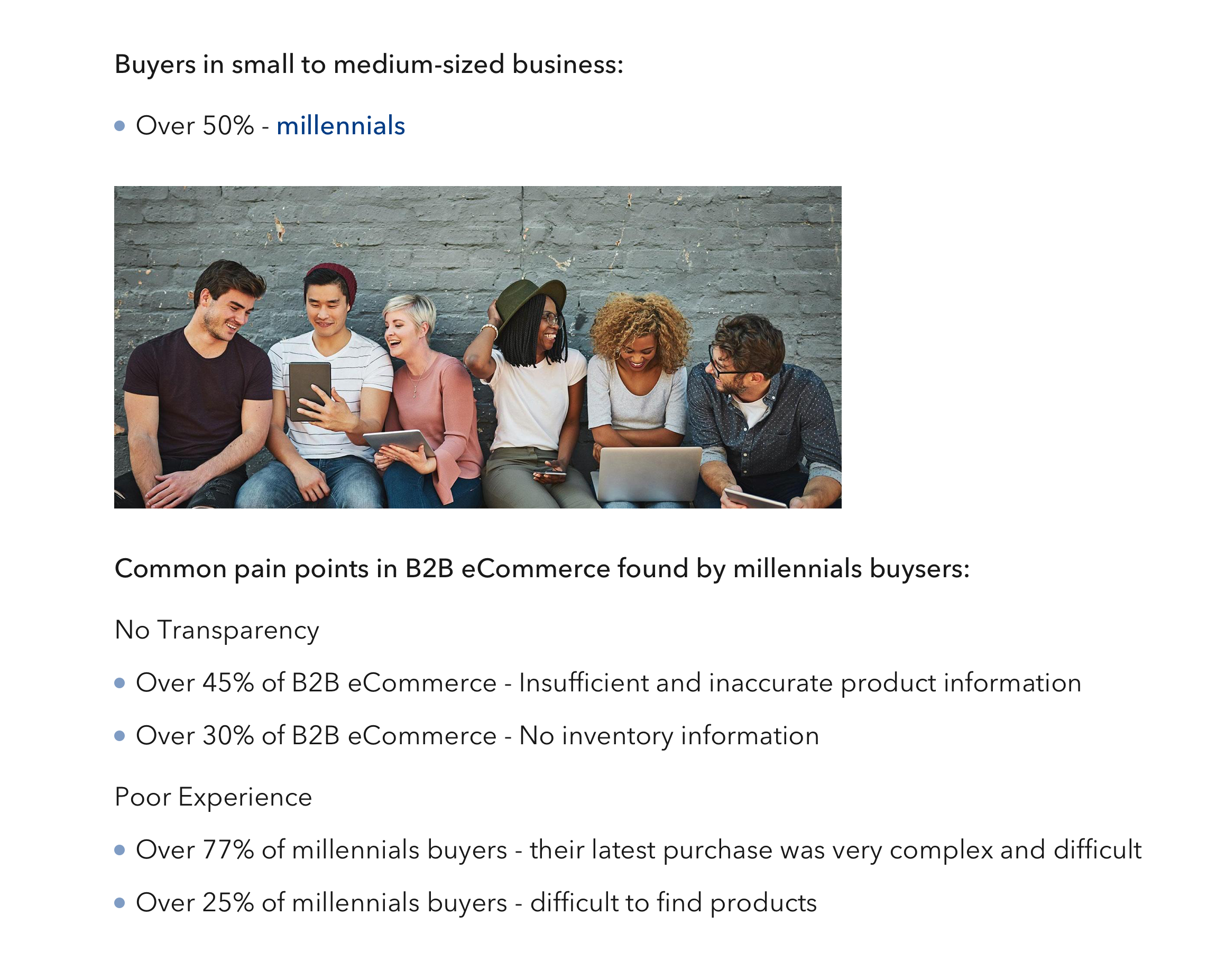
After learning the background and problems of Netsymm, I conducted user research to gain quantitative insights about the SMB’s buyers and their common pain points in the purchasing process.
Define
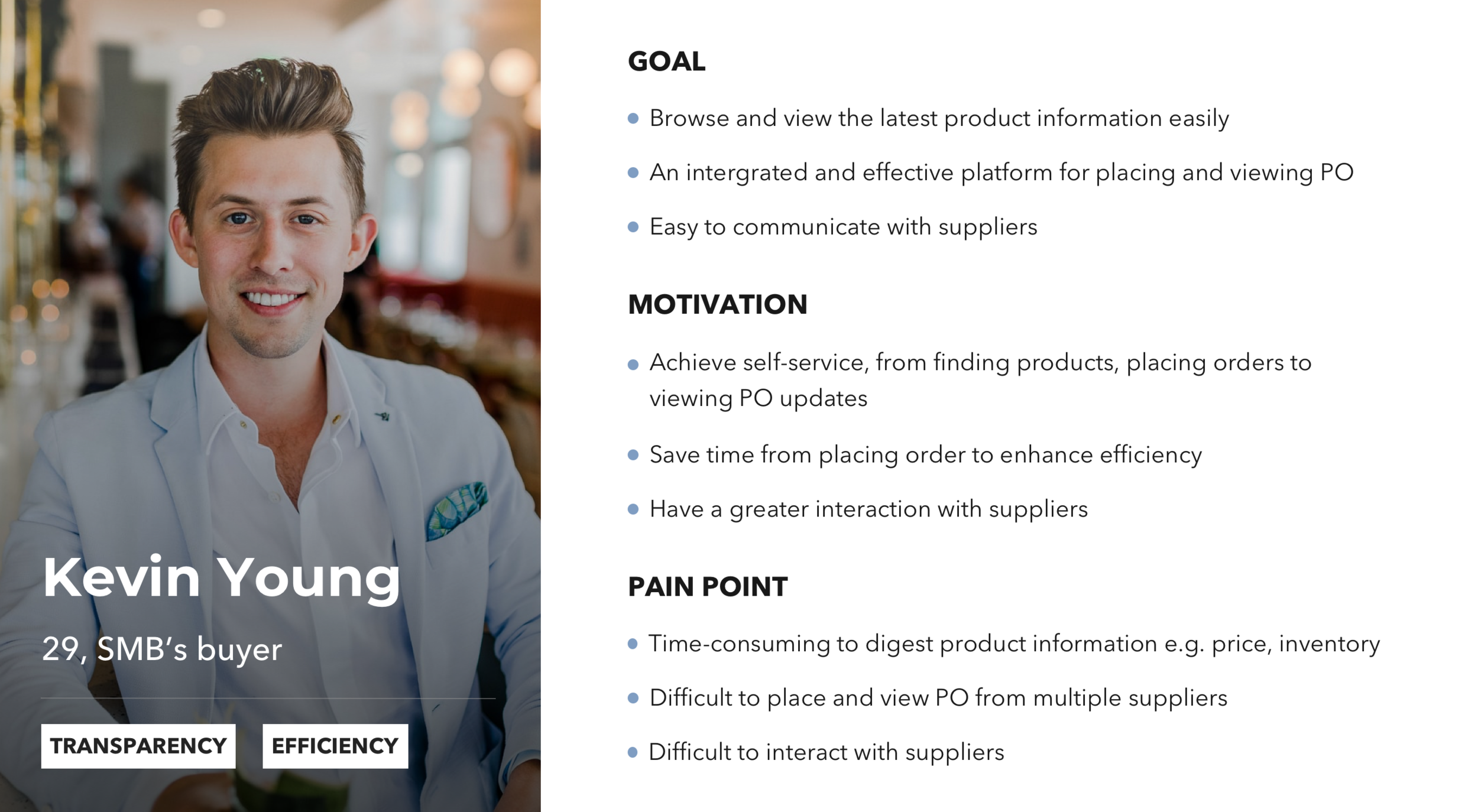
Persona
By combing my findings in the research phrase, I developed a persona to address the SMB buyers’ needs and pain points which is essential for me to restructure the site map, user flow and information hierarchy in the later stages.
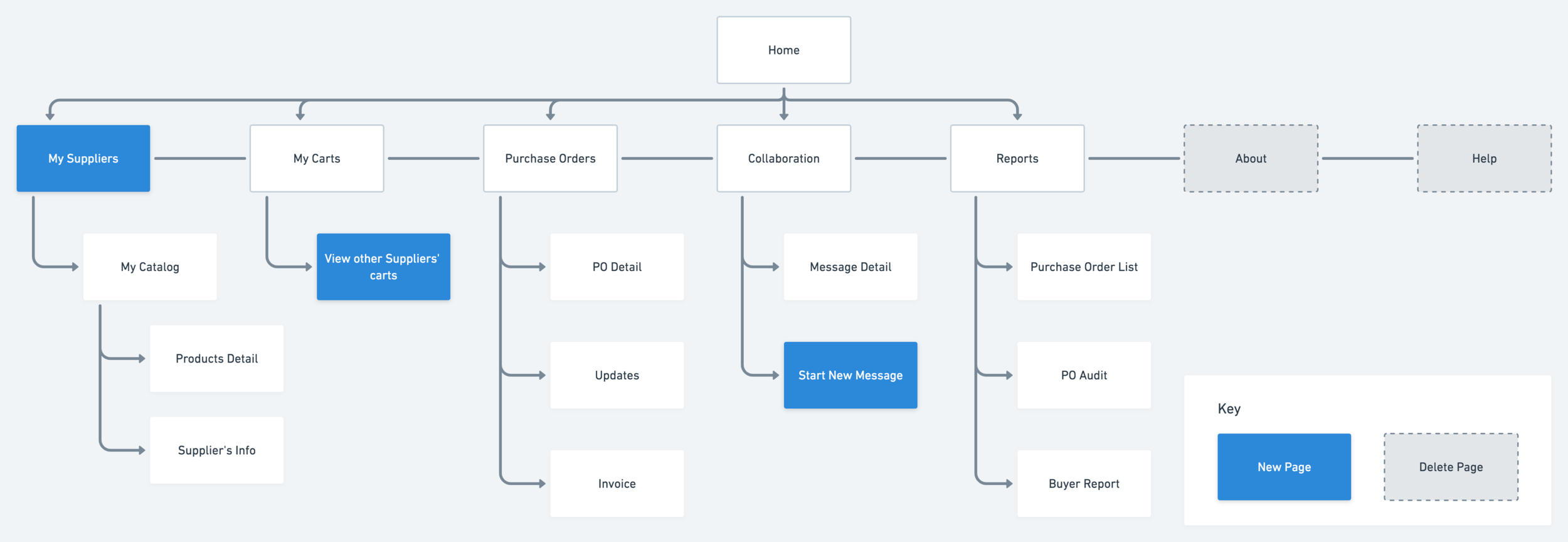
Site Map
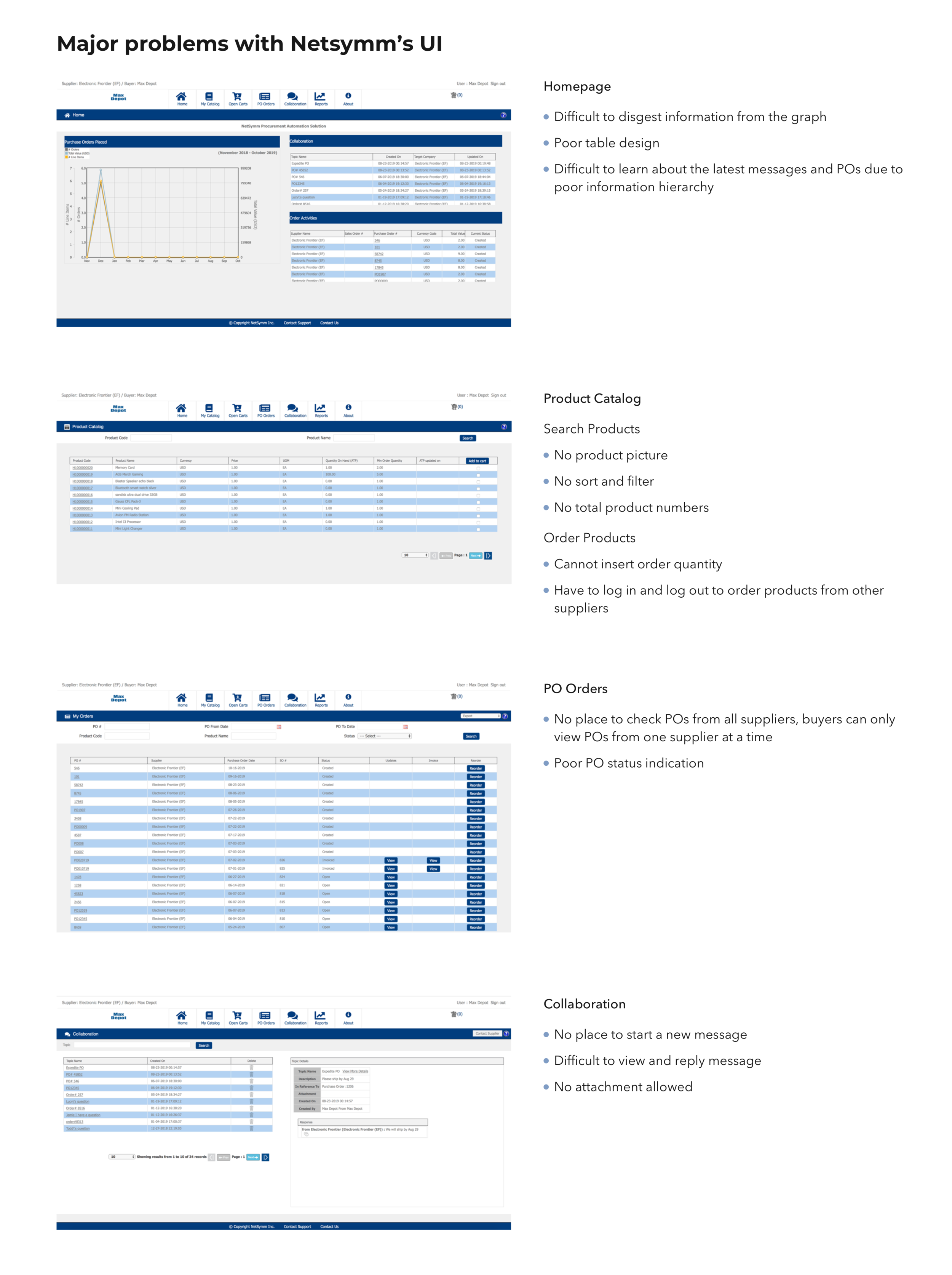
For their previous website structure, Netsymm’s users hold a separated account for each supplier. When they want to place and view orders from other suppliers, they have to log in and log out repeatedly, which is very time-consuming. Therefore, I created new pages to integrate all the product catalogs and carts from multiple suppliers into one single account while eliminating reductant pages to enhance efficiency and simplicity.
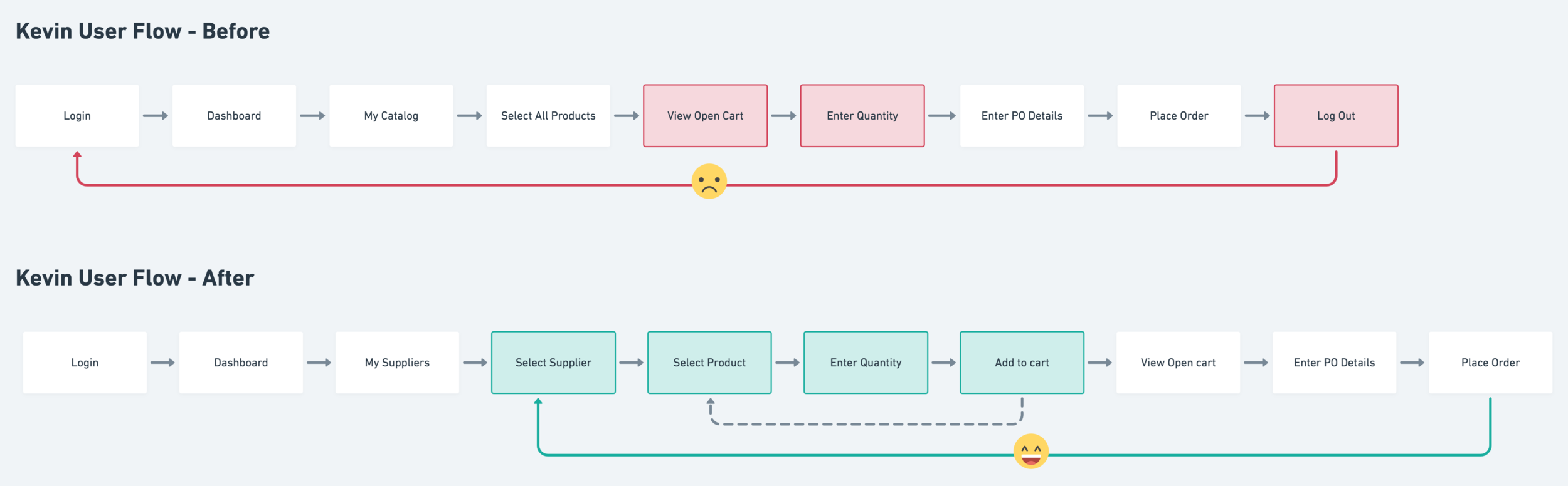
User Flow
With the new user flow, users will be able to place orders from multiple suppliers easily without logging in and out to separated accounts. They are also allowed to enter quantity right after selecting a product, which is more consistent with millennial’s buying behaviors.
Design
Low to High-Fidelity Wireframes
I created low to mid-fidelity wireframes for getting early feedbacks from business owners, project manager and developers. After rounds of iterations, I created high-fidelity wireframes for testing purpose in the later stage.
Testing
User Test
I conducted user testings with three Netsymm’s customers by using the high-fidelity prototypes (Desktop, Mobile).
Tasks were given to measure task completion rate and to identify pain points that could be improved in future iterations.
All participants were able to browse products, place and view POs from multiple suppliers effortlessly and they all agree the new design has improved its overall efficiency and effectiveness.
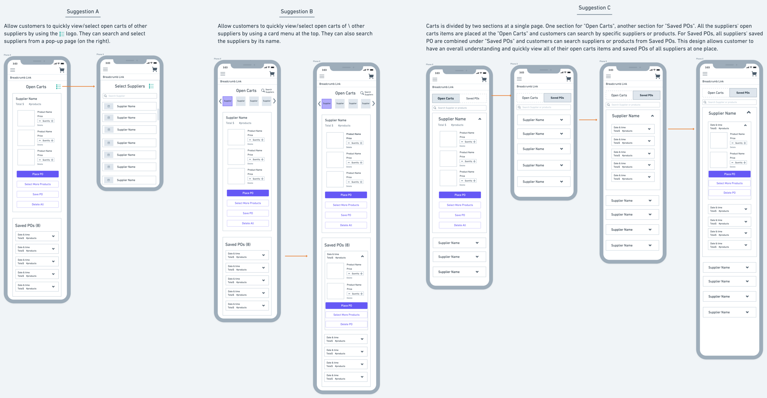
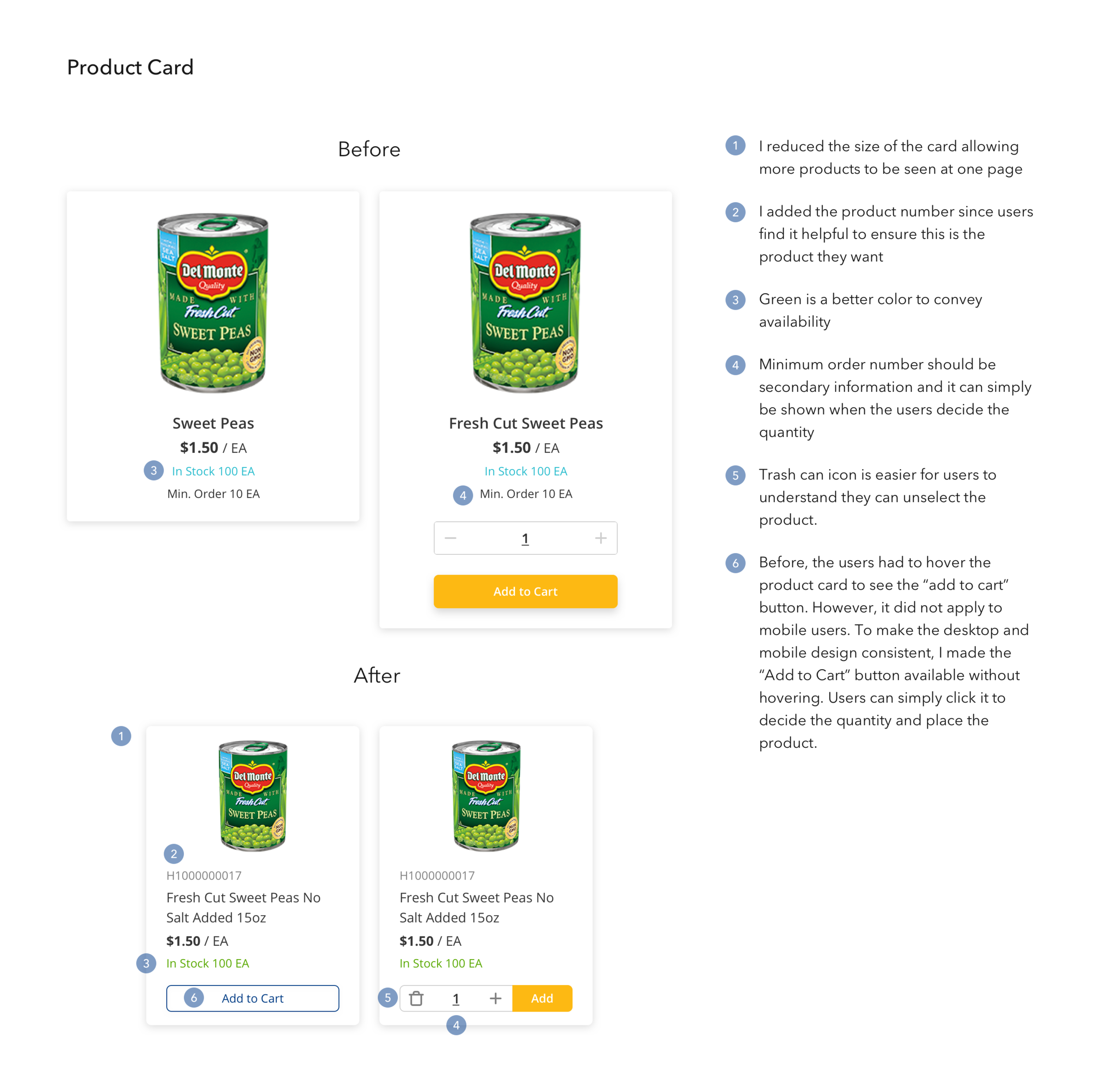
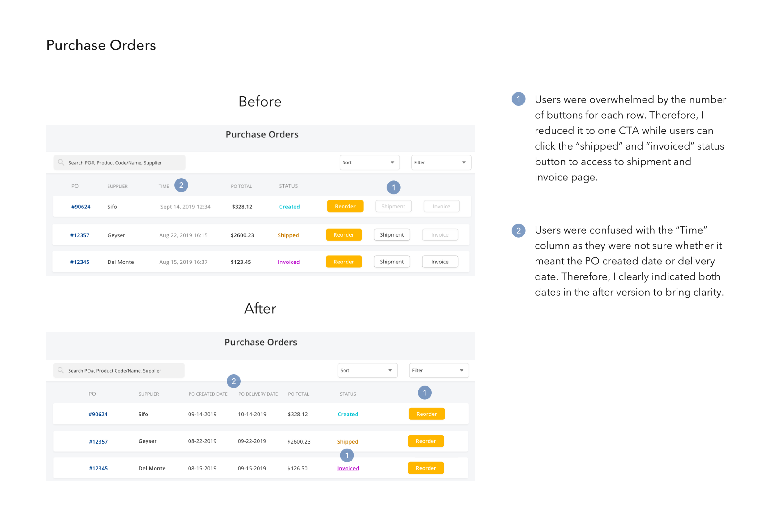
Iterations
I gained valuable feedback from the participants and after ideating the possible solutions, below are the major iterations I have made.
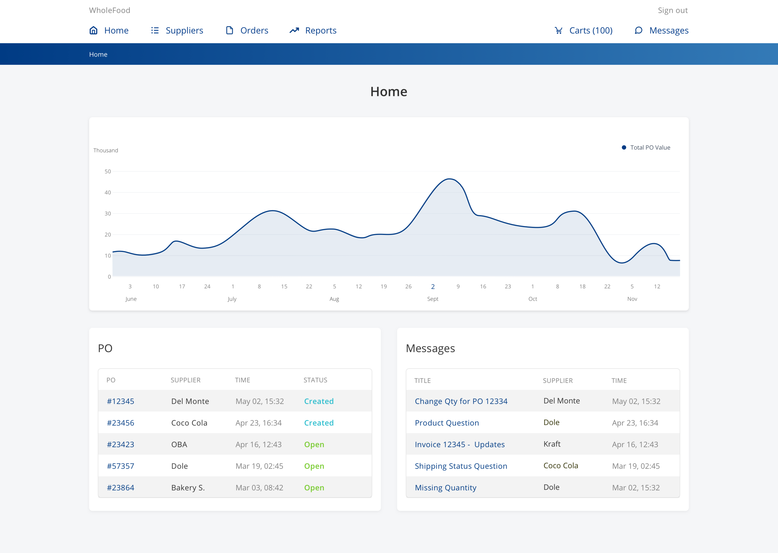
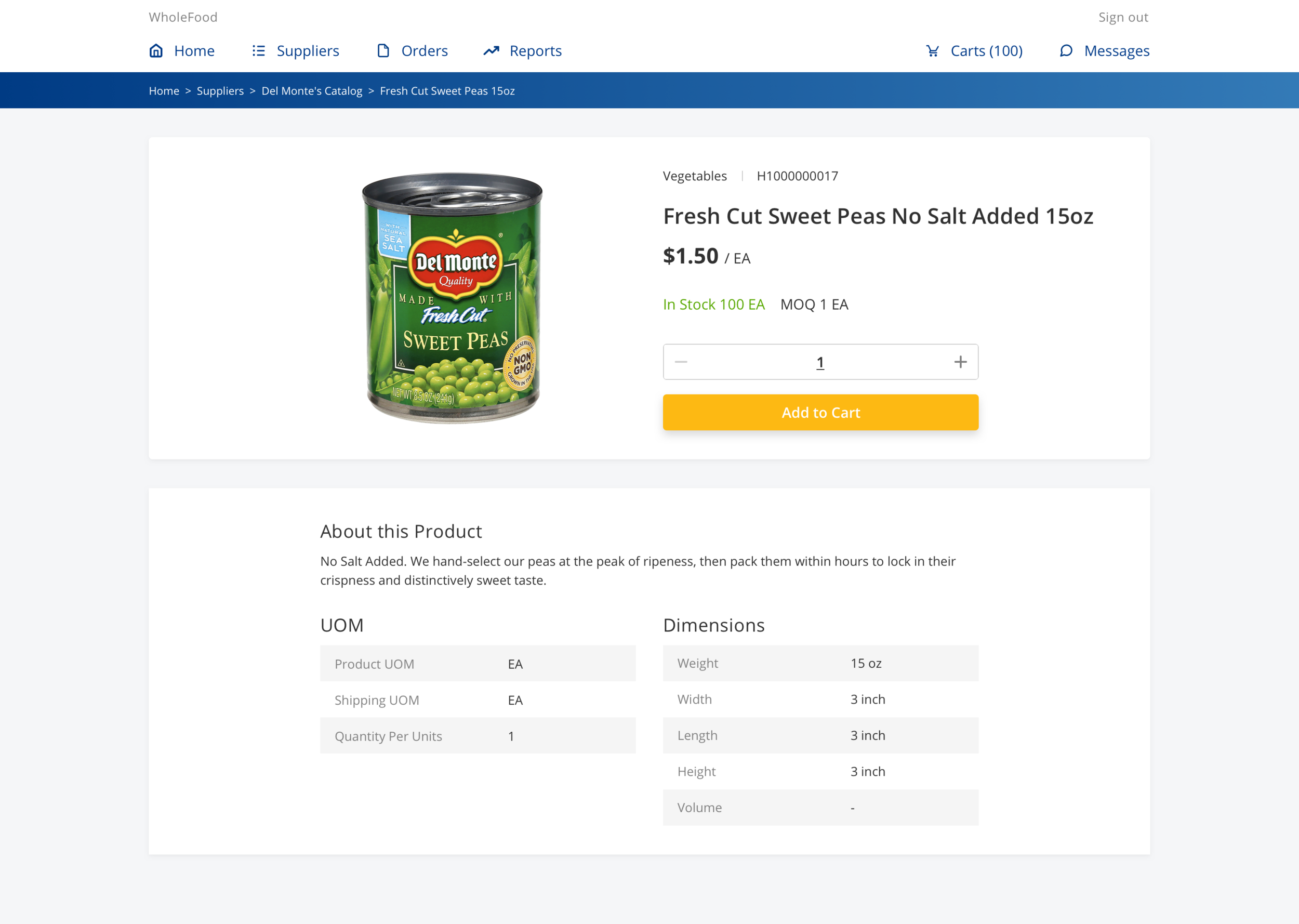
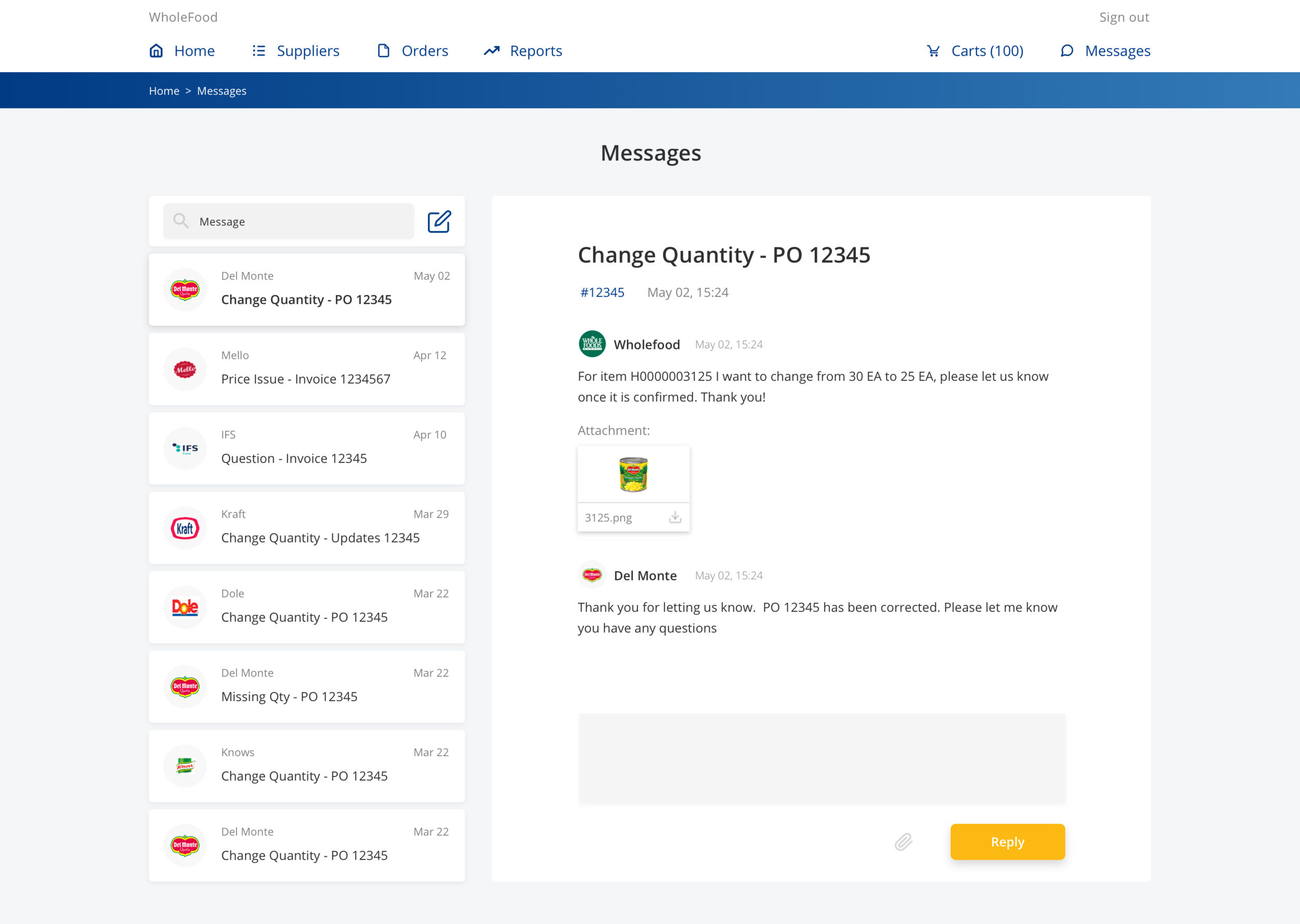
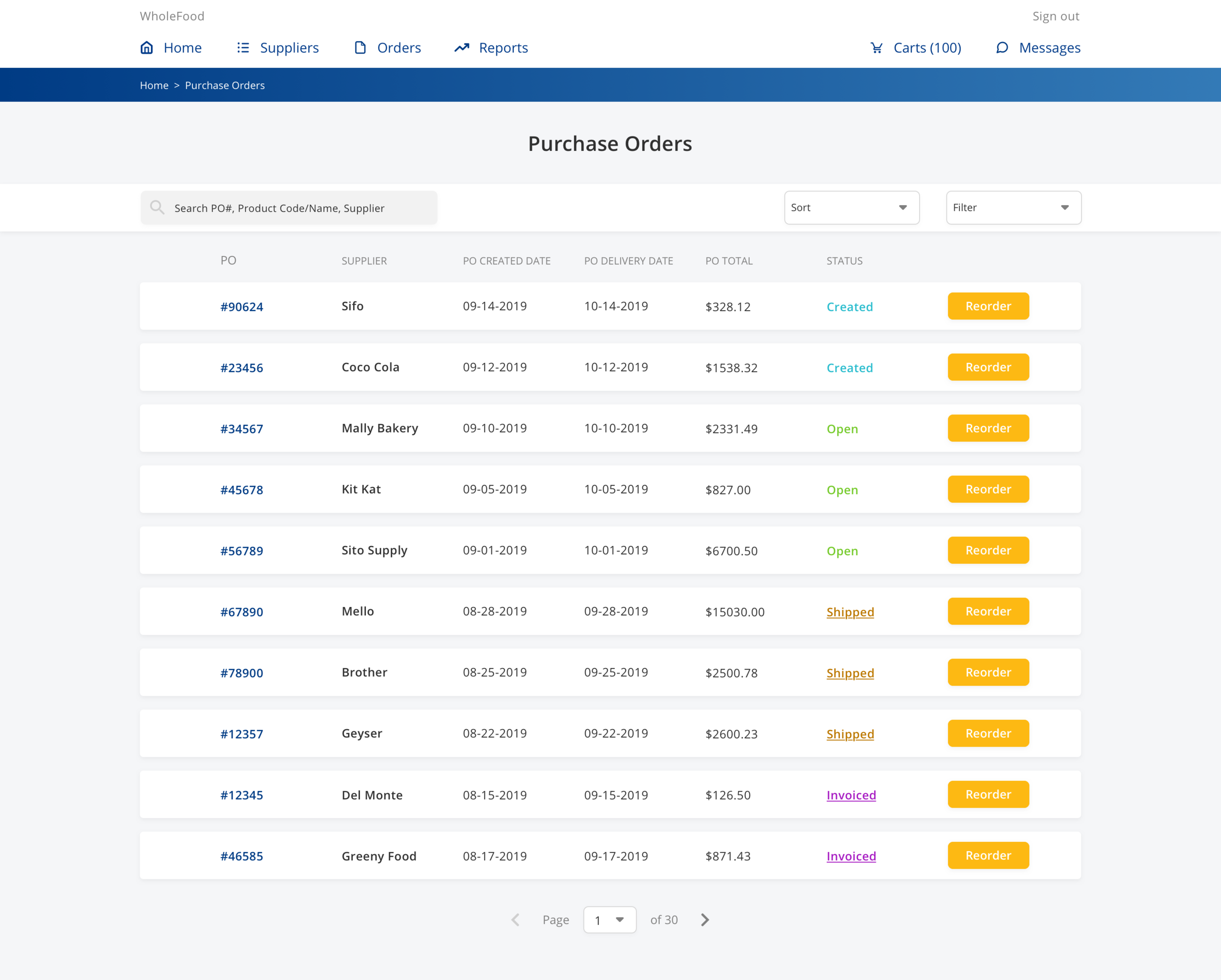
Final Mockups
Visual Design
Based on their given color palette, I recreated all the design elements to modernize their user interface while ensuring its consistency across desktop, tablet and mobile platforms.
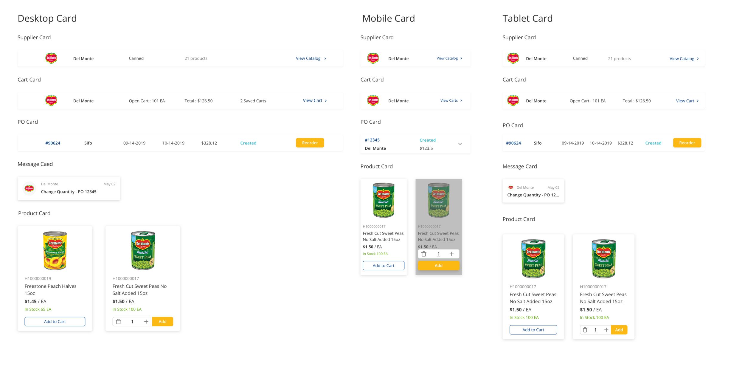
Final Mockups
Below are the key screens of the final mockups:
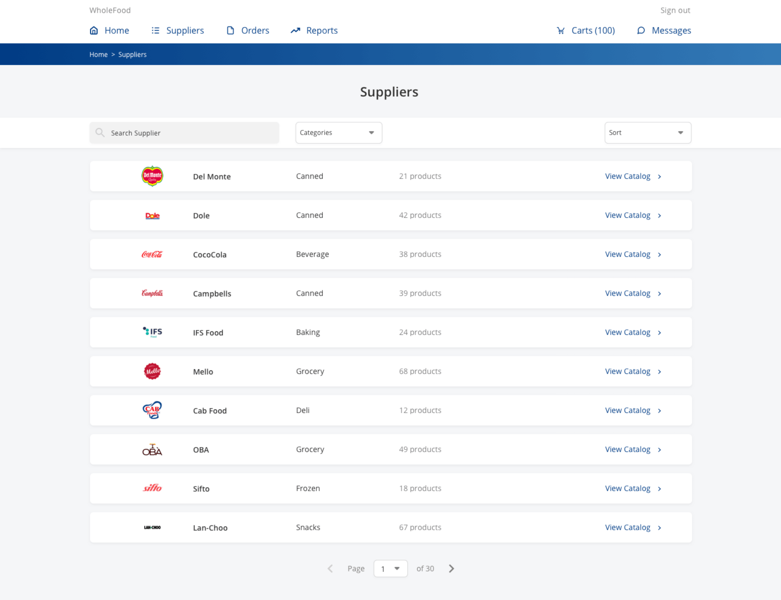
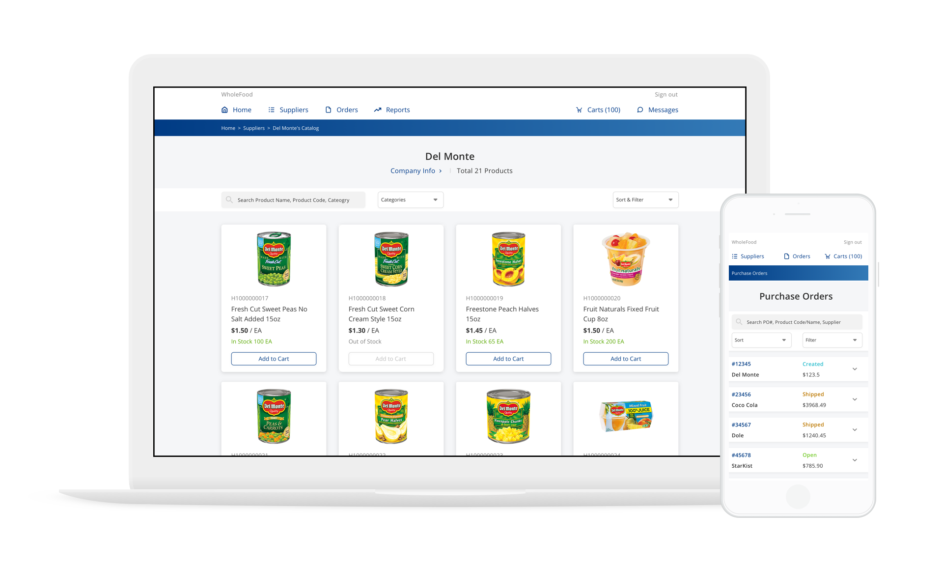
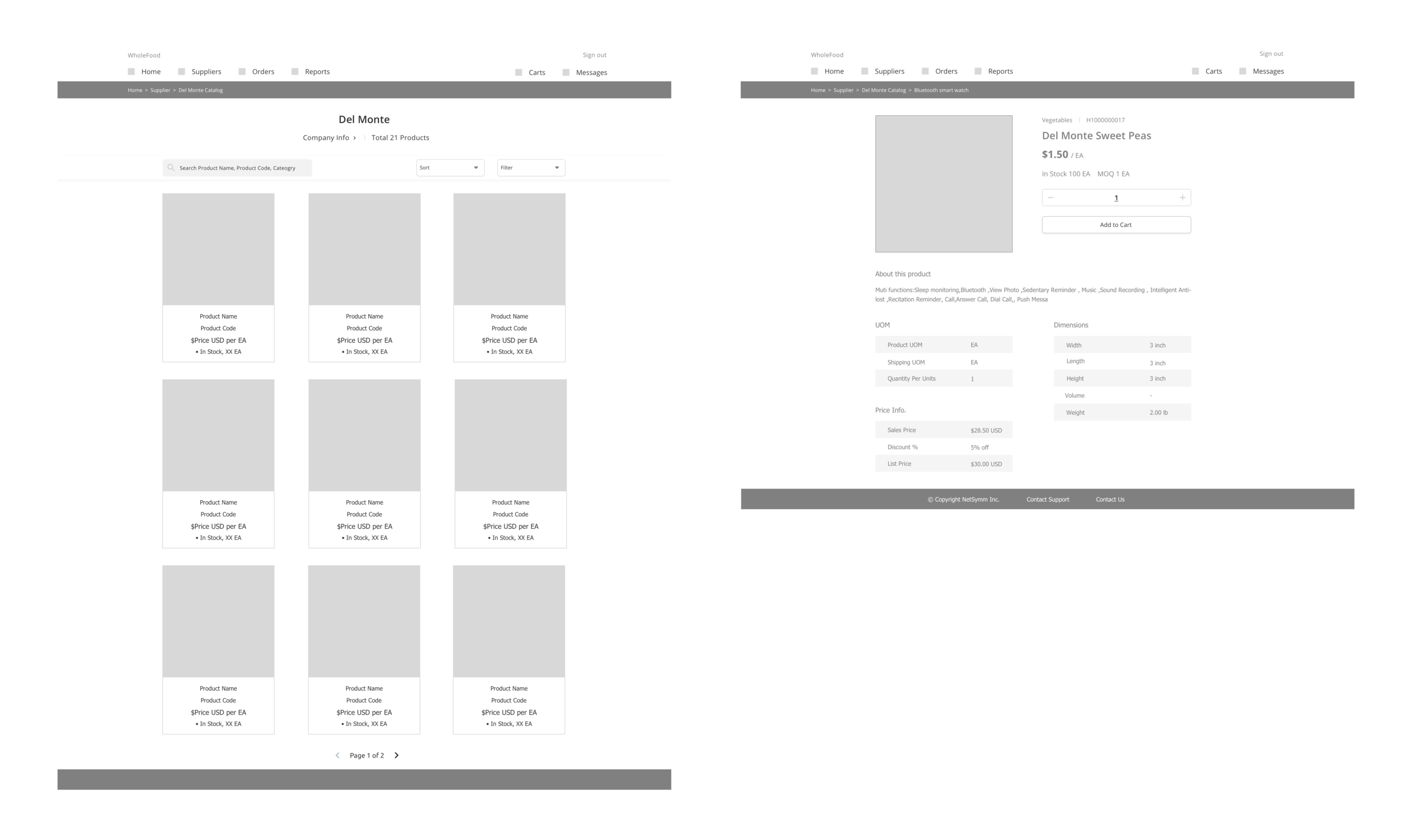
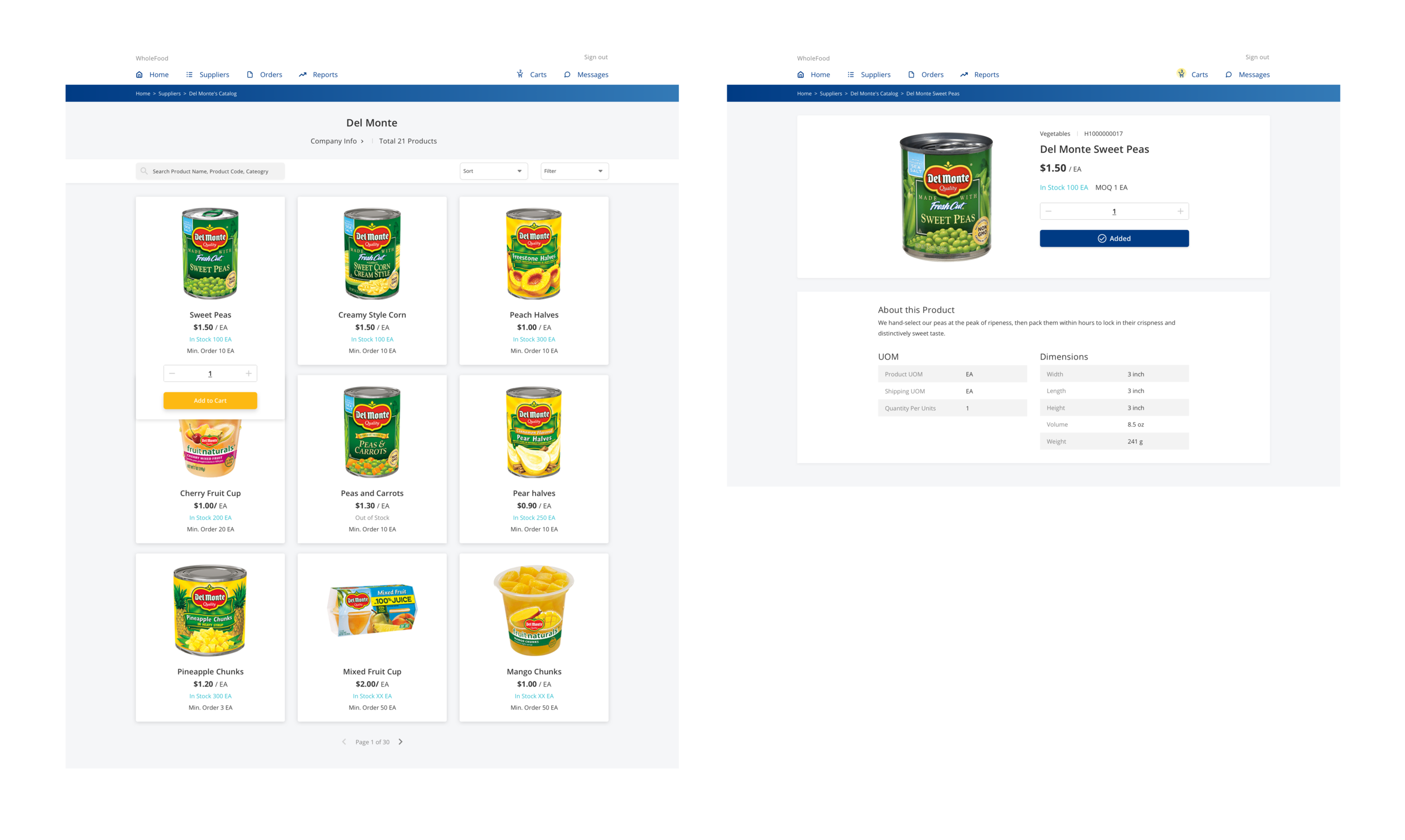
Select Suppliers and Products
All suppliers are integrated into a single page.
Users can choose a supplier, select products they want and enter the quantity efficiently.
Product image, sort, filter and total product number are added to the product catalog which are easier for users to view and find products they want.
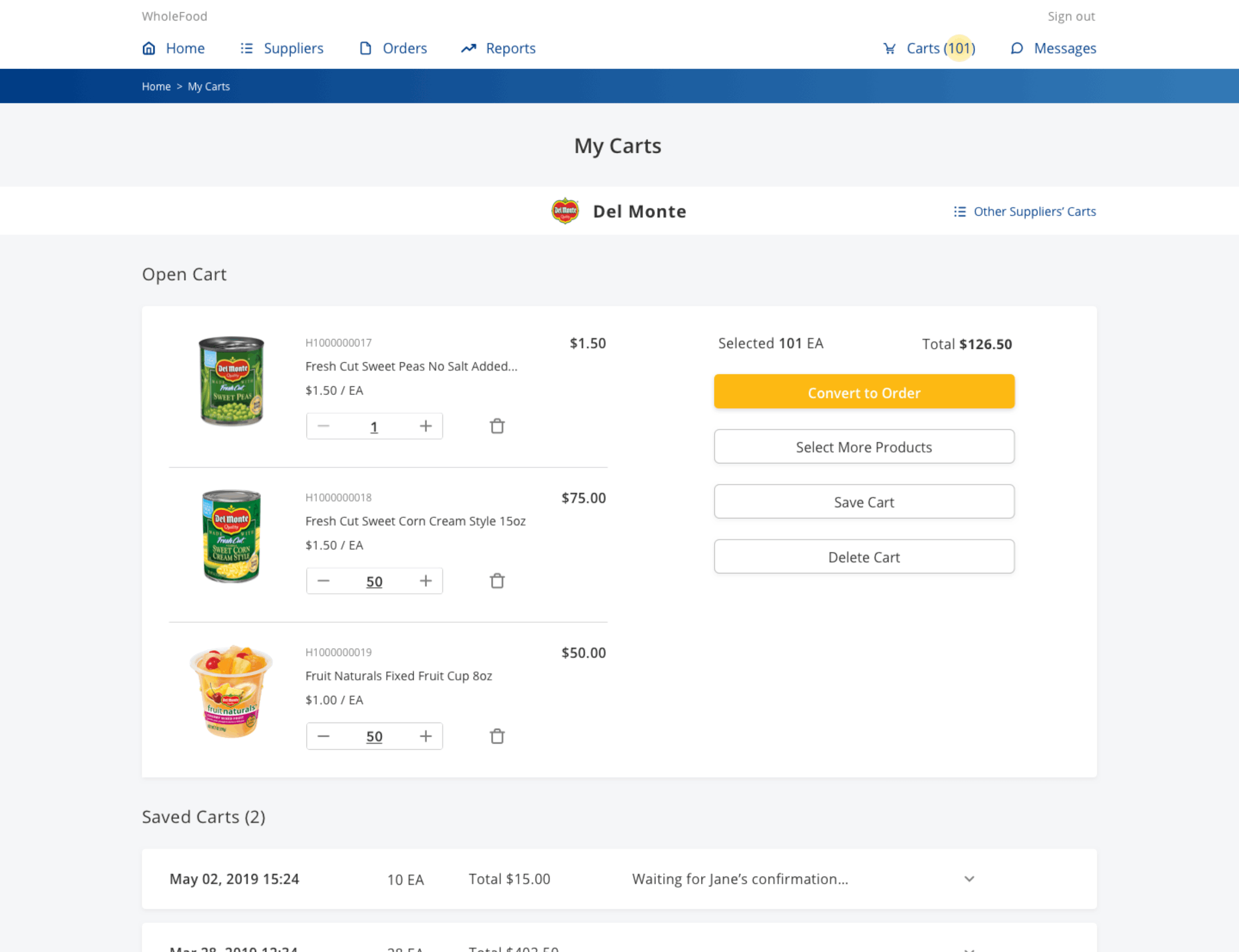
Review My Carts and Place Order
All the selected products will go into the “My Carts” page.
Since buyers place purchase order from one supplier at a time, each supplier has its own cart page.
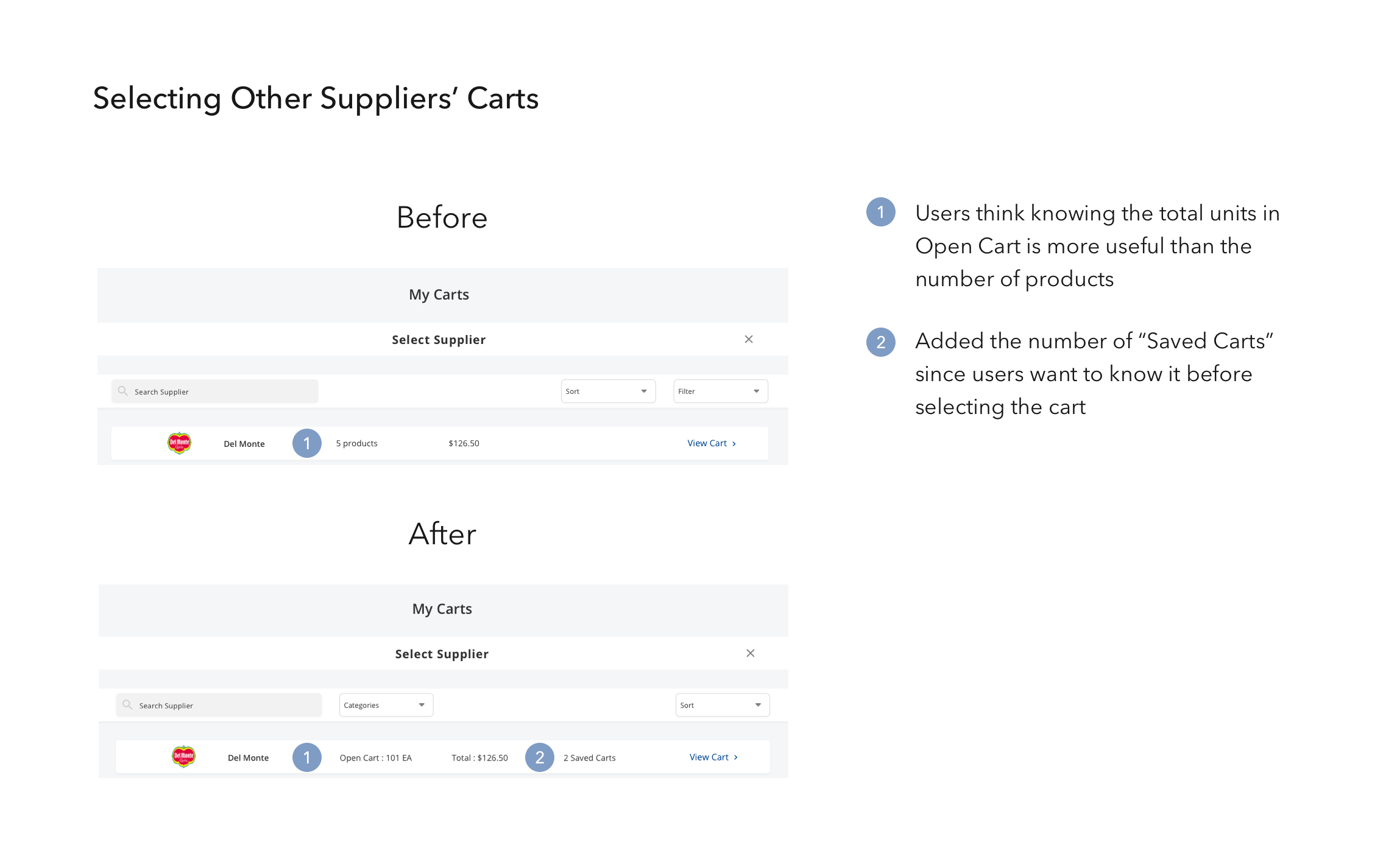
Users can review the products, covert products to order, or click “other suppliers' carts” to view selected products from other suppliers.
Challenges and Lessons Learned
As the sole designer in the company, redesigning the entire platform for Netsymm is a challenging yet rewarding project. I was requested to handoff the final mockups within a month, which gave me limited time to conduct research. Also, Netsymm did not want to do any user interviews. Attempting to learn about the users’ needs and pain points while staying on a tight timeline, I decided to find an alternative; stakeholders’ interviews.
Interviewing the business owners and sales director allowed me to understand their business goals and challenges faced by their users in an efficient way. After building the persona, sitemap and user flow, I was capable to create the wireframes quickly to get early feedback from the team and do user testings.
This project gave me a valuable experience to learn how to alter my design approach based on the company’s situation. Also, even I have a tight timeframe, I was grateful to manage my time to get feedback from business owners, developers and, most importantly, the end-users, which drives me to optimize user experiences in the final mockups.
Next Steps
In addition to qualitative analysis, I want to gain quantitive data to verify the success metrics. For the next steps, I would like to measure how Netsymm has improved users’ ordering time by running a before and after test. Also, I would like to obtain the Net Promoter Score to measure how Netsymm has enhanced users’ satisfaction rate based on the new design.
Besides, my design works view millennials buyer as an individual but in many scenarios, they work in a team. Learning how they work with C-levels and other departments to make the purchasing decisions will help me to have a further understanding of their needs and challenges, which will be essential for me to strategize new features in the future.