
Punchh
Revamping the outdated homepage into a user-centric, all-in-one Campaign Management hub
My role
Lead Product Designer
Timeline
12 months (Feb ‘23 - Feb ’24)
Responsibilities
Research, Strategy, Design, Testing, Data Analysis
Tools
Figma, Miro, Usertesting.com, Pendo
Overview
Punchh (PAR Tech) is the leading platform for restaurant loyalty and marketing, supporting over 40% of the top 100 U.S. restaurant chains, including Taco Bell, Wendy’s, and Carl’s Jr.
Their most-used product, Campaign, was highly requested by marketers for a redesign. I led the transformation, turning the outdated homepage into a powerful, all-in-one Campaign Management hub. The impact was significant:
75% of users chose the new design over the classic version
CSAT increased by more than 50%
Research
Hypothesis
When users said they needed a new homepage, I wanted to uncover what that truly meant. I began by brainstorming and developing hypotheses around users’ needs and pain points when they landed on the homepage, deliberately stepping away from legacy design constraints to explore broader possibilities.
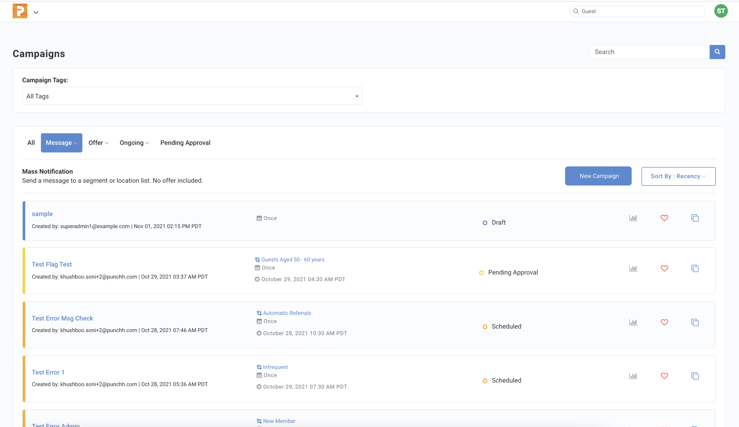
The legacy homepage
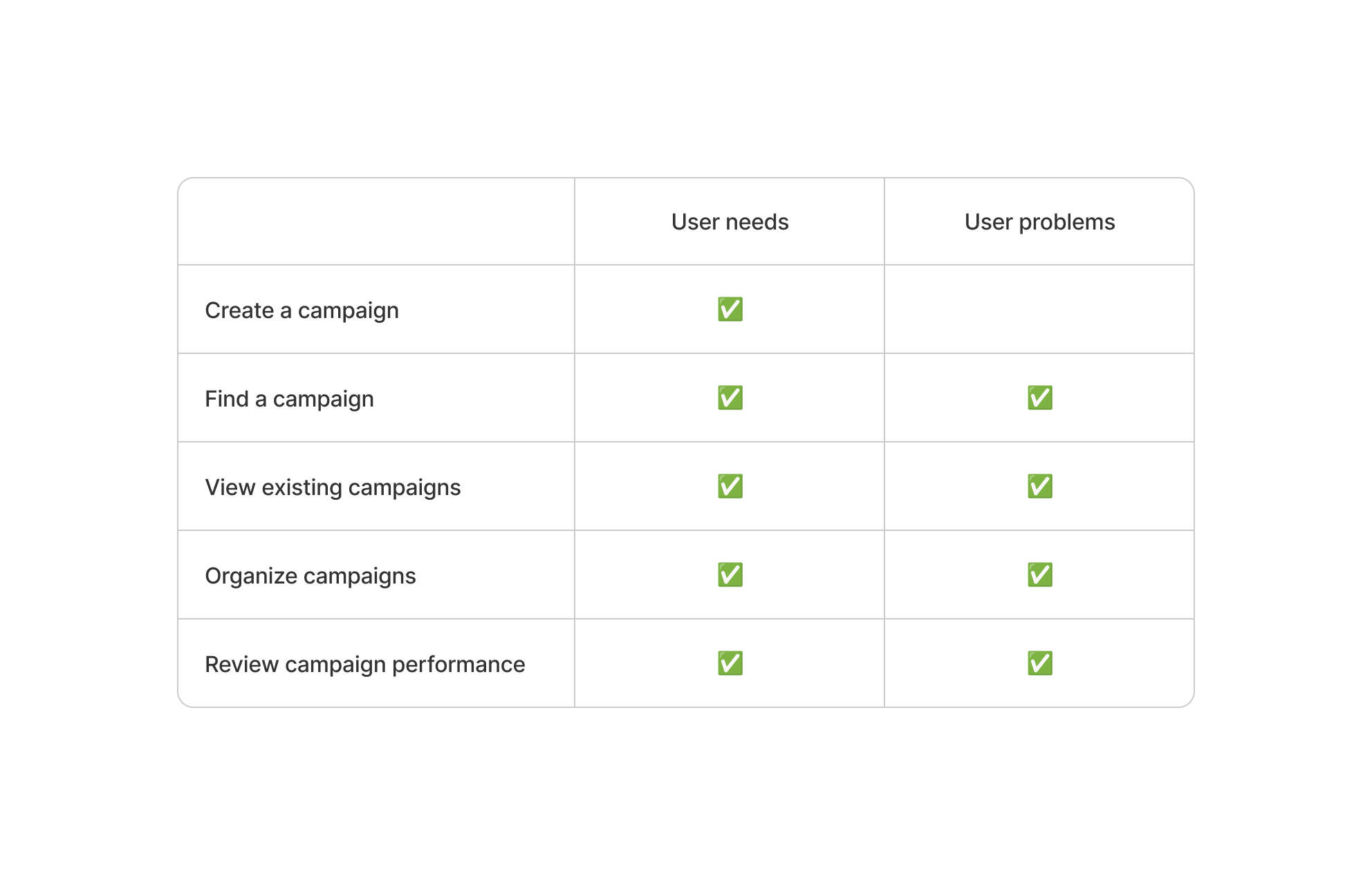
User needs and pain points hypotheses
Validation
To validate user needs, I launched a survey with 21 respondents. The results confirmed strong demand—each of the five hypothesized user needs was rated extremely important by 33–57% of participants, reinforcing that these priorities were real and worth solving.
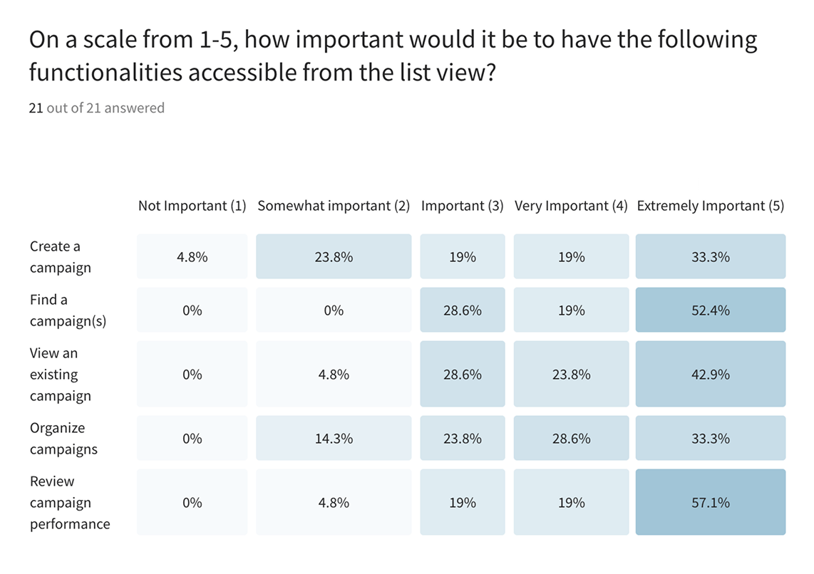
Released a user survey on Typeform with 21 respondents.
To validate user problems, I facilitated an internal workshop with Customer Support, Sales, and Enablement teams. Their close customer relationships provided firsthand insights that confirmed key issues and added real examples and context to clarify what needed to be solved.
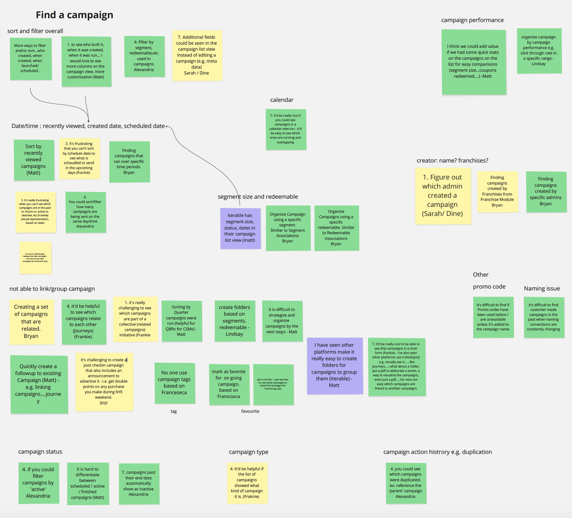
Most insights center on challenges in finding campaigns.
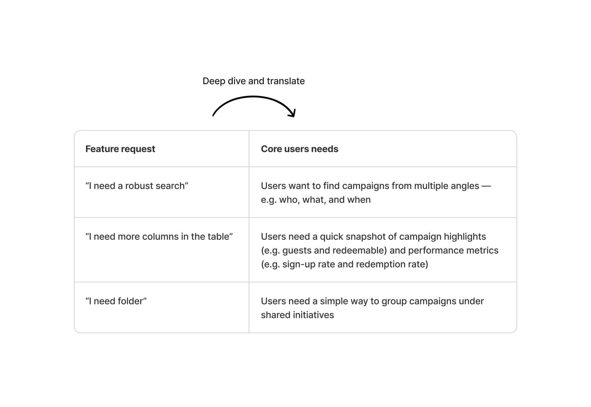
Turn feedback into research
Users often express feedback as feature requests. My role was to look beyond the proposed solutions and translate those requests into underlying user needs.
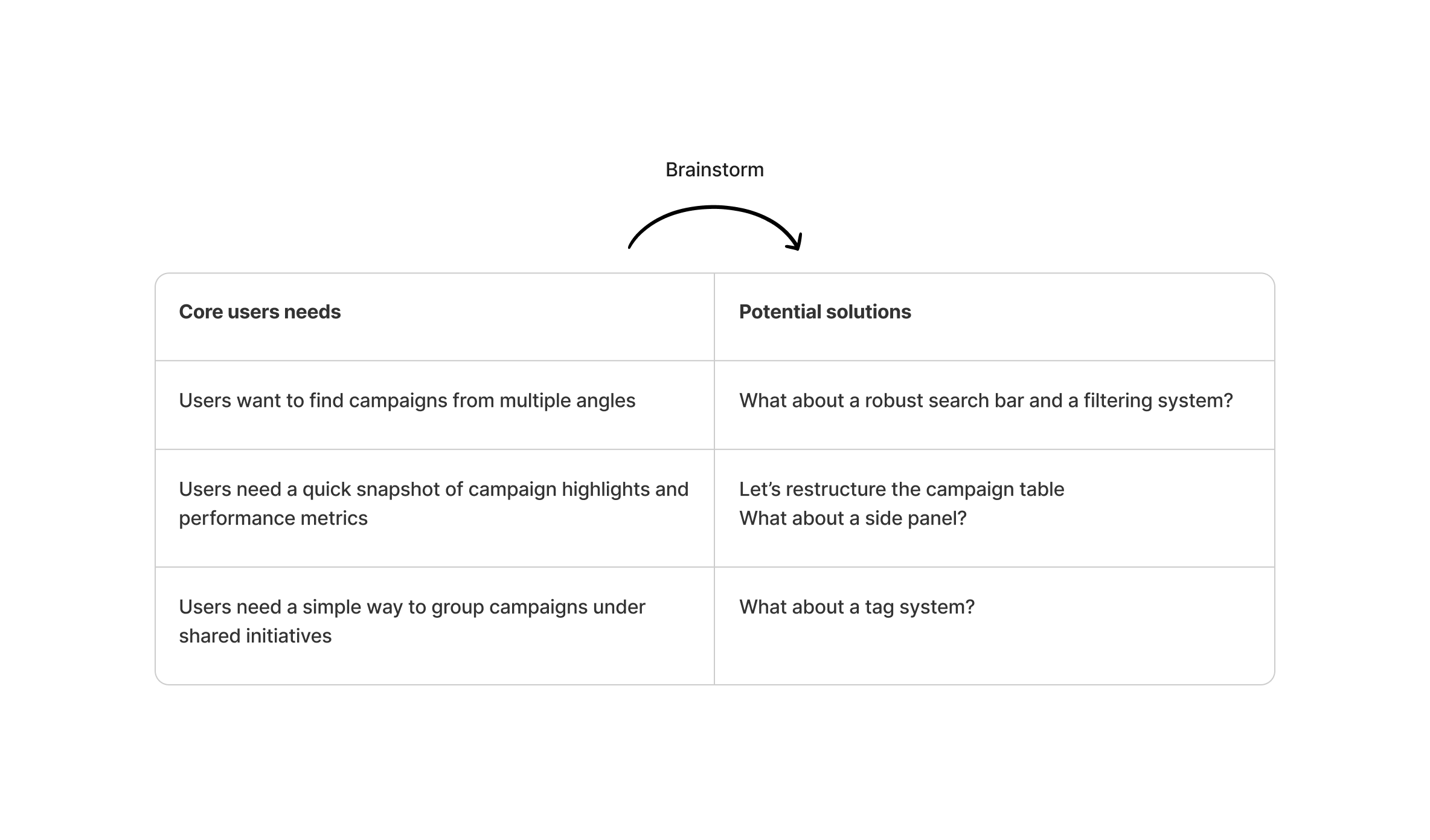
Ideation
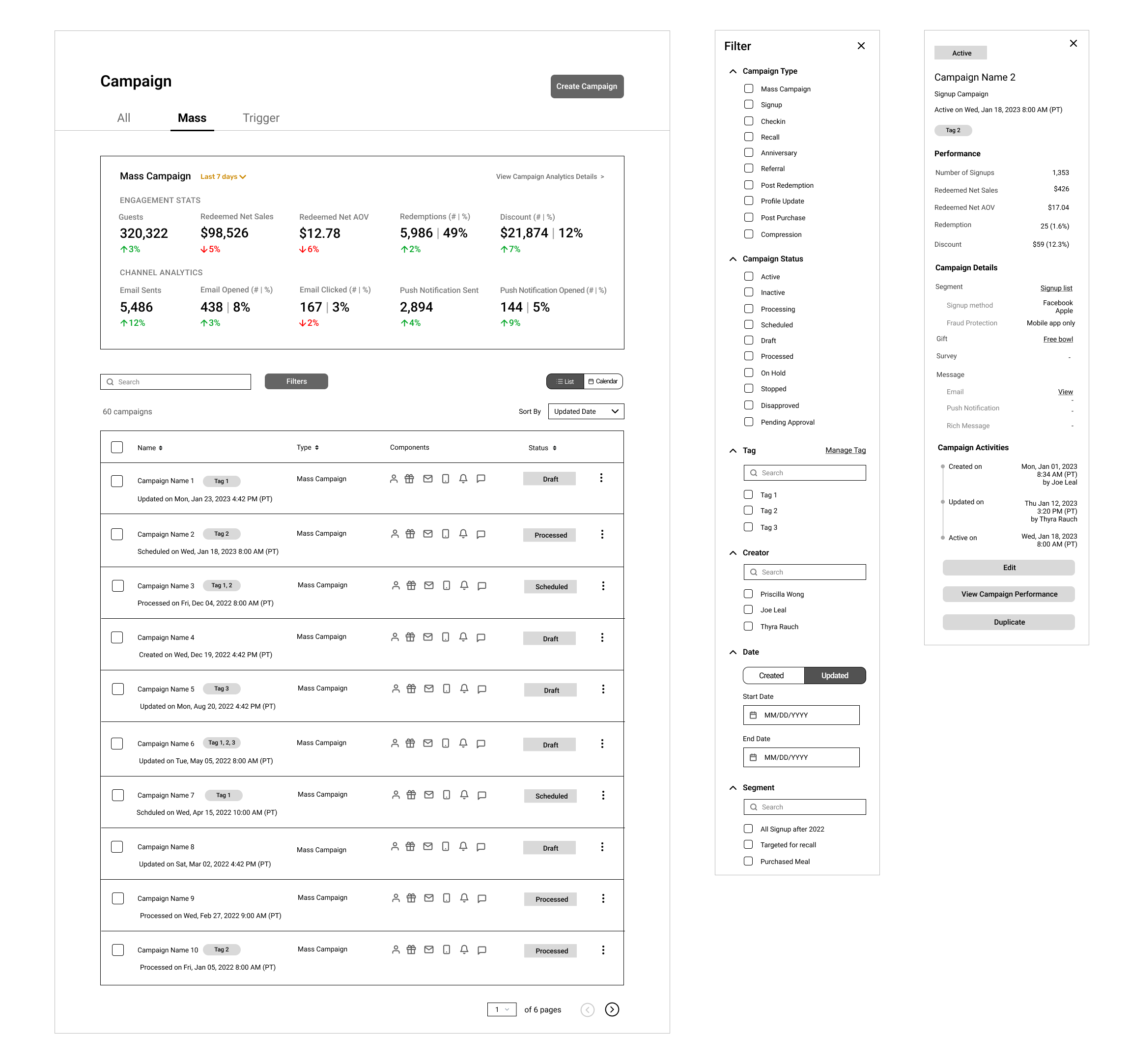
After conducting competitor research to understand industry standards and user expectations, I brainstormed potential solutions and created low-fidelity wireframes to explore different design directions.
Testing and Iterations
With the wireframes in place, I conducted usability testing to gather early feedback and validate the solutions.
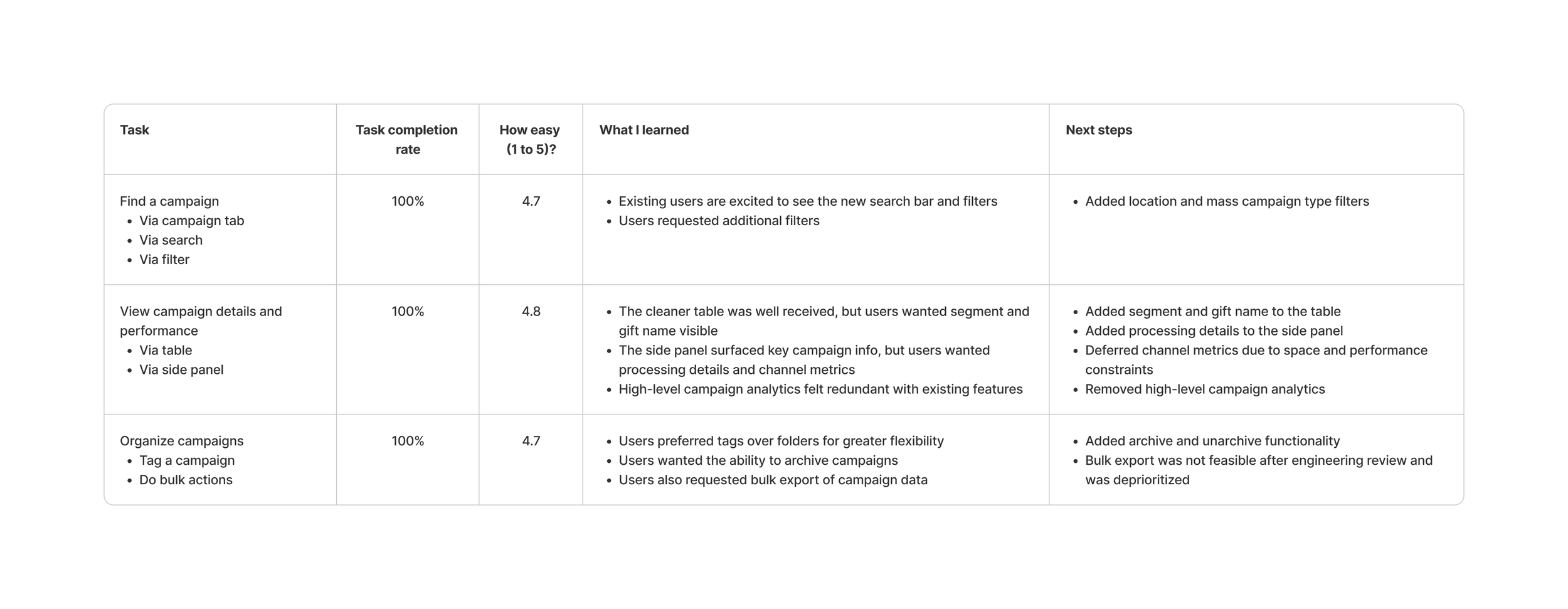
We tested with 10 existing customers and 10 external loyalty marketers recruited through UserTesting.com. This balanced mix provided both product-specific insights and fresh, unbiased perspectives.
Participants completed key tasks using the prototype, then answered follow-up questions to identify friction points and measure ease of use.
The results showed a 100% task completion rate and an average 4.7/5 ease-of-use score. Based on the feedback, I refined the designs through several iterations.
Before the release
Partnered with PMs and engineers to define story maps, requirements, and milestones.
Worked with the Principal Designer to ship a new design system supporting the updated experience.
Ran a pilot with an early access user group to gather feedback and identify missed use cases before full release.
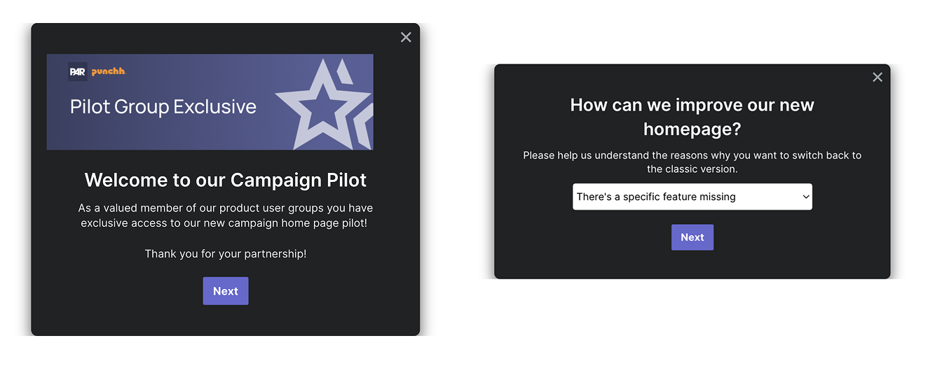
We used Pendo to gather feedback from early access users, with a specific focus on understanding why some chose to switch back to the classic version.
After the release
Created onboarding guides to help users navigate the new design
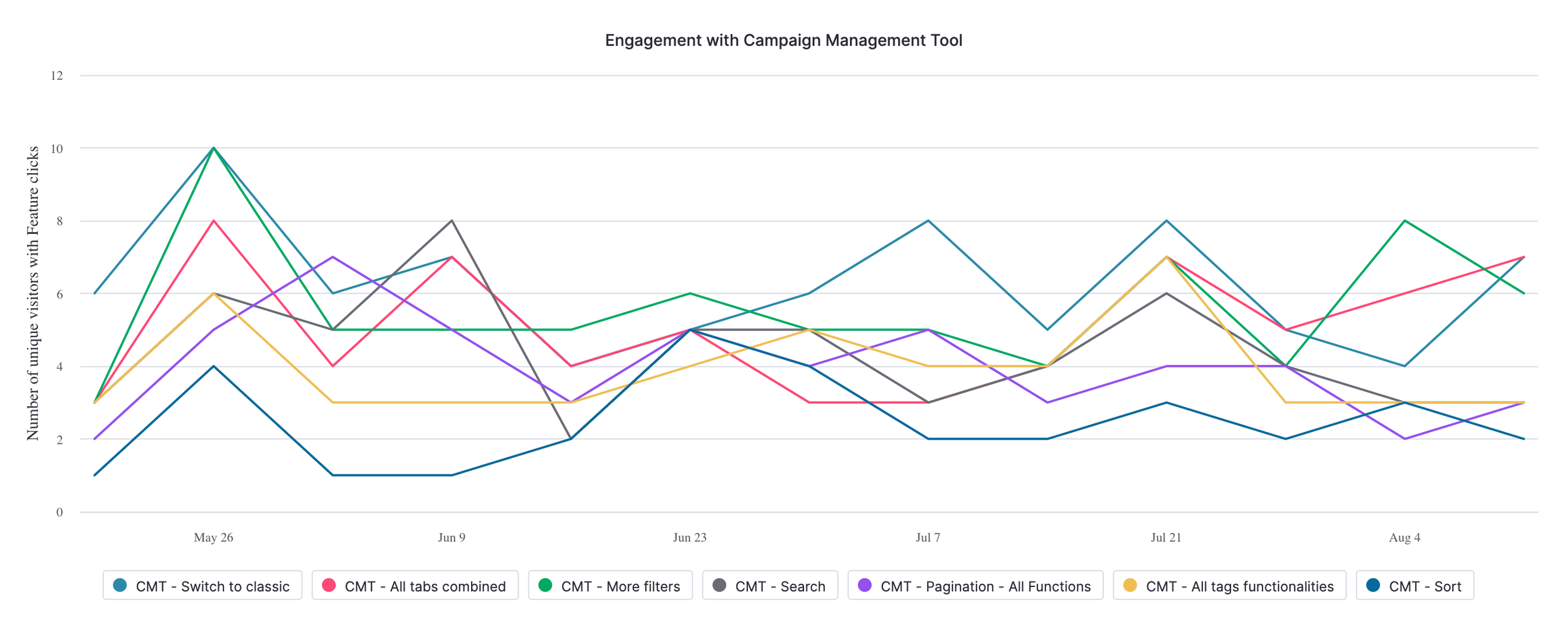
Set up Pendo metrics to track user adoption and engagement
Final design
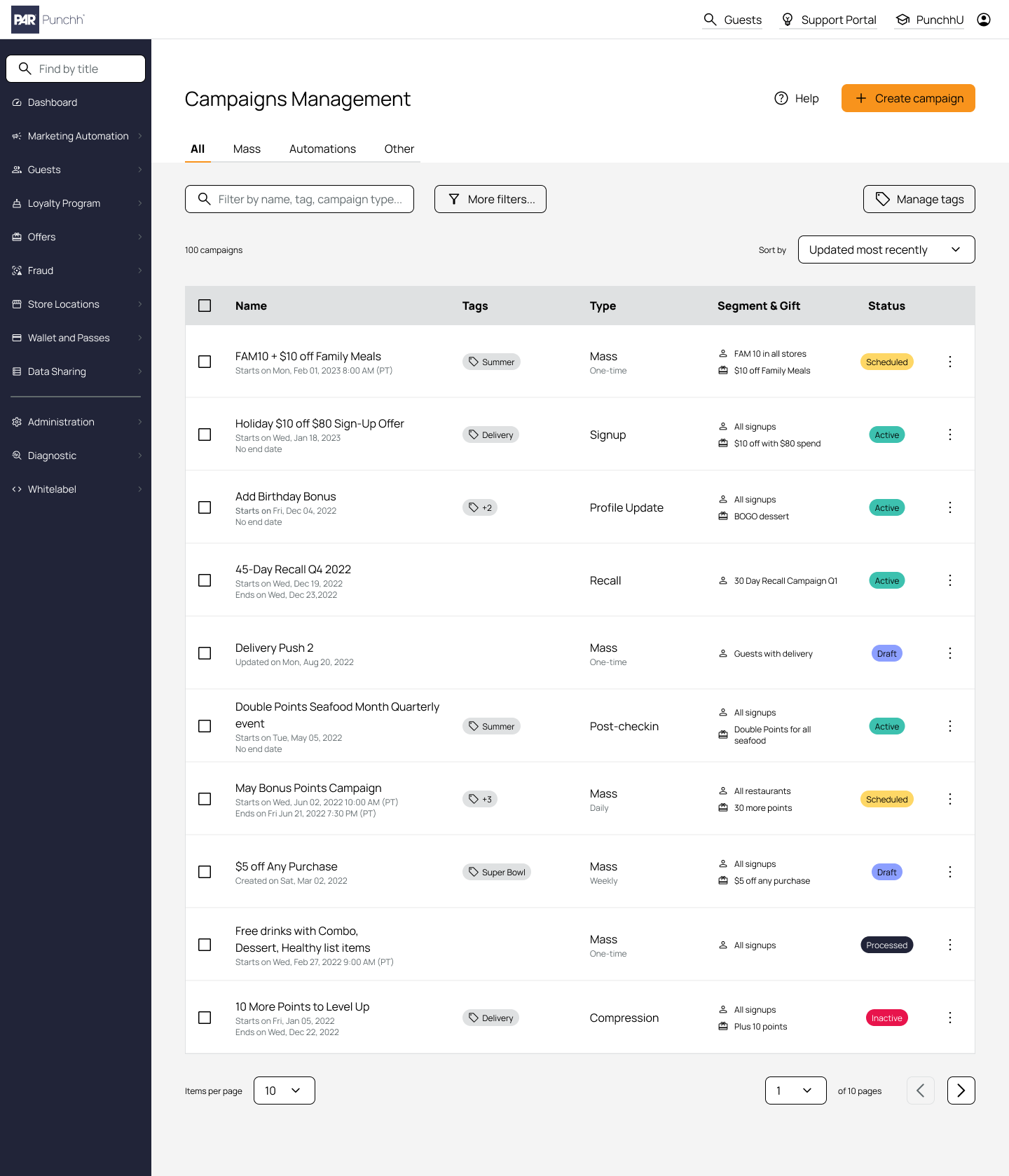
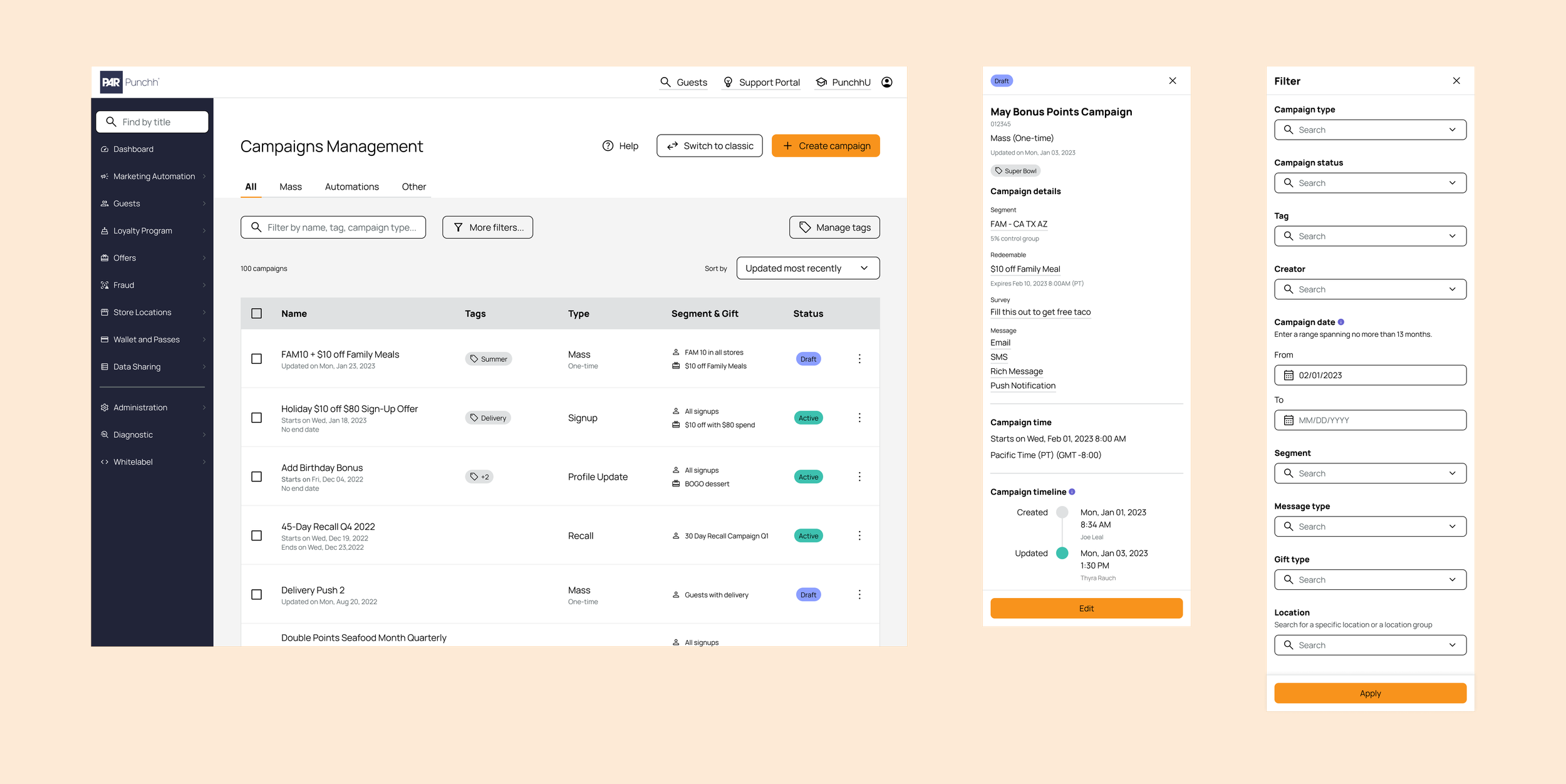
New campaign dashboard
Transformed the legacy campaign table into a cleaner, more intuitive experience, enabling users to quickly scan and understand key campaign information
Introduced a flexible tagging system to simplify campaign organization. Compared with folders, tags offered greater flexibility and better supported complex marketing strategies
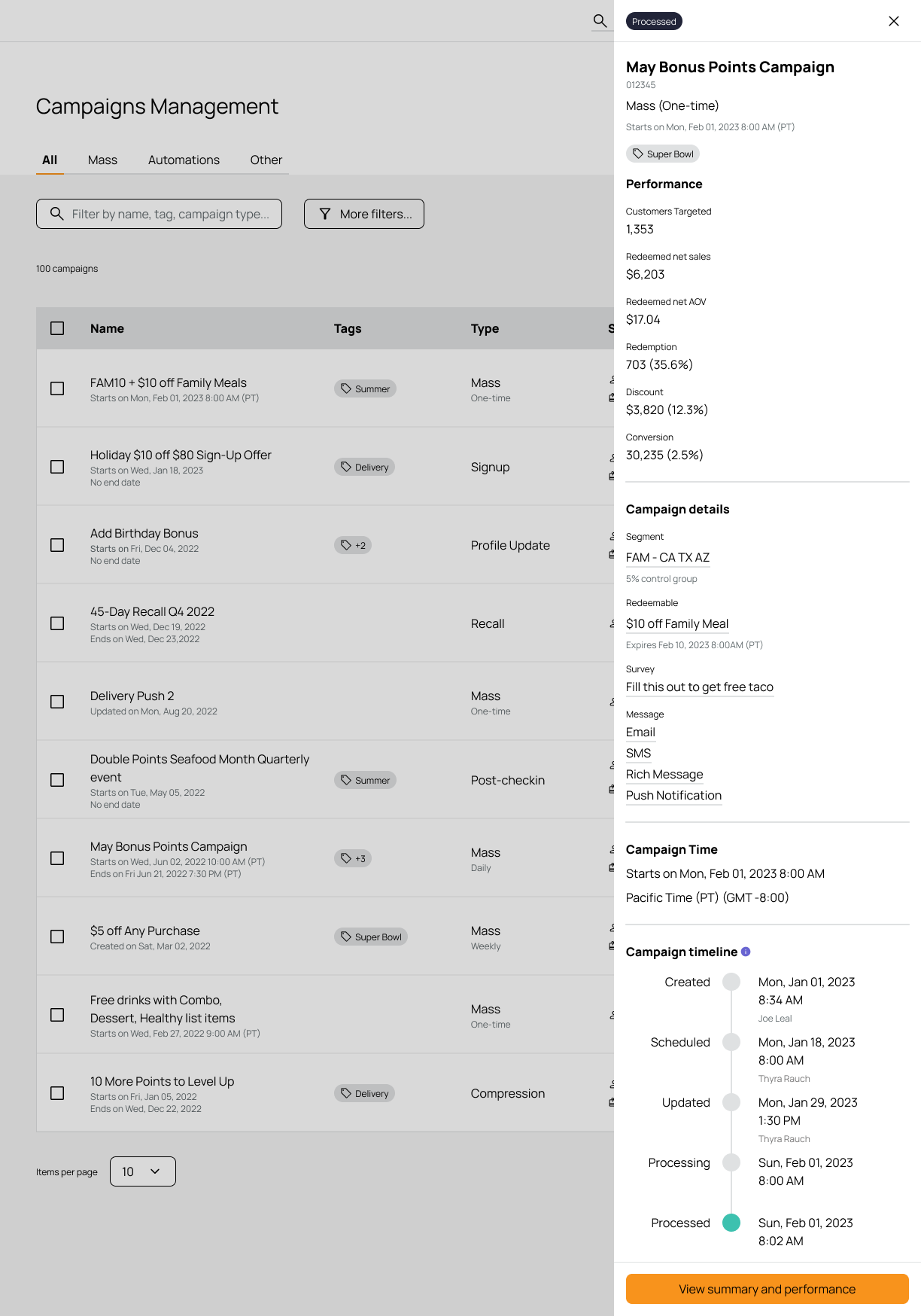
Side panel
Before, users had to open multiple tabs to access campaign information, making reviews slow and inefficient
With the side panel, key metrics and campaign details are surfaced at a glance—allowing users to stay on the same page, reduce navigation, and make faster decisions
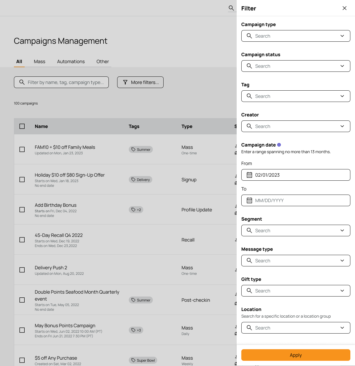
Filter
Introduced a powerful filtering system that dramatically speeds up campaign discovery
Built on industry-standard filters (e.g., type, status) and extended them with high-value filters like creator, date, and segment based on user needs
Adoption
In the first four weeks post-launch…
75% of users stayed on the new experience, with minimal return to the legacy design
CSAT increased by over 50%, rising from 3.25 to 6.43
Key features reached best-in-class benchmarks, aligning with or exceeding industry standards
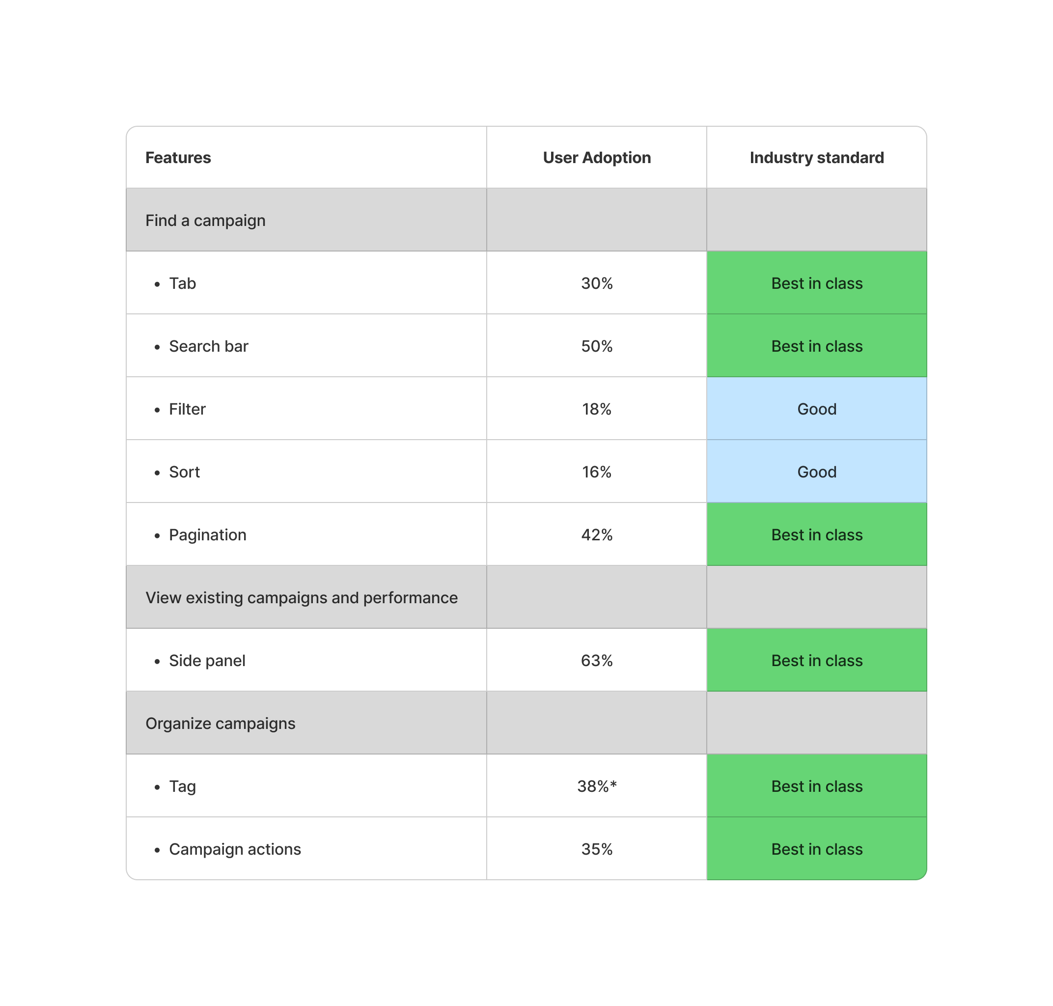
*Tag adoption is measured at the account level, as only manager-role users would create campaign tags
Areas for Growth
Leverage AI
When this project started, AI tools were not as advanced or widely adopted as they are today. Looking back, I would now leverage AI to accelerate research, generate insights faster, and create rapid prototypes—enabling more testing cycles and iteration
Speed up design system development
We spent months building a new design system. With tools like Claude available today, this process could be significantly faster
Go beyond what users say
We relied heavily on interviews, which led us to miss some key use cases (e.g., right-click to open campaign details page). In the future, I would incorporate more observational research to uncover unspoken needs and real user behaviors
Enhance feature prioritization
Our prioritization was largely based on how frequently pain points were mentioned. While this helped us move quickly into validation, a more structured and in-depth prioritization approach would lead to more informed decision-making