
Punchh - Mobile
AI-Powered Prototyping for Gamified Loyalty Experiences
My role
Lead Product Designer
Responsibilities
Research, Strategy, Design, Testing
Timeline
2 weeks (Dec ‘25)
Tools
ChatGPT, Figma Make, Figma, Usertesting.com
Overview
At the end of 2025, I joined a new team to bring gamification into Punchh’s white-labeled loyalty app. The timeline was tight — I had only two weeks to design the experience from concept to validation.
To move quickly without sacrificing user-centered thinking, I used AI tools to accelerate research synthesis, rapid prototyping, and iteration. Through multiple rounds of testing, I validated the core experience and refined the design into an intuitive Challenges feature that made it easy for restaurant loyalty guests to participate and stay engaged. Results:
100% task completion rate during usability testing
All participants rated joining or rejoining a challenge as “very easy”
Product Strategy
Goals
Introduce Challenges, a flexible gamification feature for white-label restaurant apps
Encourage reward-driven guest actions, such as repeat visits and item trials
Increase engagement, visit frequency, and incremental revenue
Requirements
Ensure the feature is scalable and generic enough to support white-label customization
Reuse existing white-label app patterns, such as card-based discovery and detail pages, to reduce development effort
Success Metrics
Reach a 20–30% package attach rate within 12 months.
Drive 10–15% challenge adoption among eligible monthly active users within the first 90 days
Achieve a 25–40% completion rate among joined users
Increase visit frequency and measure revenue lift from challenge-driven visits
Research and Define
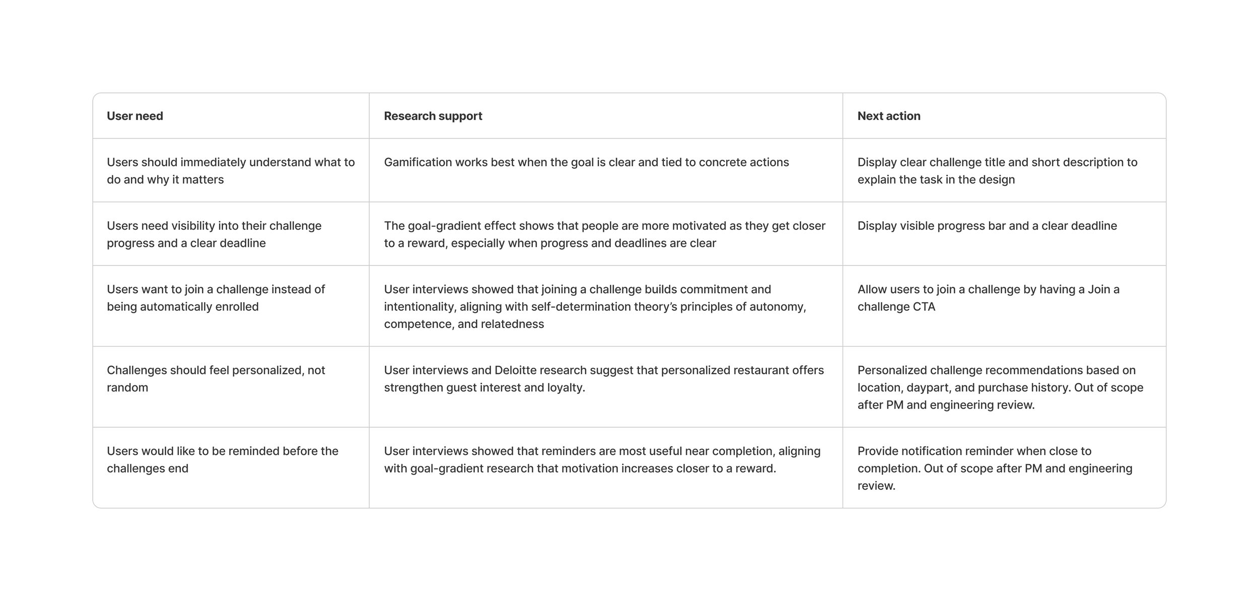
As time is limited to recruit and interview restaurant loyalty guests, I decided to do user interview with the marketers since they are the decision maker of the design mobile app and they have a deep understanding of their guests. Combined with secondary research by using AI, these are the findings:
Ideation
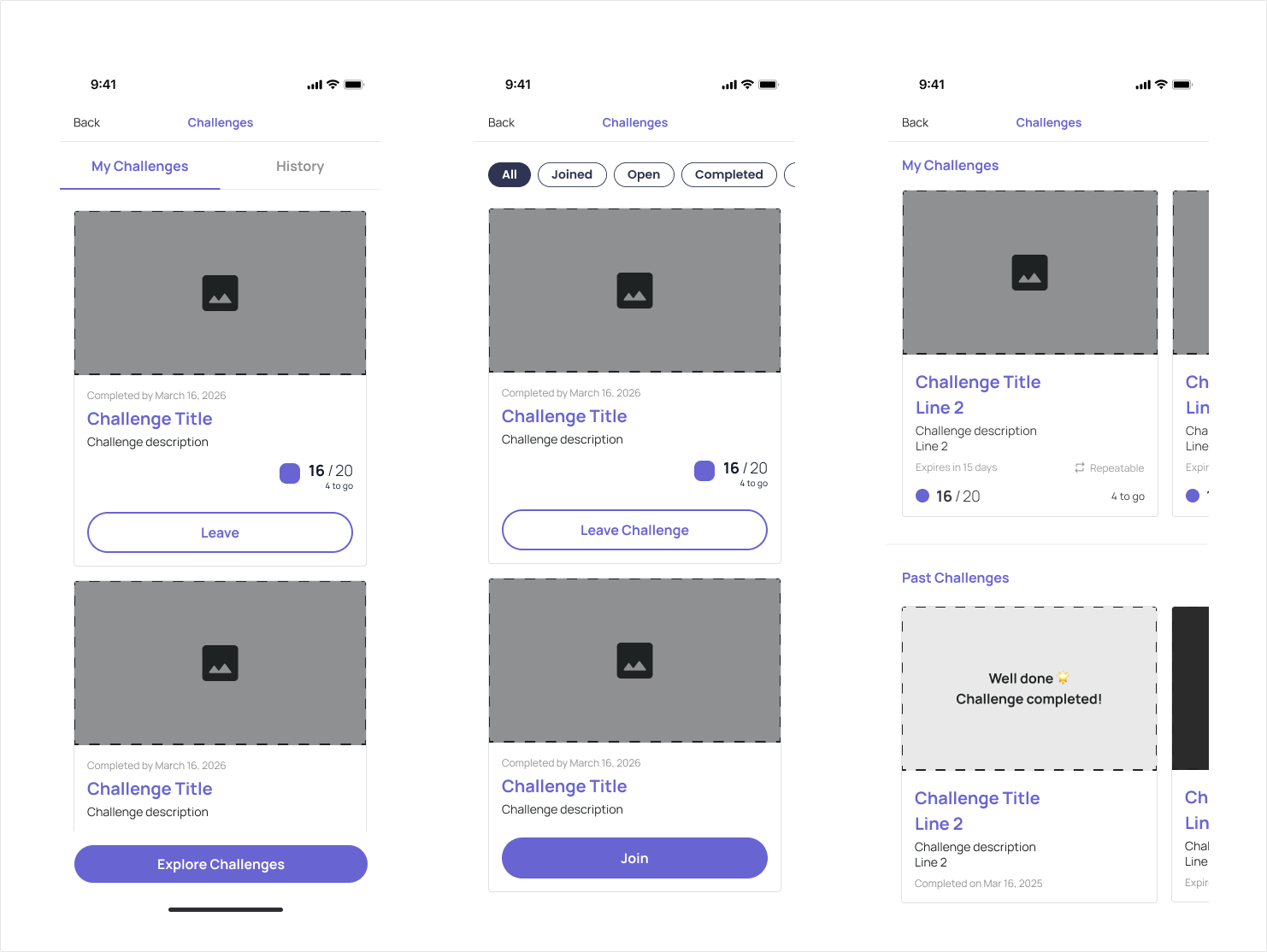
Because Challenges can have different statuses—such as New, Joined, Completed, and Expired—I explored various information architectures and card designs to help users easily distinguish and navigate them.
Rapid prototyping
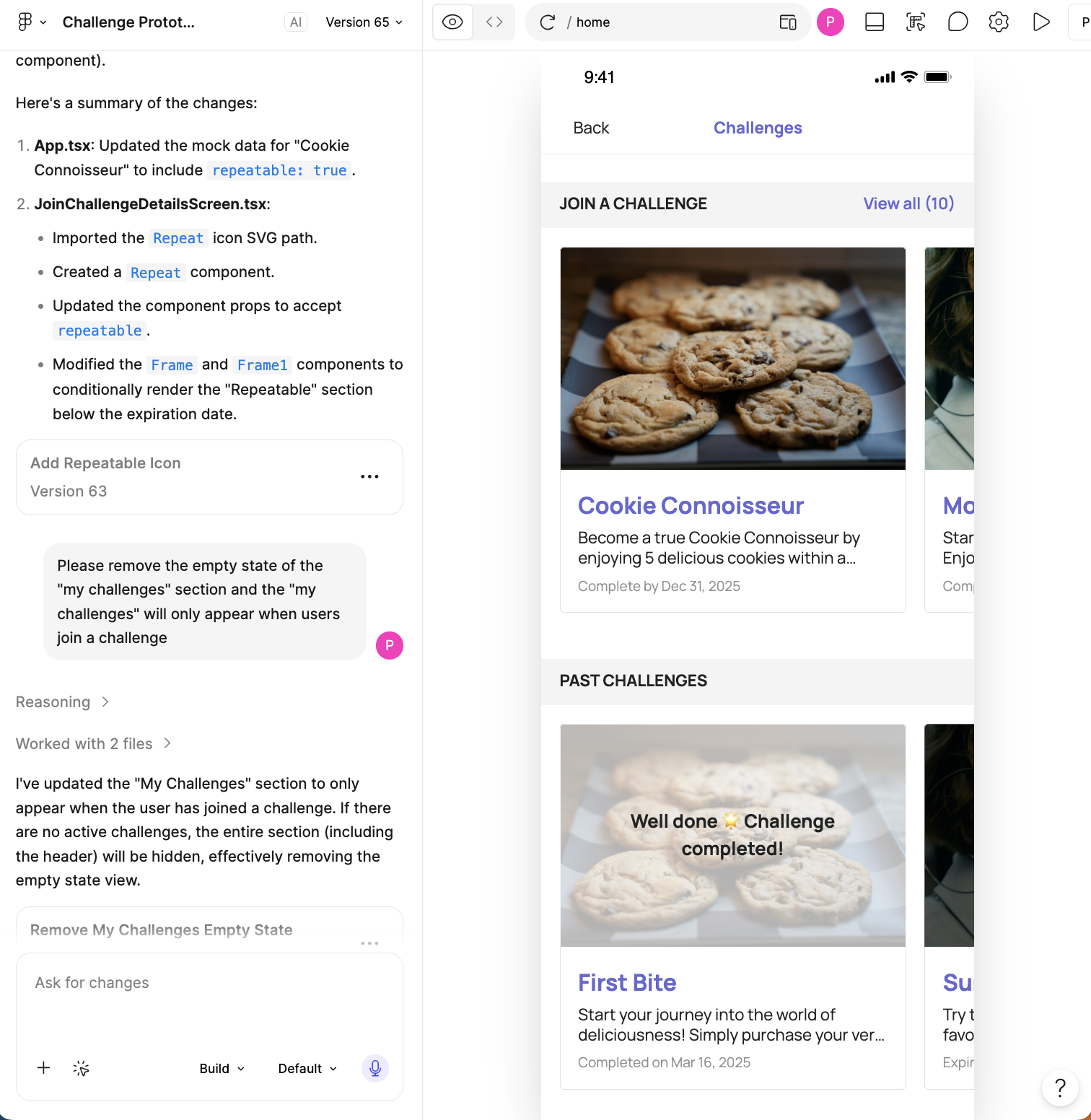
After refining the wireframes, I used Figma Make to quickly turn them into a high-fidelity prototype with realistic content, enabling multiple rounds of testing and iteration.
Testing
Using UserTesting.com, I recruited restaurant loyalty app users to evaluate the structure of the Challenges and Challenge Details pages and test how easily they could join, leave, and rejoin a challenge.
Results
😀 100% task completion rate, with all participants rating the tasks “very easy”
😀 Participants felt the challenge cards and details page included the key information they needed
☹️ The “repeatable” icon caused confusion and was often mistaken for refresh or share
Final Design
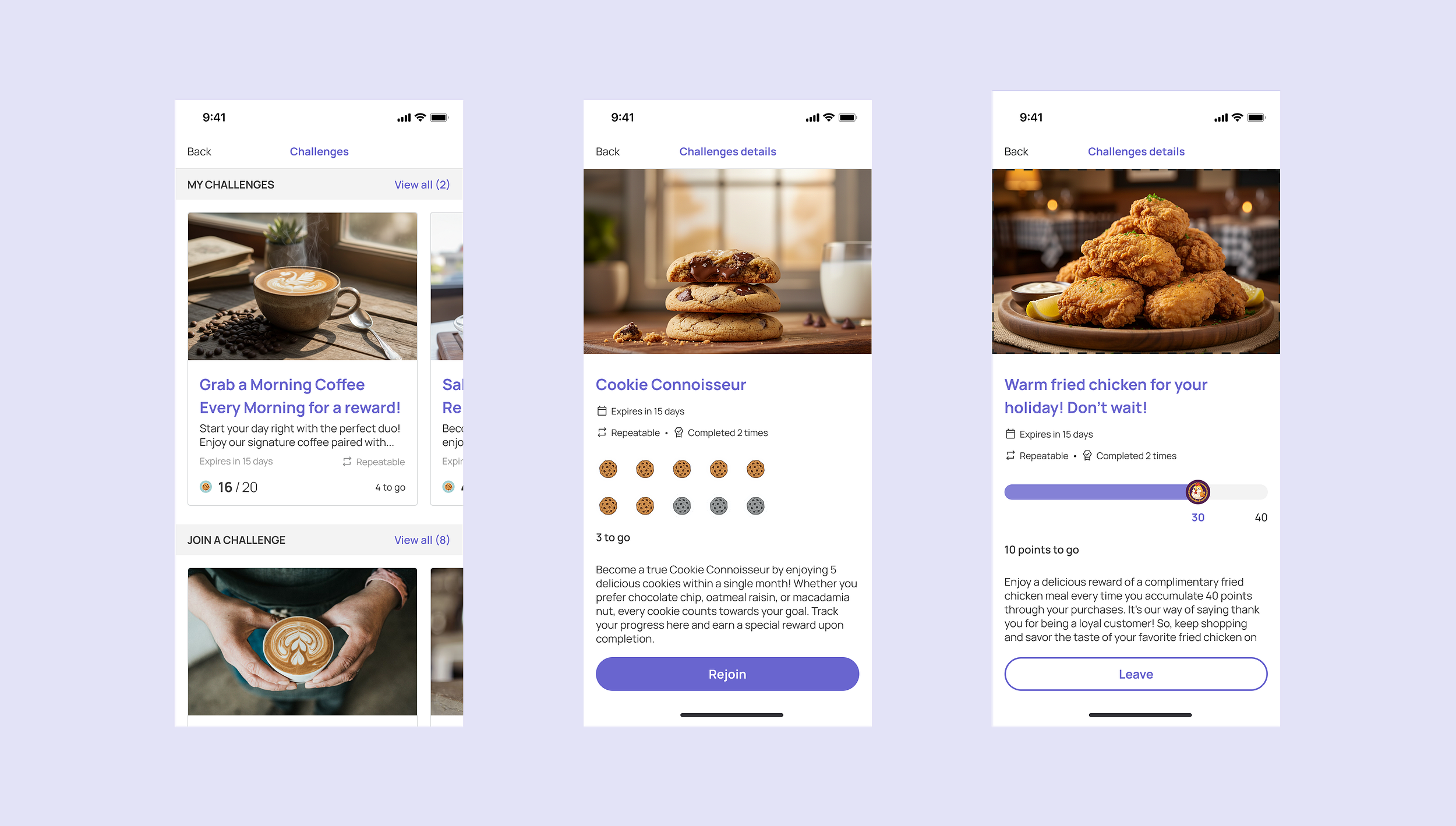
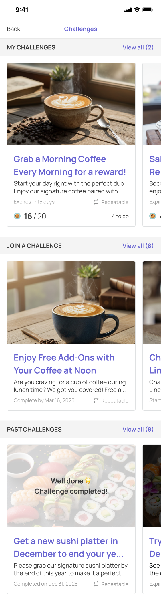
Challenge homepage
Gamified discovery: Users can swipe horizontally to browse available challenges.
Research-informed structure: “My Challenges” appears first, followed by “Join a Challenge” and “Past Challenges,” based on how frequently users access each section.
Clear content hierarchy: Challenge cards highlight essential information, while a text label clarifies the repeatable icon and reduces confusion.
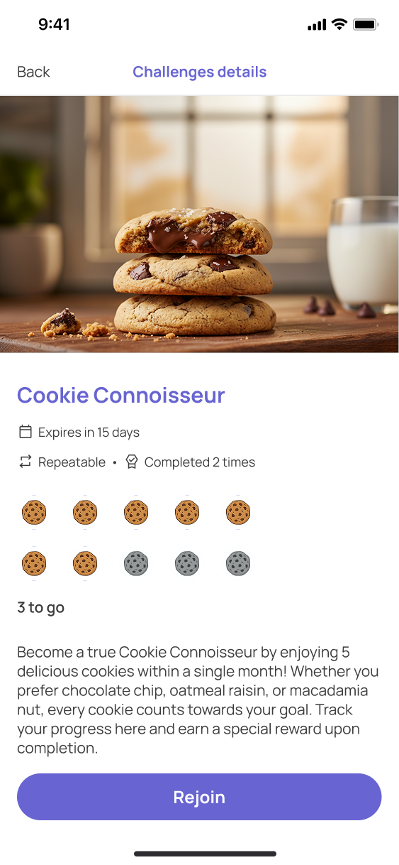
Challenge Details Page
Visible progress: A prominent progress bar shows completed and remaining steps, using the goal-gradient effect to motivate users as they move closer to the reward.
Clear information hierarchy: The challenge title and expiration date appear first, followed by progress and supporting details, allowing users to quickly understand the challenge.
Persistent CTA: A sticky “Join” or “Rejoin” button remains at the bottom of the screen, making it easy for users to take action at any time.
Final Thoughts
Validate before designing: Even under a tight deadline, I learned not to skip discovery. AI-assisted research helped me challenge the PRD and advocate for a “Join a Challenge” feature that strengthens autonomy, competence, and connection.
AI works best with strong design foundations: Figma Make accelerated prototyping, but clear layer names and well-structured auto layout gave the AI better context and produced stronger results.
Push beyond the obvious: In future iterations, I would explore a more seamless, game-like experience. Could users complete everything on one screen? Is a separate details page necessary? These questions open the door to more engaging possibilities.