United Healthcare
Optimizing the plan browsing experience of UHC’s Small Business Store
My Role
Product Designer
Scope
Responsive Website
Responsibilities
Strategy, Testing, Design
Timeline
3 months (Mar’21 - May '21)
Overview
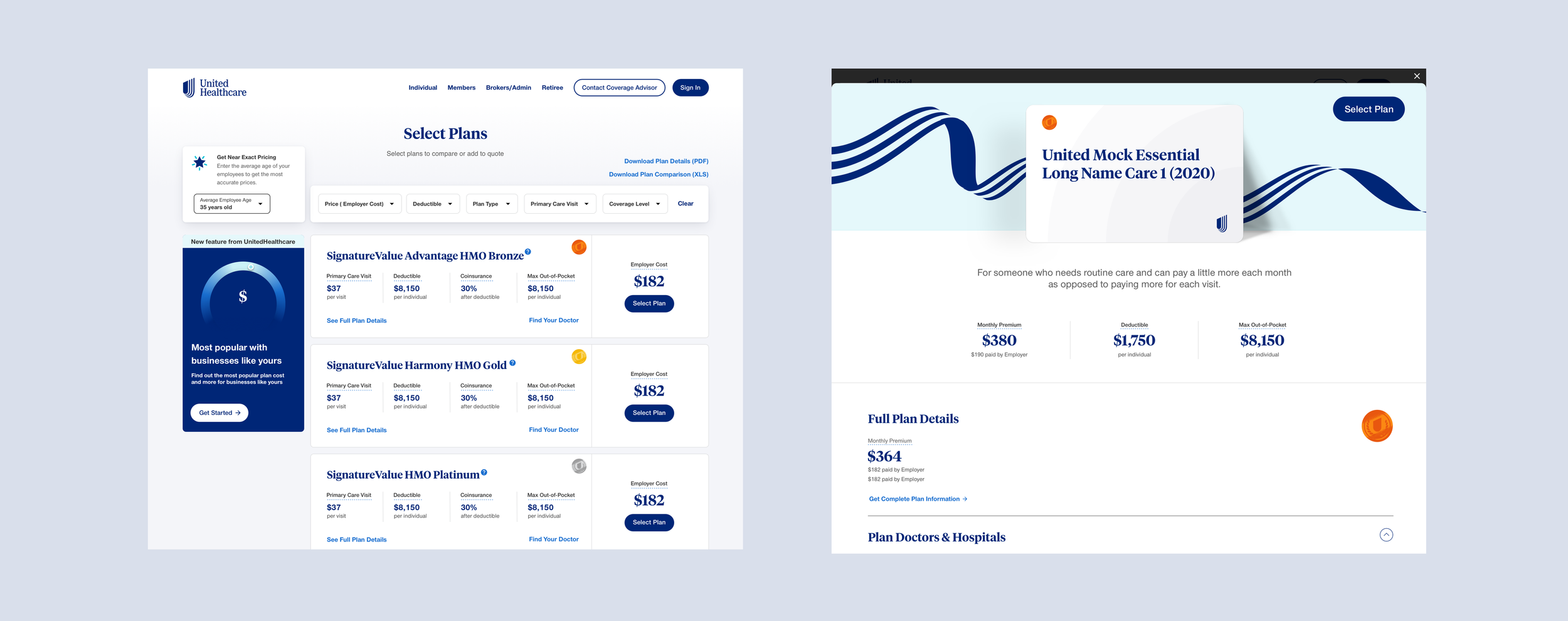
United Healthcare’s Small Business Store targets small business owners (2-50 employees). Within the store, users can browse plans and get a instant quote without going through a broker. As the site was outdated, we not only aimed to visually upgrade the site, but also enhance the browsing plan experience.
See the live experience at smallbusiness.uhc.com
Problem
We worked with the United Healthcare’s Digital B2B team to identify issues with the plan browsing page:
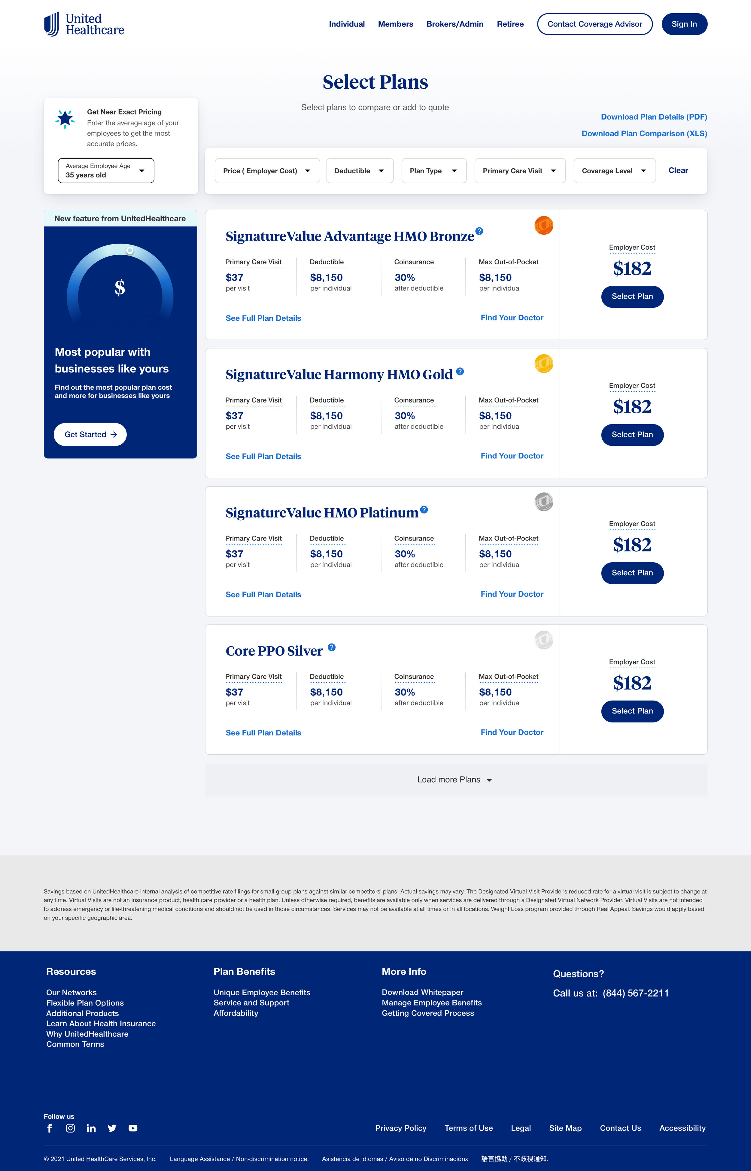
Too much information on the plan card
The layout looks too compact
Weak guidance in bringing the users to get a quote after selecting the plan
Limitations in suggesting plans that tailor to users’ preferences
Outdated UI
Design Goals
Modernize and simplify the plan card and the overall layout design
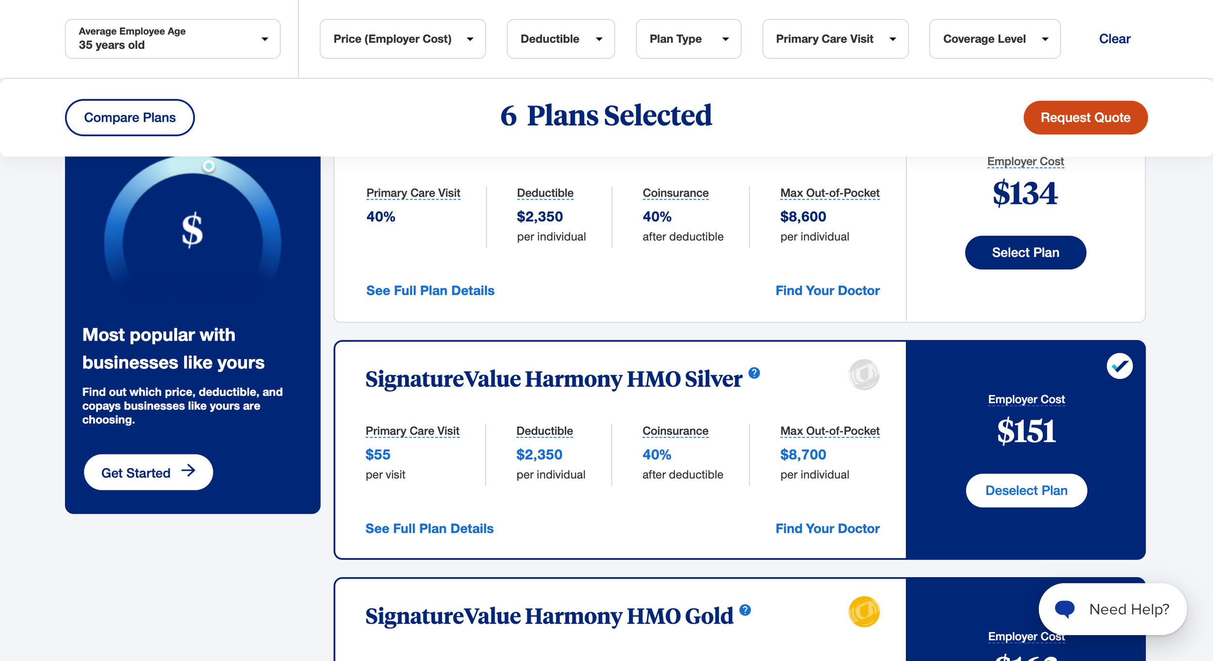
Empower users to get quotes seamlessly after selecting the plans
Personalized the browsing experience
Ideation
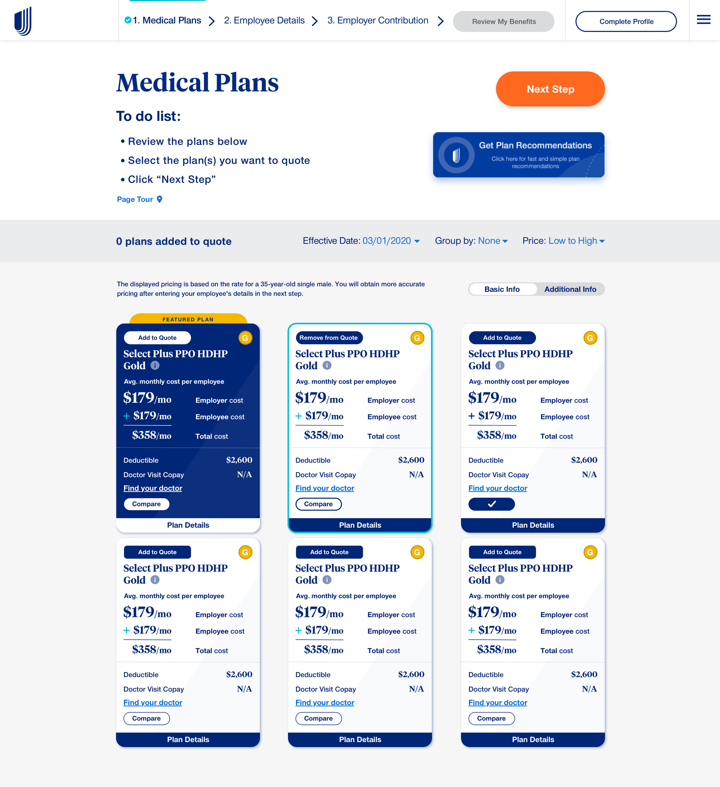
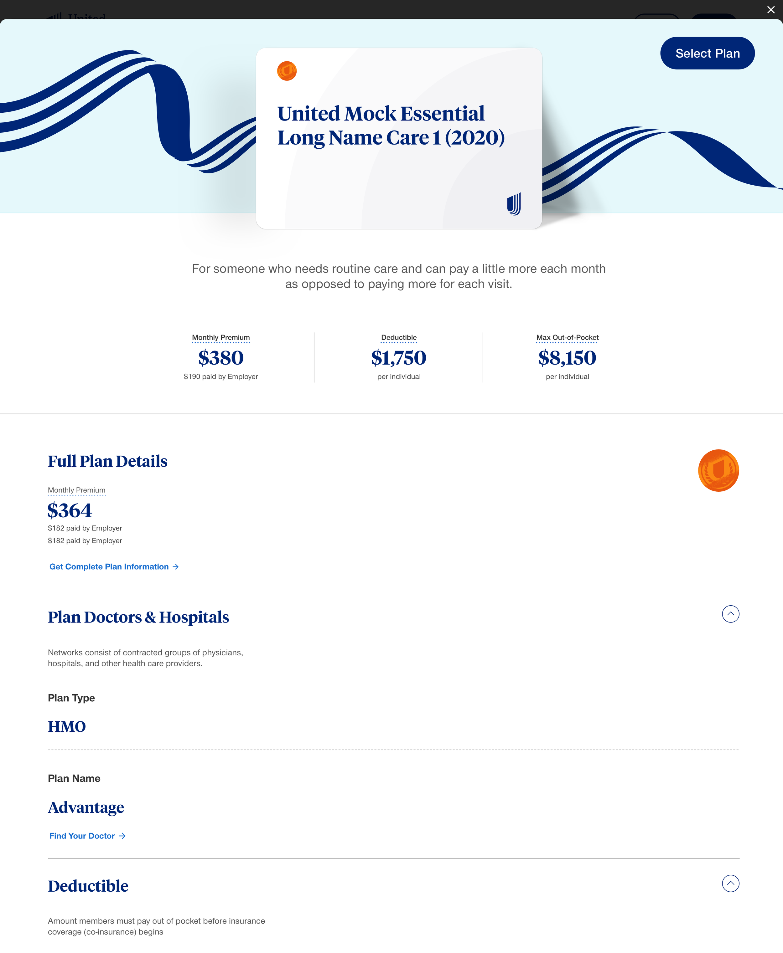
High Fidelity Wireframe
To tackle the problems, we explored different layout designs and came up with a high fidelity screen that set up a foundation for user testing.
The enhancements include:
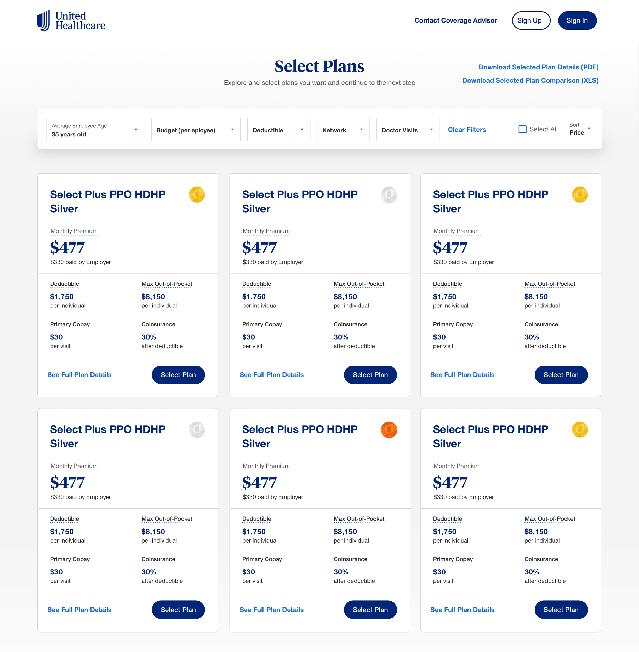
Simplified the card design by displaying the overall cost and the benefit highlights only
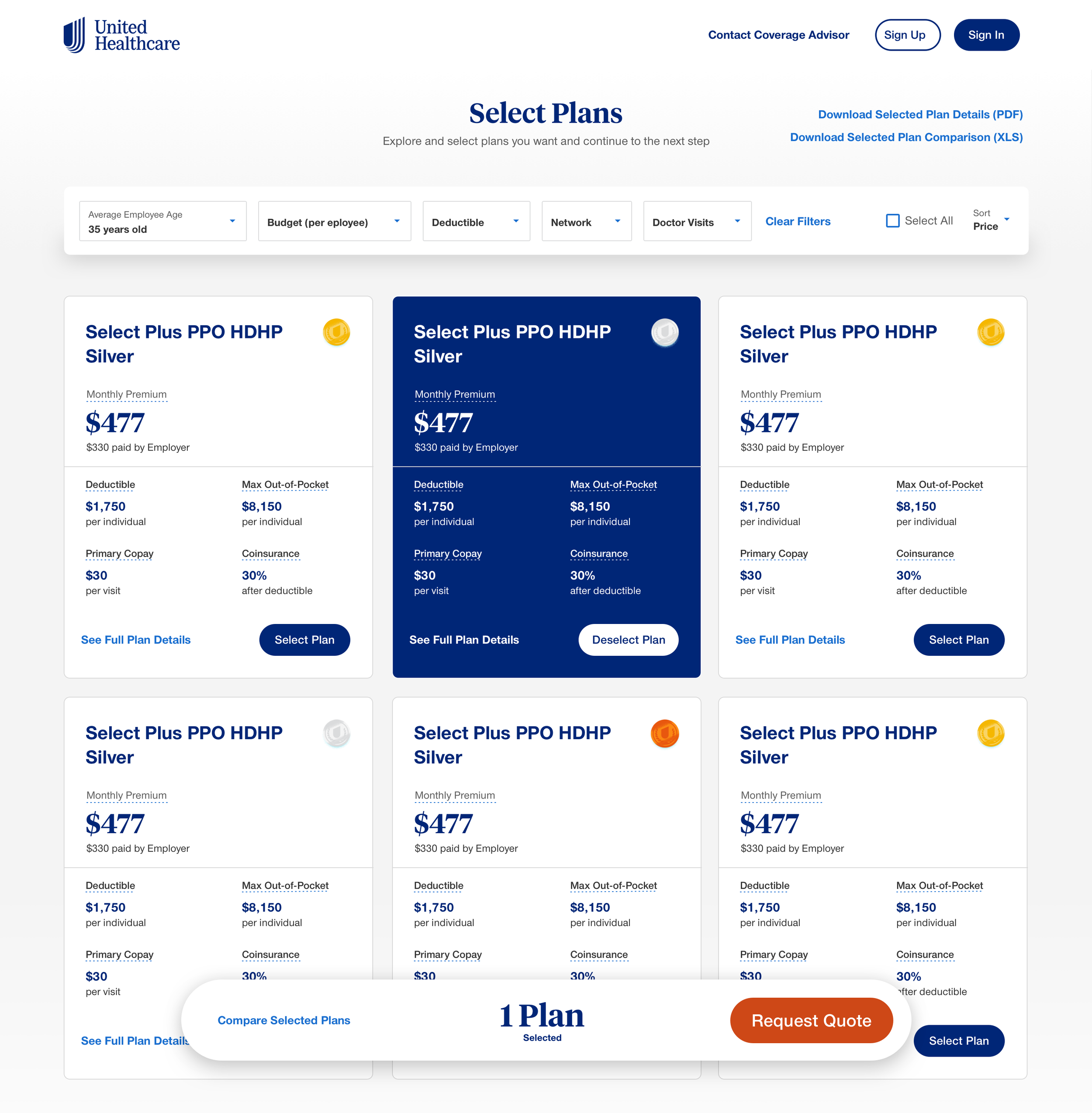
Added a sticky CTA bar that encourages users to request quotes after making the selection
Added different filters supporting the users to find plans that fulfill their requirements
Testing
User Testing
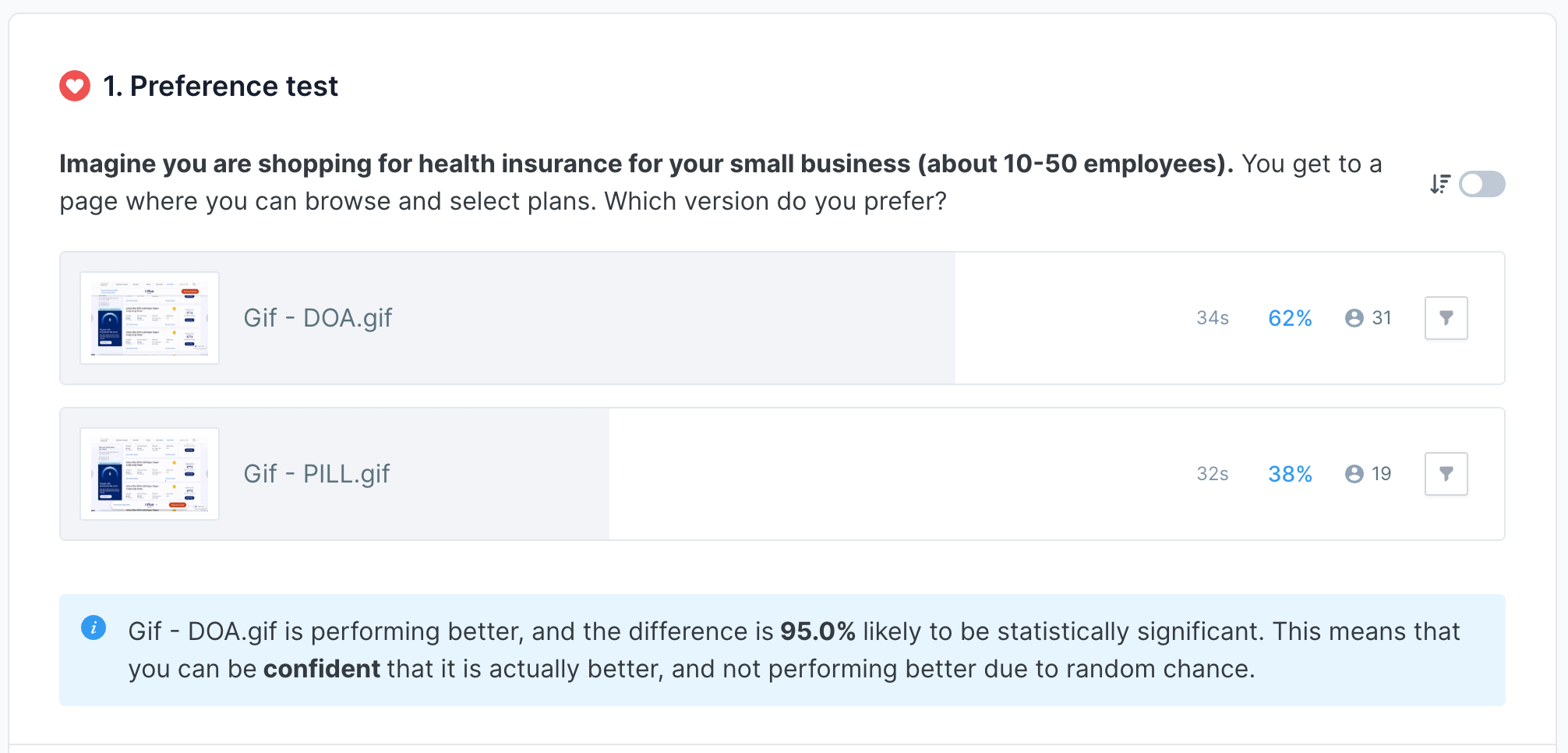
To validate the changes and get user feedback, we created a couple of testings on Usability Hub ( 50 participants per test):
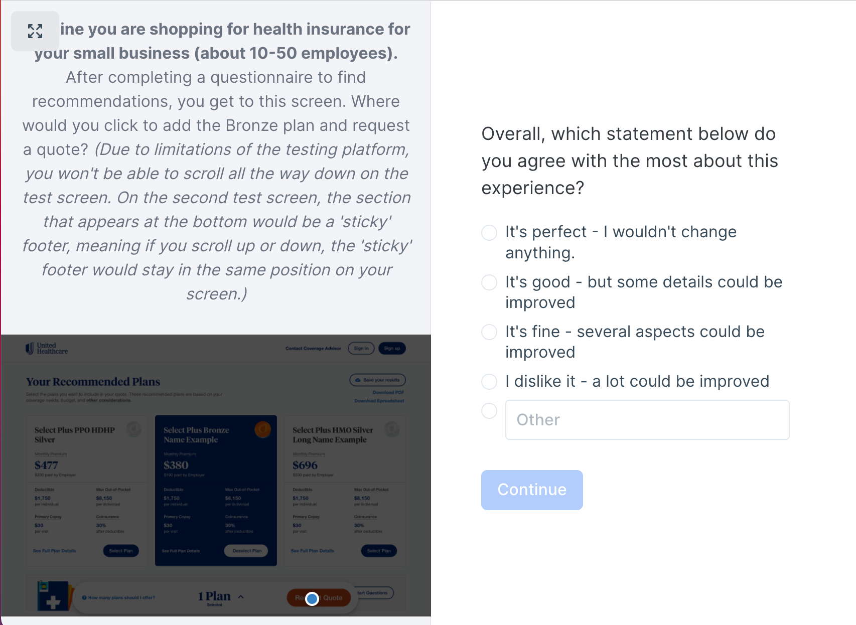
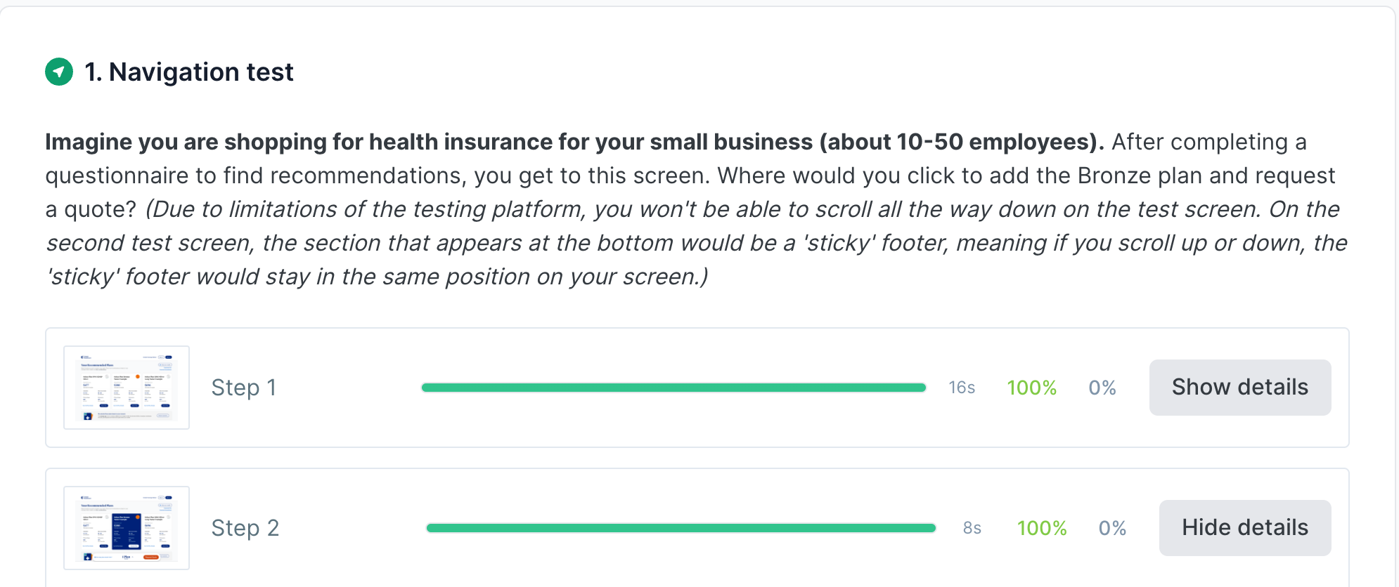
Navigation Test
How easy is it for users to select a plan and request a quote?
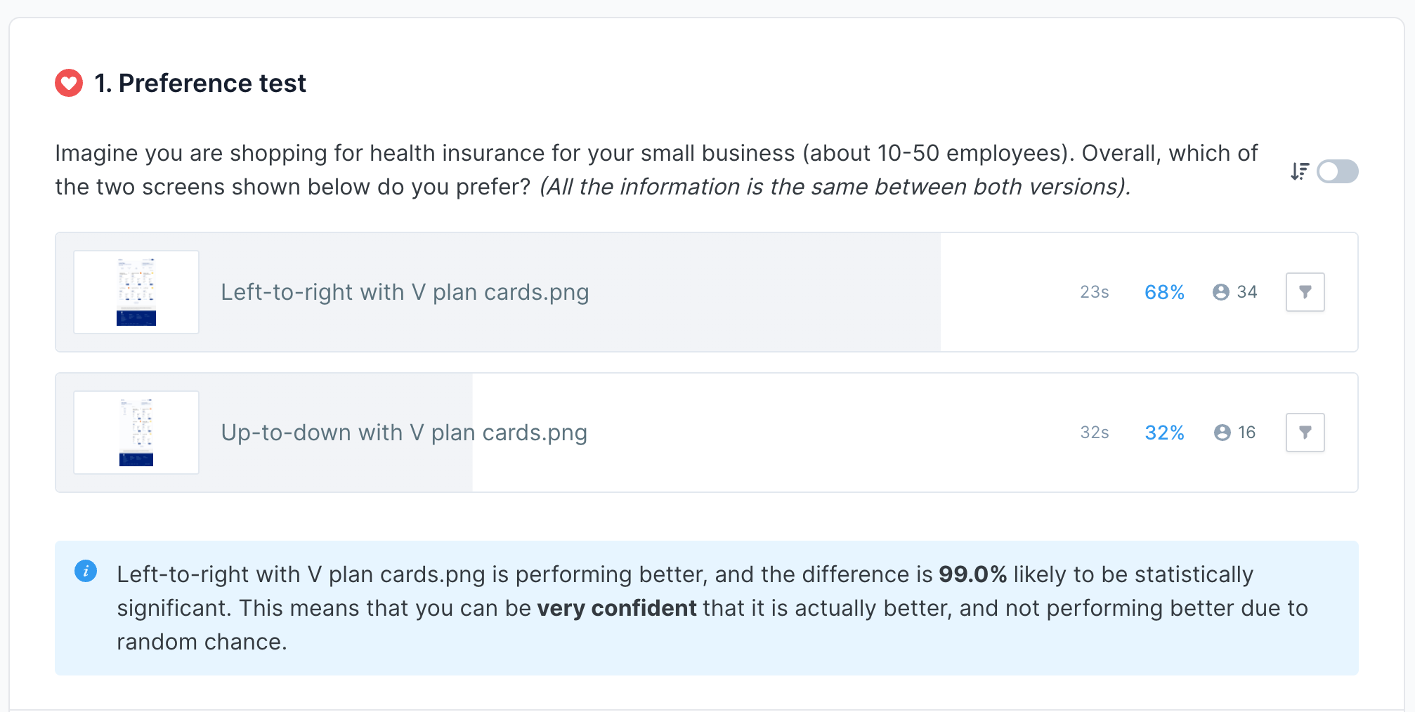
Preference Test
Do users prefer a vertical or horizontal filter design?
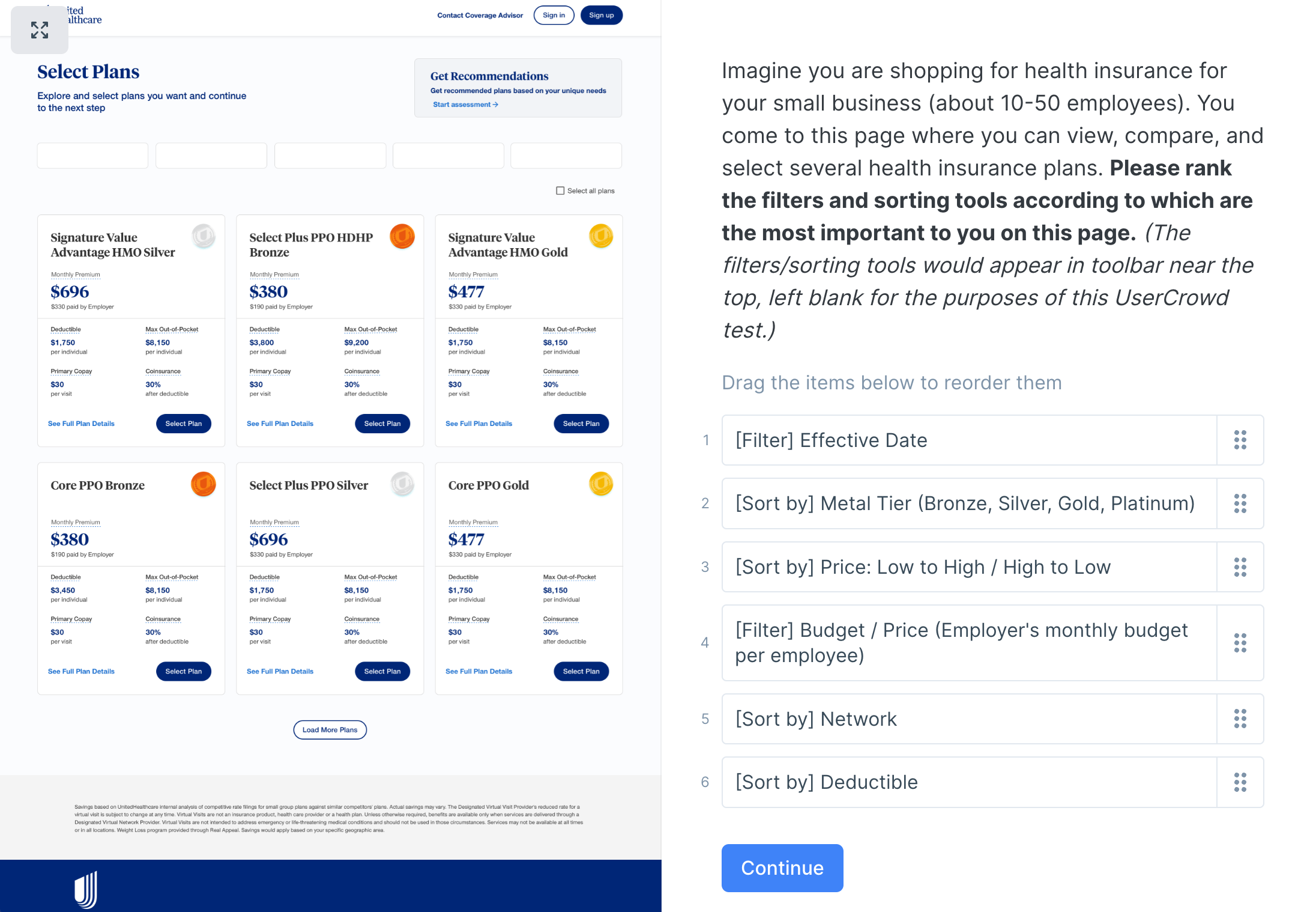
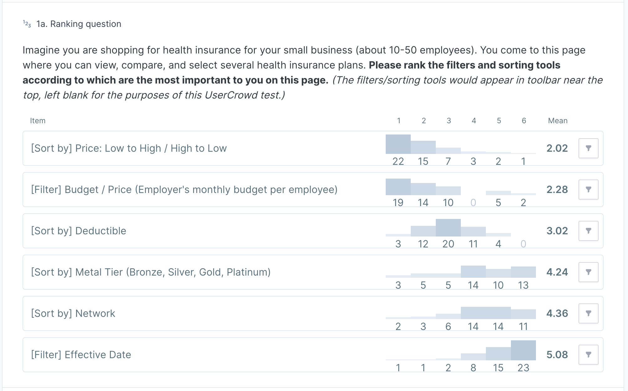
Design Survey
For the filters, what information do users prioritize?
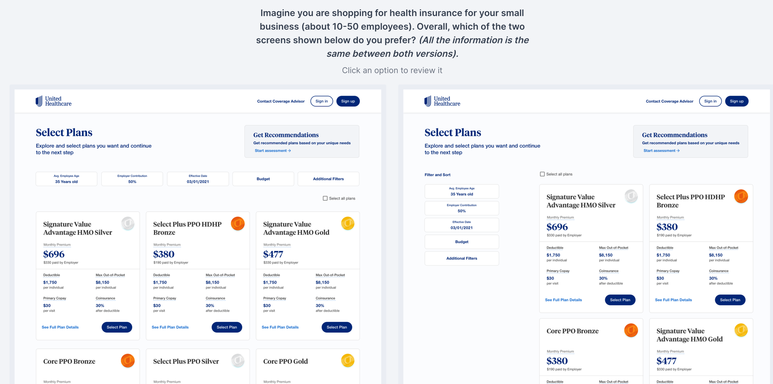
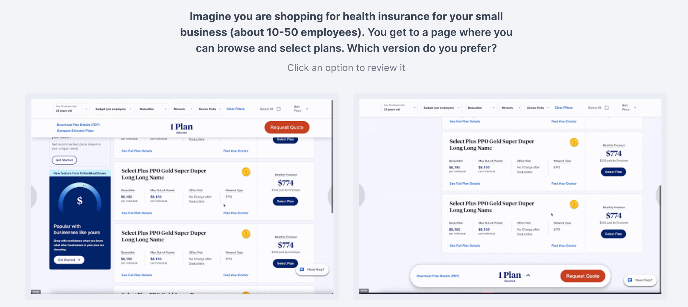
Preference Test
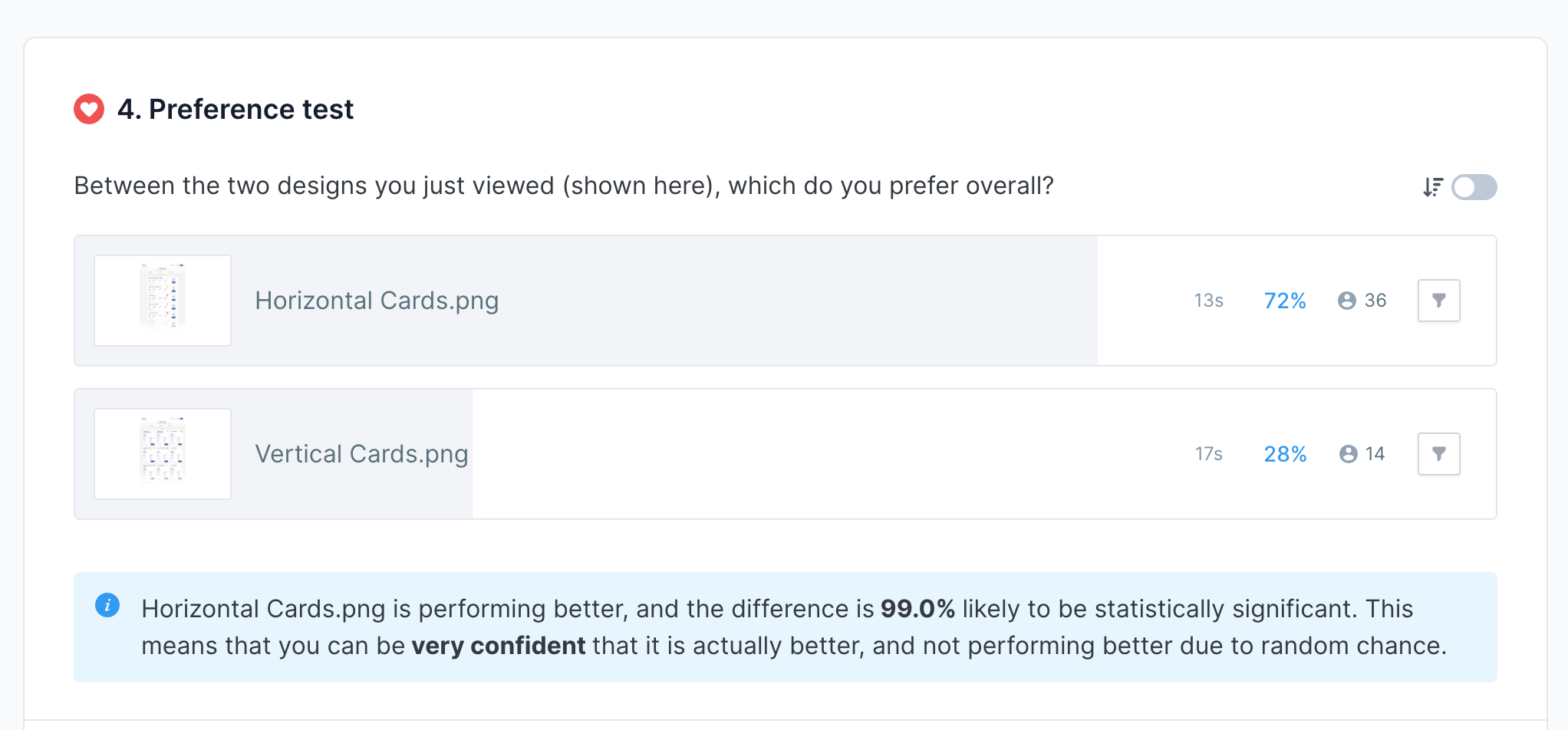
Do users prefer a vertical or horizontal card design?
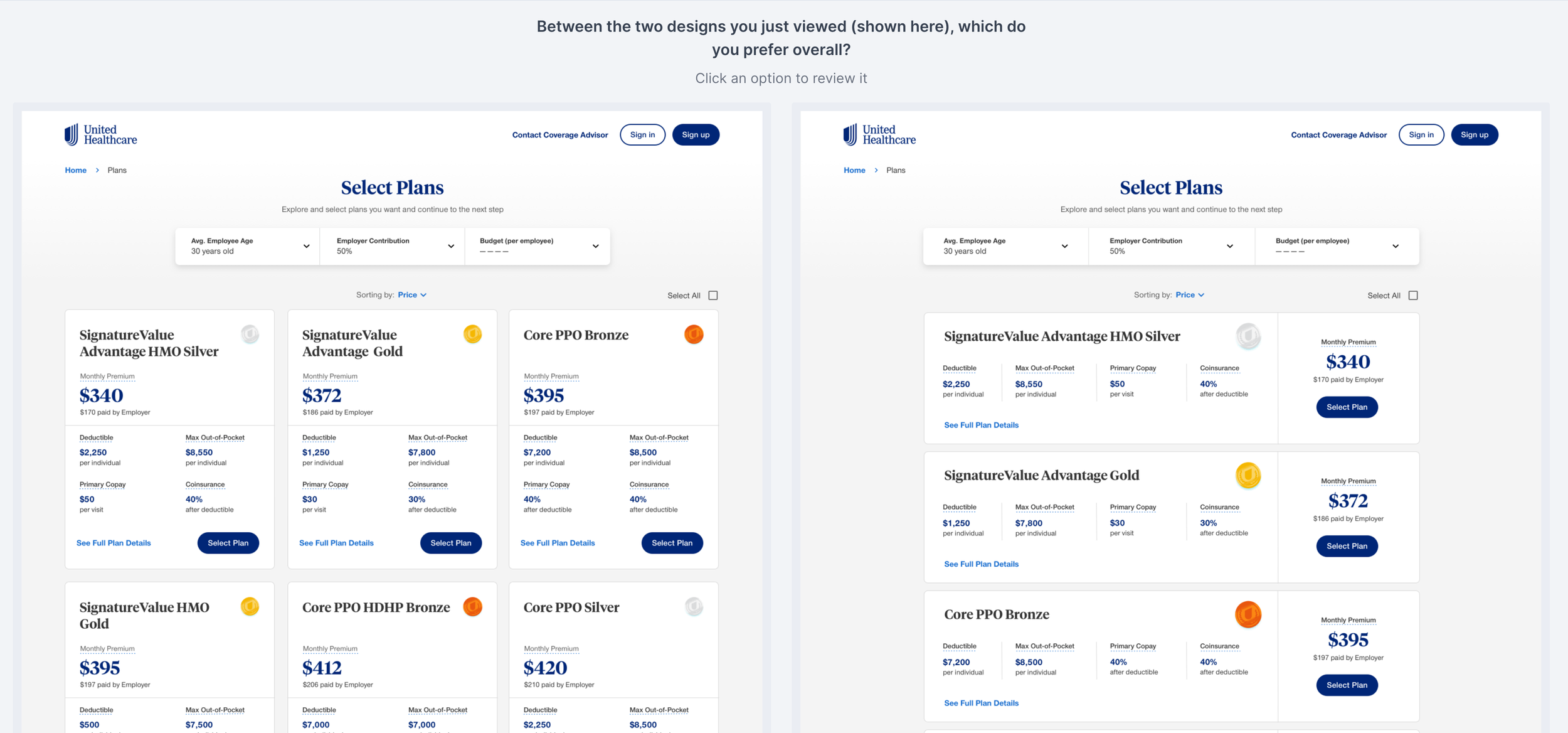
Preference Test
For the sticky CTA bar, do users prefer it to be placed at the top or bottom?
Result
Based on the testing results, we learned:
Users have no issues with selecting the plan and clicking the CTA. 100% of participants completed the steps in an average of 24 seconds.
Horizontal filter design does significantly better (68% of the participants) as it is easier for users to read and it utilizes the space better
For the filer content, users prioritize “plan price”,” budget” and “deductible” information. Therefore, they should be placed on the left as users read from left to read.
Vertical card design does significantly better (72% of the participants) as it assembles a table format, which is easier for users to digest and compare the data
The top sticky CTA bar does significantly better (62% of the participants) as it brings less distraction. It also feels more intuitive and visually cleaner.
Final Design
Conclusion
Design solely based on assumptions could be dangerous. In this project, I appreciate the opportunities to work with two designers to identify the problems of the browsing plan page, ideate design solutions, and most importantly, validate the design with quantitative data and get feedback from users to enhance the user experience.