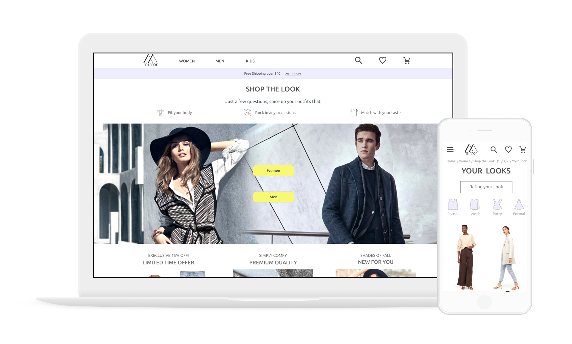
Shop the Look
An AI-powered stylist that builds instant and personalized looks for apparel shoppers
My role
Create a fashion e-commerce website highlight Shop the Look feature
Scope
Responsive web (mobile and desktop)
Timeline
January - February 2019
Tools
Sketch, Figma and InVision
Overview
Mirror is a clothing-retail company where customers can find trendy, quality yet affordable apparels from their physicals stores around the world. Because of the growing opportunities in the digital landscape, Mirror decided to take a step in establishing e-commerce.
However, considering the fierce competition in the fashion industry, new entrants like Mirror would find it difficult to acquire online market share.
Shop the Look, a style quiz that integrates artificial intelligence, personalization and gamification, would allow Mirror to stay competitive while making customer experience a differentiator.
Design Challenge
How might we differentiate Mirror from other competitors by offering a hyper-personalized experience for apparel shoppers?
Research
Market Research
To discover the unmet user needs, I started by researching the top fashion technology trends for the next five years.
One significant finding is the trend of hyper-personalization.
Studies showed that only 22% of shoppers are satisfied with the current level of personalization from brands.
Customers expect an increasing level of personalization and anticipate retailers to discern their deepest preferences.
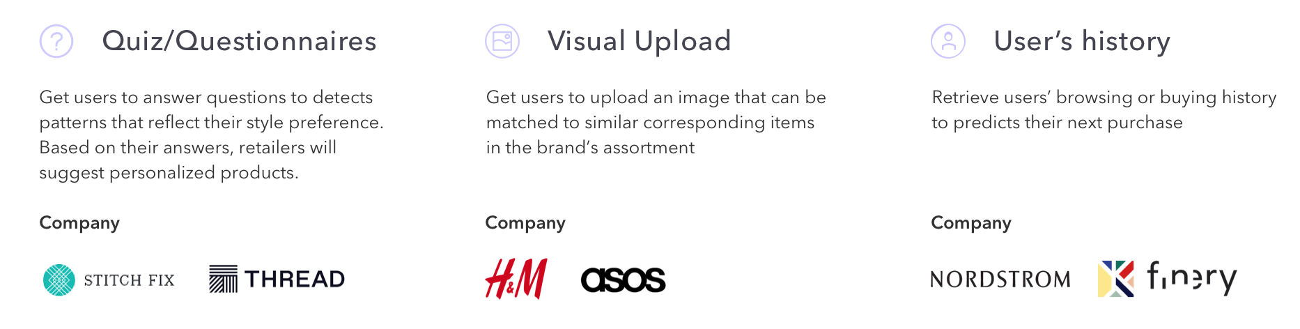
Because of the ever-increasing granularity of personalization, many fashion retailers companies were incorporating artificial intelligence to raise the bar on personalized services. The top three features introduced by fashion retailers for personalization include: Fashion quiz, visual upload and retrieving user history.
User Interviews
To understand what kind of personalization is most needed by apparels shoppers, I conducted 5 user interviews to uncover their frustrations and desires of apparel shopping.
Frustration:
Unable to identify their clothing styles
Difficult to discover new clothing styles
Needs:
Outfits tailor to their latest body and styling preferences
Outfits ideas on different occasions
Learn how to wear the same clothing items on different occasions
A fun and delightful experience for finding clothes online
Other:
Male and female have opposite needs for body preference
By combing the findings from market and user research, style quiz would be the ideal personalized experience for apparel shoppers.
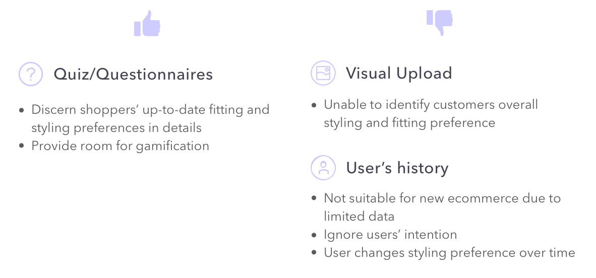
Competitor Analysis
I conducted a competitor analysis to understand the pros and cons of different style quizzes in the market and I learned an ideal style quiz should:
Consist only one question and one call-to-action item per page to minimize confusion and distraction
Utilize graphic illustrations to enhance engagement and gamification
And should not:
Have too many questions, users may eventually lose their interests to complete it
Force users to sign up before they can obtain the results
Define
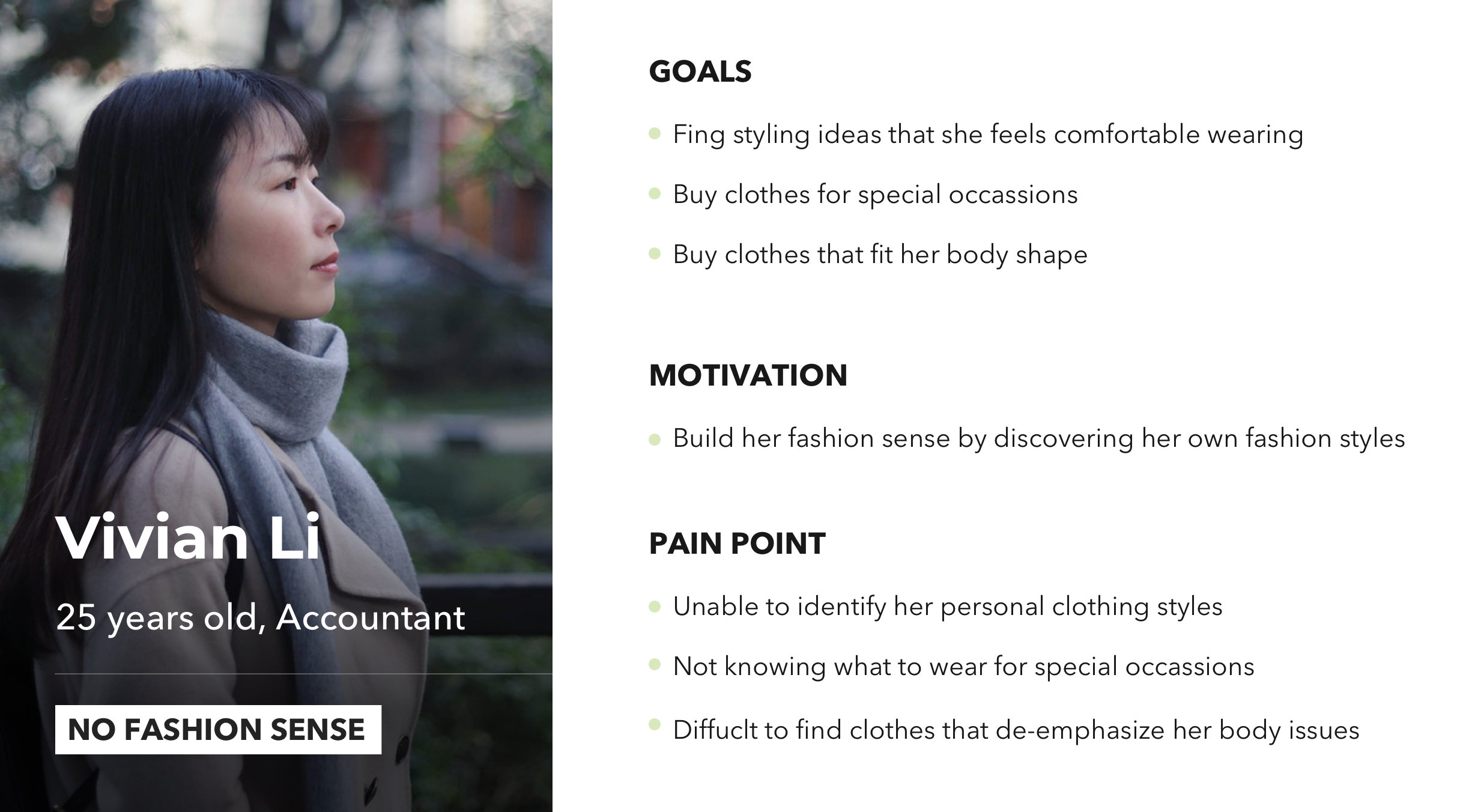
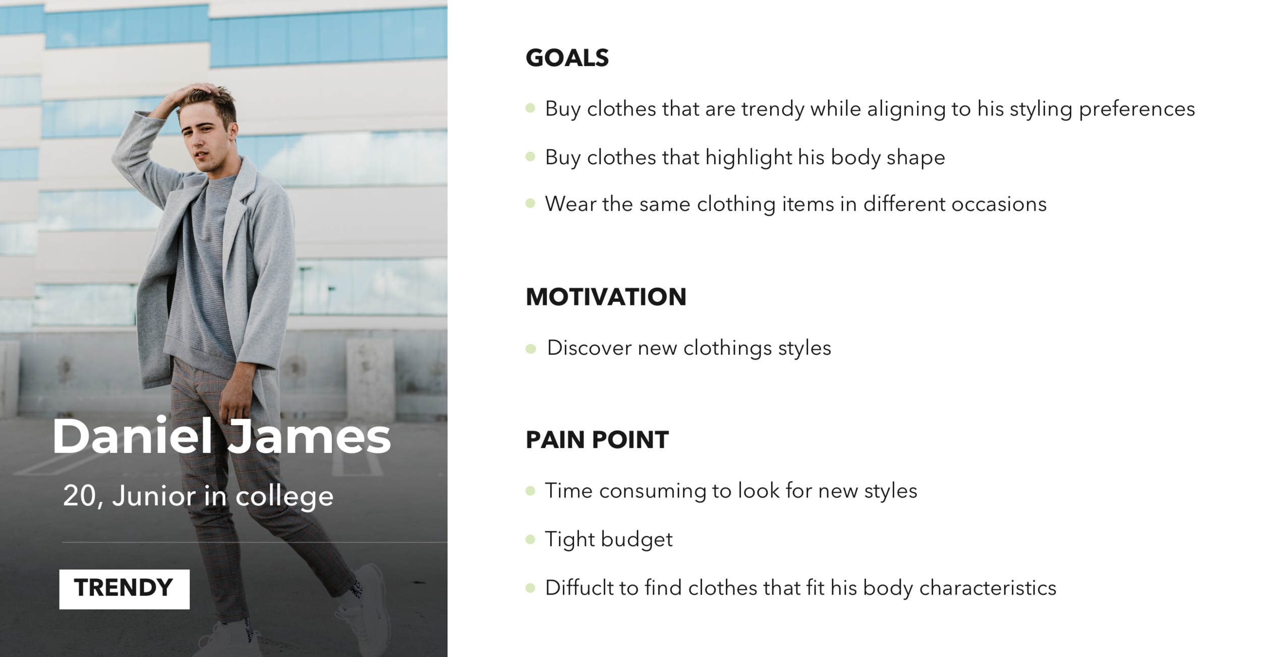
Personas
I created two personas to define two different types of apparels shoppers; Vivian wants to find clothes that match with her current styles while Daniel wants to find new clothing styles. Segmentation of user types and identifying their distinctive pain points are important for me to create specific user flows tailored to their needs. (View full versions: Vivian & Daniel)
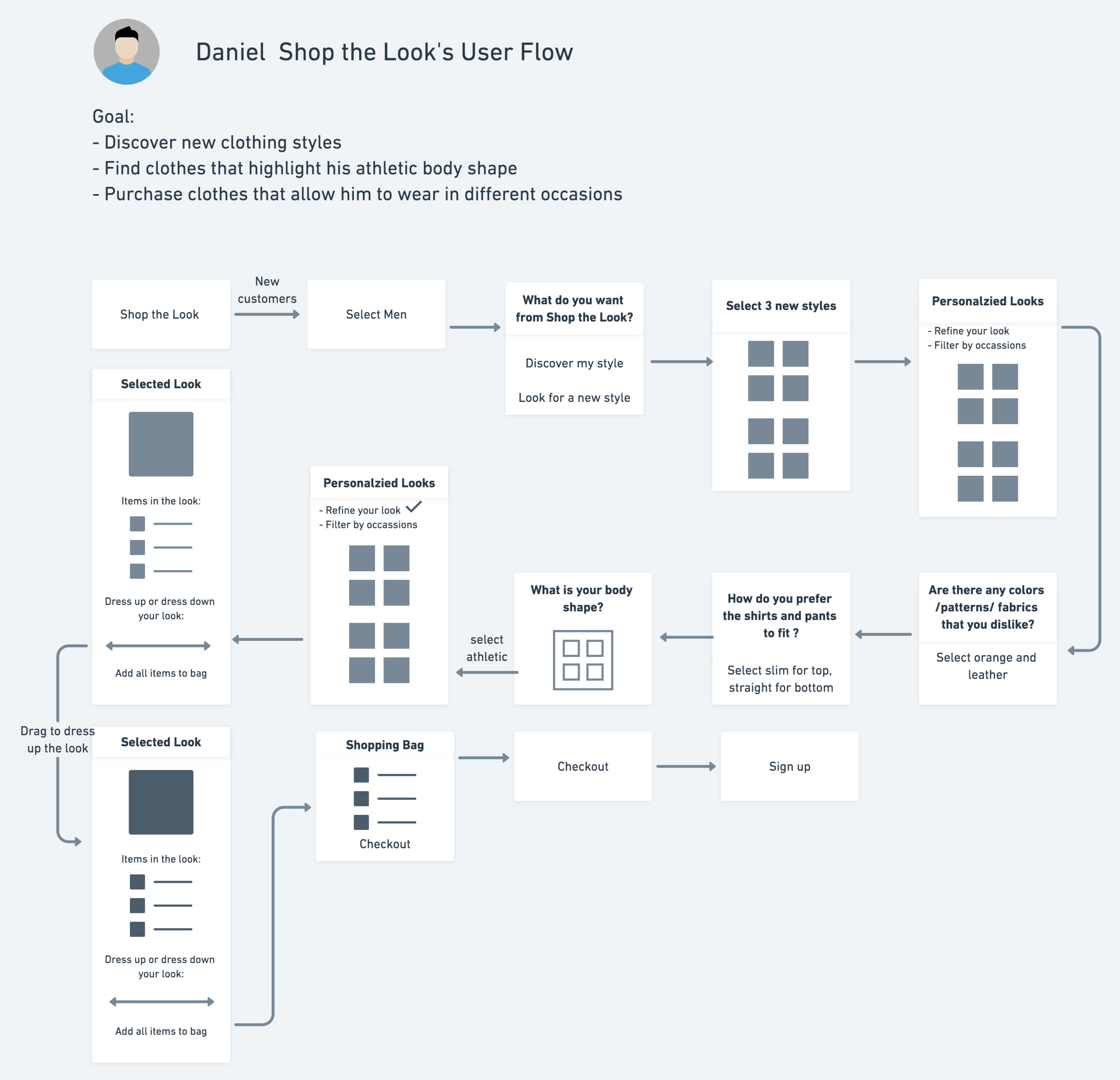
User Flow
I created two user flows to illustrate how Vivian and Daniel can quickly get access to their personalized looks and refine the result simply by answering 3 additional questions respectively.
Main strategies include:
Use “What do you want from Shop the Look?” as a key question to divide two persons
Gain value first (personalized looks) and refine later
Gender-specific questions
Sign up after they complete their checkout

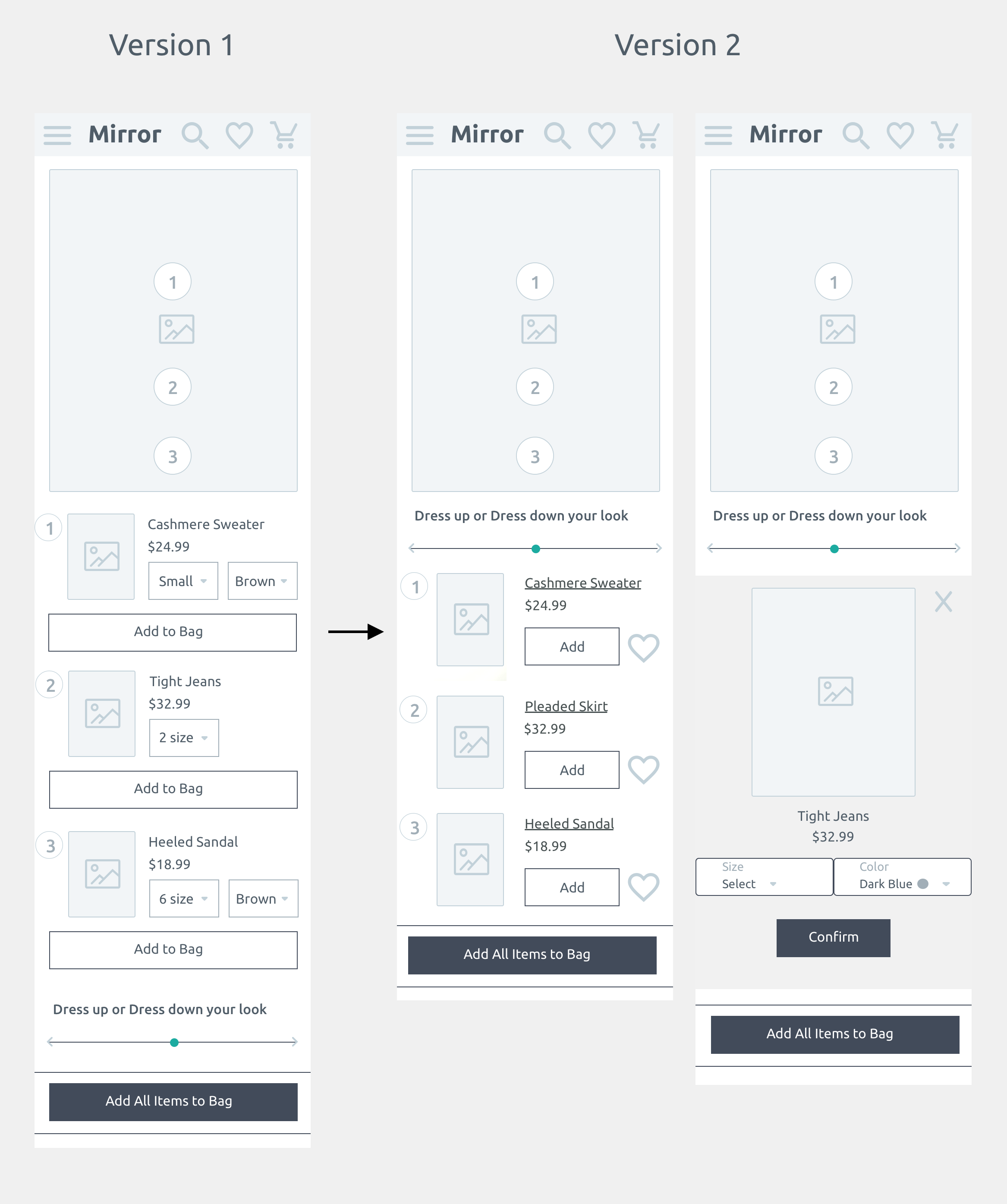
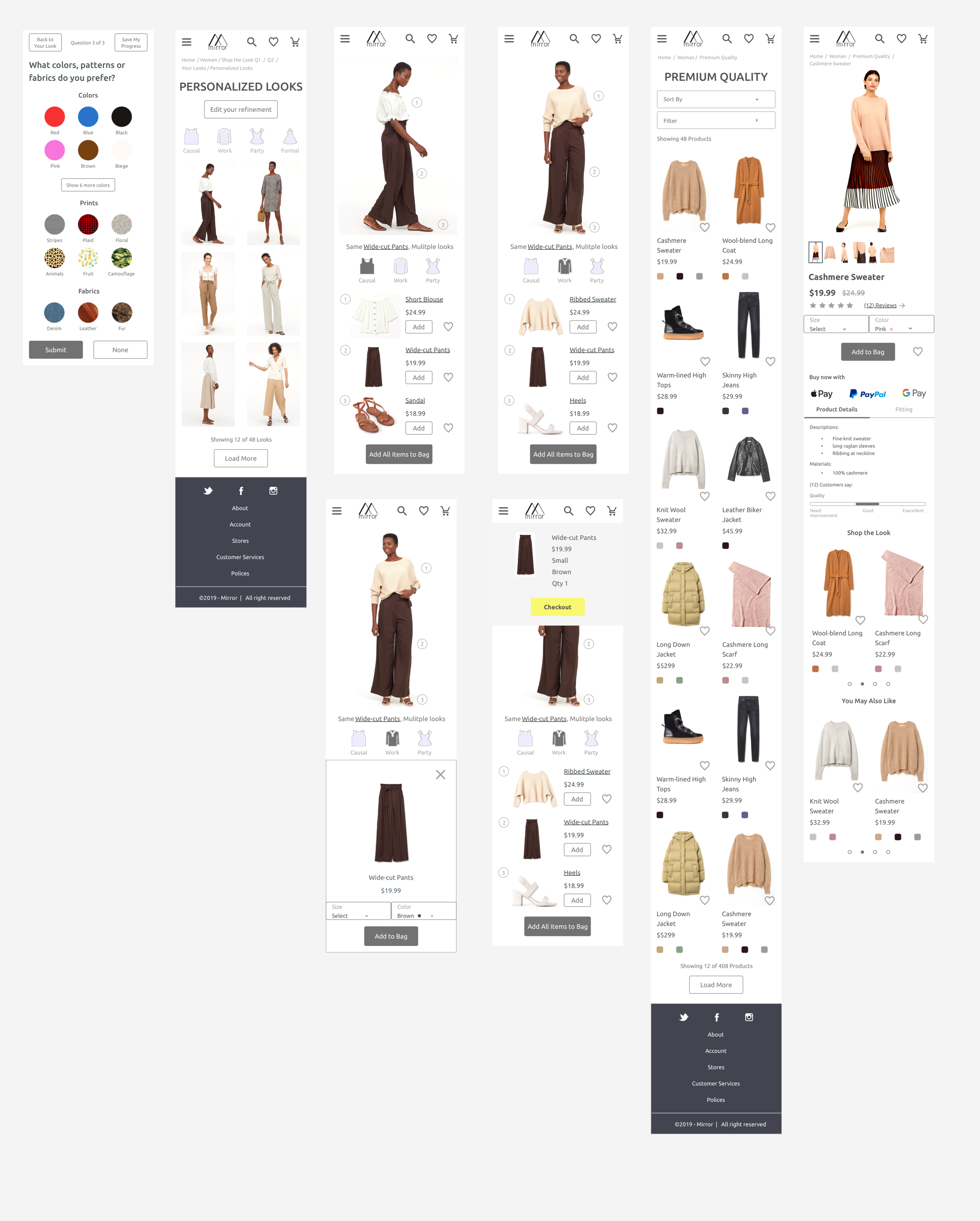
Mid-Fidelity Wireframe and Prototype
To experiment with different hierarchies, visual treatments, content and navigation patterns, I created a set of mid-fidelity wireframes for mobile and desktop respectively. The wireframe consists of all the necessary pages in the style quiz, product menu, product details page and checkout for user testing.
Highlighted wireframes and iterations:
View Clothing Pieces
I created an interactive design enabling users to click the number icons which navigate to the clothing list at the bottom seamlessly.
My initial design has excessive amounts of buttons that make the screen lacking focal points. Therefore, I created version 2 by separating the size and color selections into another page to maintain the simplicity and clarity of the information hierarchy.
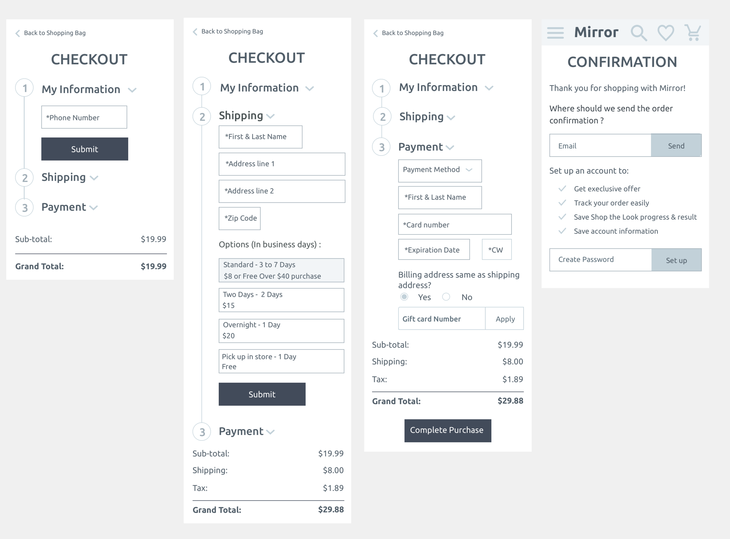
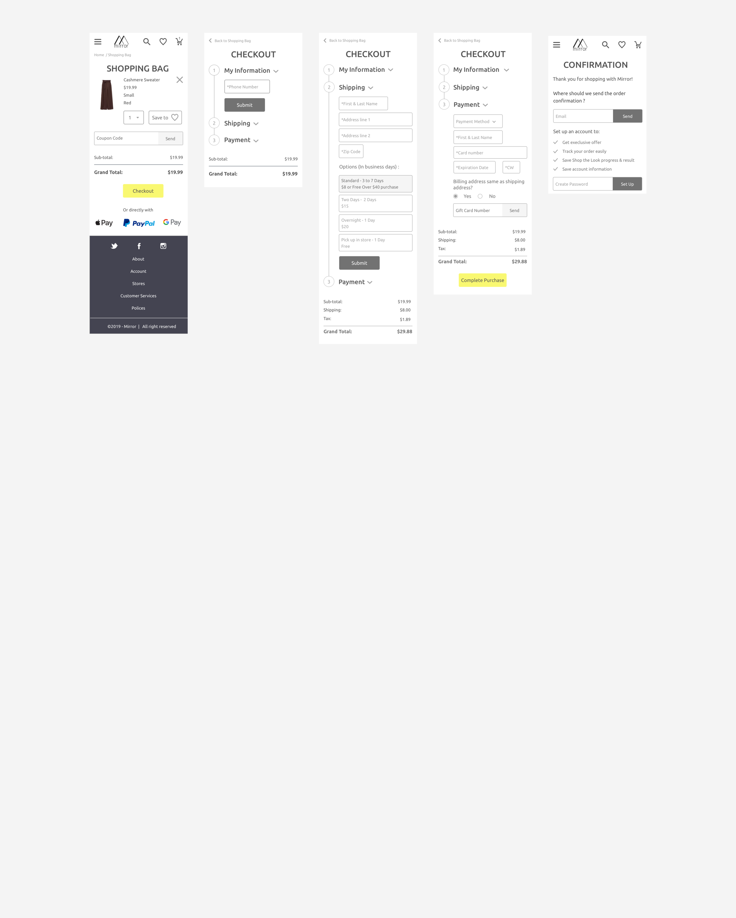
2. Checkout
After a couple round of iterations, I condensed the checkout process into 3 simple steps aiming to minimize the shopping cart abandon rate.
Users are not required to sign up before checkout so as to maintain a fast and smooth checkout process. Instead, they can quickly set up an account on the confirmation page.
Testing
Usability Test and Iterations
After conducting usability tests with five different users, I identified two major pain points and this is how I decided to polish my prototype:
Pain point 1 : Feel frustrated to select color, fabrics and pattern preference
60% of users think they were too many options to view.
25% of users mentioned selecting what they like is easier and faster than picking what they dislike.
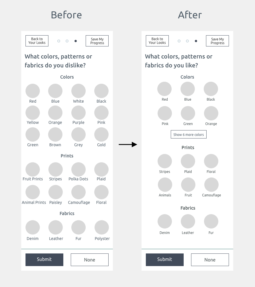
UX Solution 1:
I restructured the information hierarchy by creating more space and maintaining 3 options per line. To check all the color options, they can click“show 6 more colors”.
I also changed the question from what do you “dislike”to what do you “like” to shorten the users’ time to make selections.
Pain point 2 : Confusion of the dress up and dress down slider
100% of the users think the dress up and dress down feature is fascinating.
However, 40% of them are uncertain how to use the slider since they do not know how far they should drag to dress up and dress down the look.
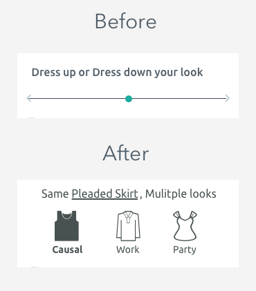
UX Solution 2:
To avoid confusion, I decided to change the slider design to three separate buttons. Users can simply click the buttons to see how they can wear the same clothing items on other occasions.
Final Mockups and Prototype
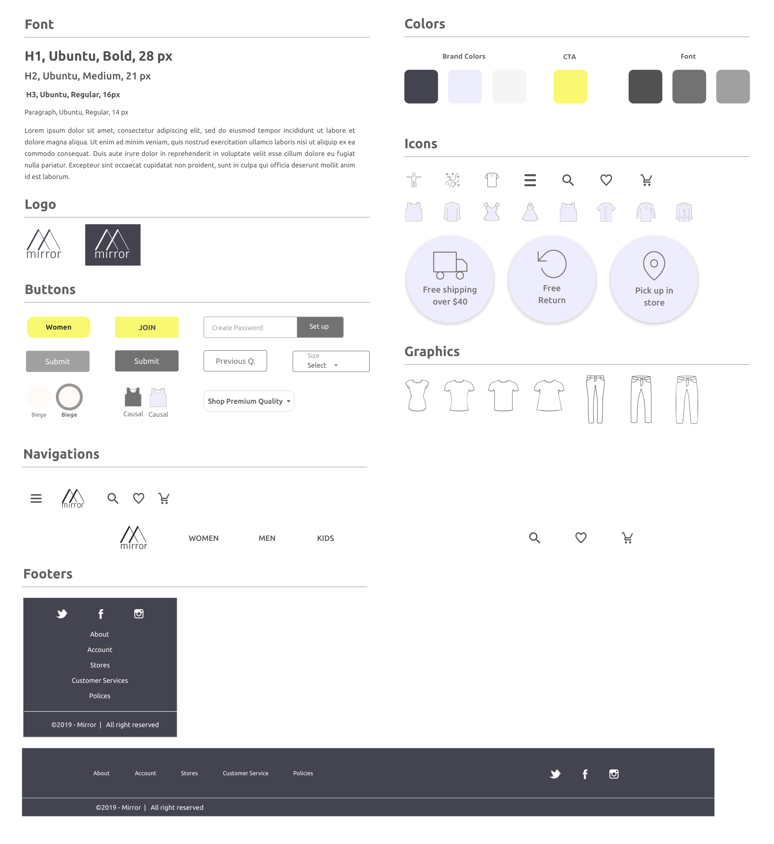
User Interface
Since Mirror targets at a wide range of age groups (Generation Z to Generation X) , I adopted black, Americans’ favorite for all ages, as the brand color to integrate with light purple and sharp yellow to create a simple yet sophisticated theme.
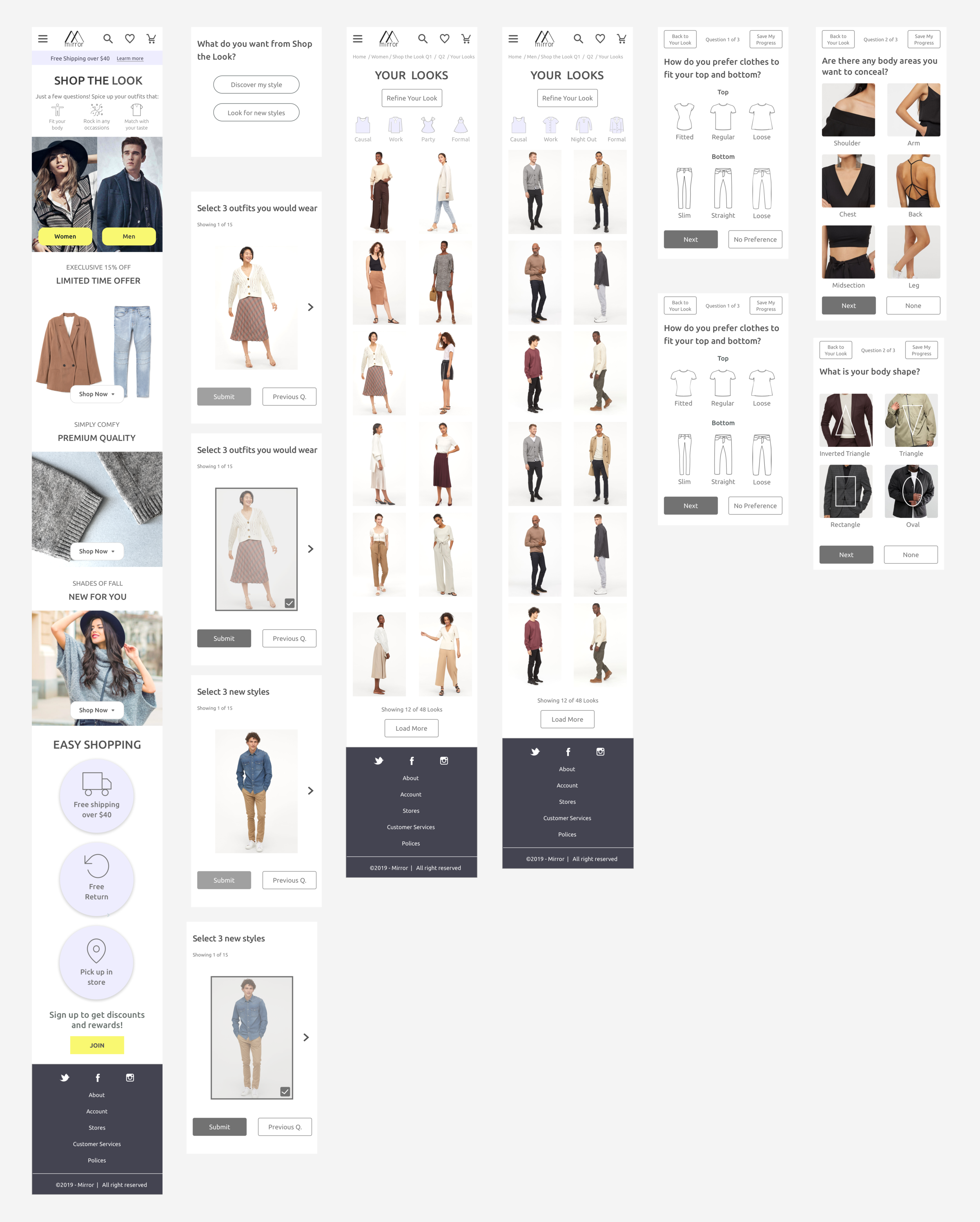
High Fidelity Mockups
Prototype
Next Steps
Create high fidelity mockup for the desktop website
Define a whole set of labelings and features
Define the ideal classification accuracy with engineers for setting up success and false metrics
Lessons Learned
This project allows me to think deeply about what kind of personalization is most needed by apparels shoppers. While style quiz is the most timing consuming solutions for users, it is the only option that can discern customers’ deepest fashion preferences and provide hyper-personalization.
I learned:
How to strike a balance between business goals and user needs
Gather enough answers of user preferences V.S. A short and fun fashion quiz
Encourage user to create account V.S. Fast and easy checkout
Importance of identifying different personas to create designs that address their specific needs
Importance of simplifying the information hierarchy by using space and eliminating unnecessary buttons.
More Case Studies
Standout
Smart Spend