Smart Spend
A mobile app helping customers to discover the best deal and the best time to buy
My role
Add a new feature to the existing app, Leverage UI pattern
Scope
Finn by Chase IOS mobile apps
Timeline
February - March 2019
Tools
Sketch, Figma and InVision
Overview
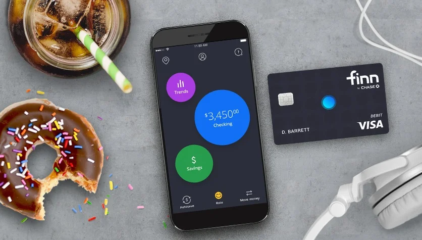
Finn was an all-mobile bank created by Chase in 2018 that emerged online banking with personal finance management (PFM) features, such as autosaving and spending tracking.
However, Finn fails to obtain enough millennials to open accounts and therefore Chase decided to shut Finn down at the end of 2019.
Thinking of what could have done to save it from discontinuation, I designed Smart Spend for Finn.
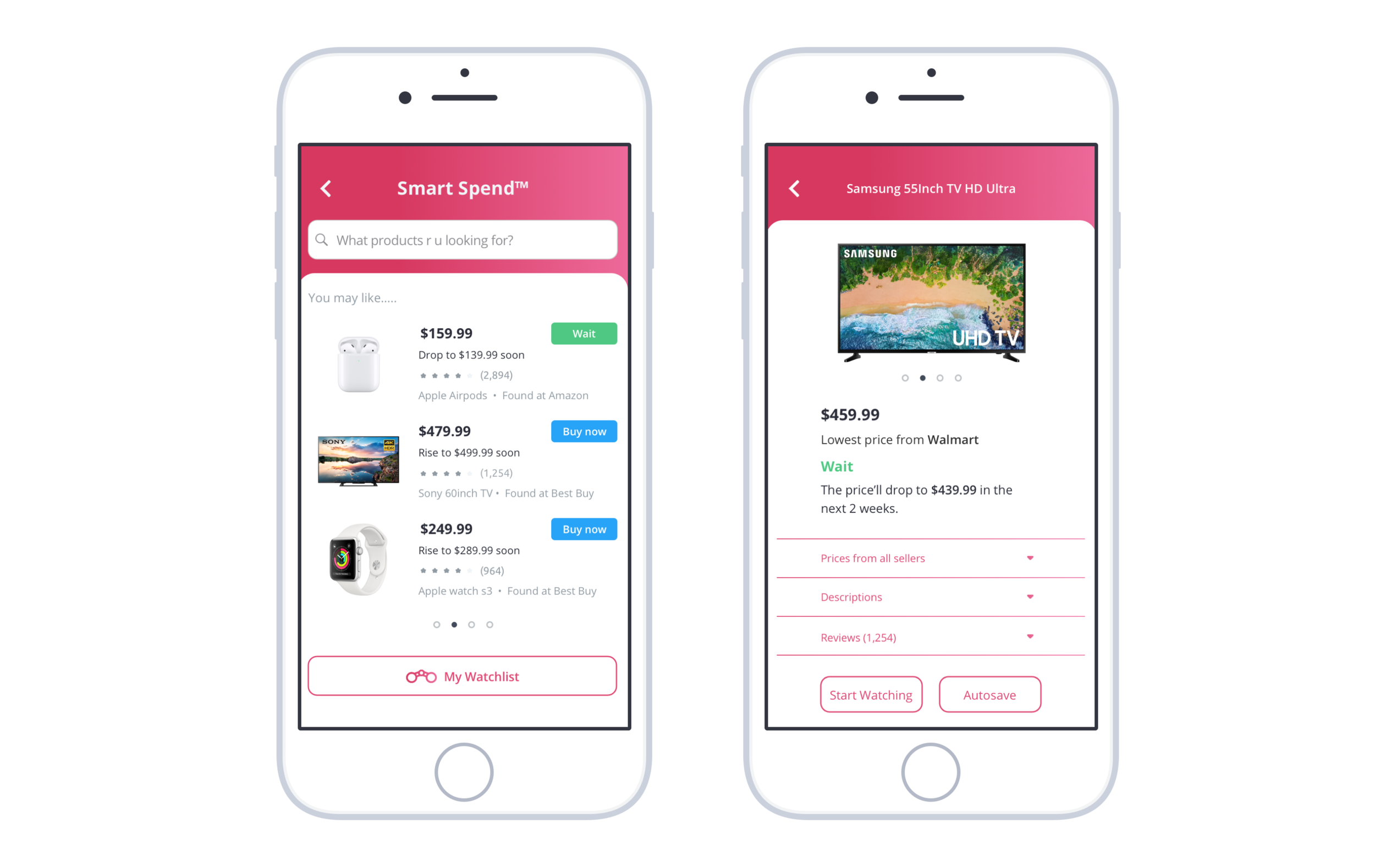
What is Smart Spend?
Smart spend is a new feature of Finn that helps customers to make strategic buying decisions. It can quickly discover the best deal of the customers’ desired online products while learning about its future price movement. Guided by Smart Spend with the “wait” or “buy now” indications, users can save money by placing the order at the best time.
How I came up with Smart Spend?
Research
Market Research
I started my research by understanding, what made Finn fail to obtain young customers?
According to Forbes, Finn failed because “it didn't offer consumers anything they couldn't get elsewhere”.
Realizing the urge of creating a unique feature for Finn, I analyzed the current features offered by Finn and dug into the specific financial pain points faced by millennials.
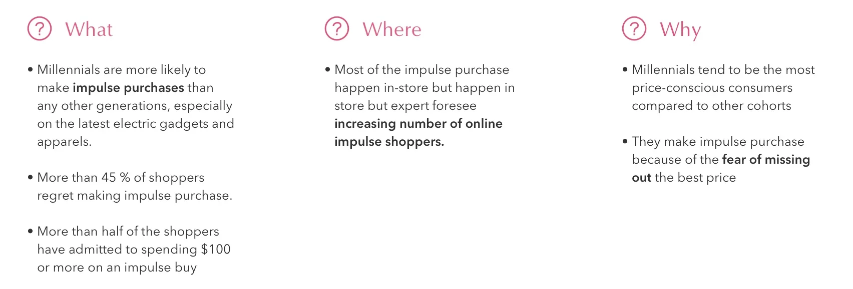
Research shows millennials struggle to save money because they often made unplanned and irrational purchases.
Based on my findings, I frame my ideation by asking:
“How might we help millennials to save money by assisting them to make wise and strategic buying decisions?”
User Interview
To answer this question, I conducted user interviews with 5 millennials to gain qualitative insights into their needs and pain points when they make online buying decisions.
Competitor Analysis
I conducted competitor research to learn about the existing resources in the market that addresses the “when to buy” and “where to buy” problems. I analyzed their strengths and weaknesses to see how they align their features with millennials’ needs and to discover the market gap.
Key takeaways:
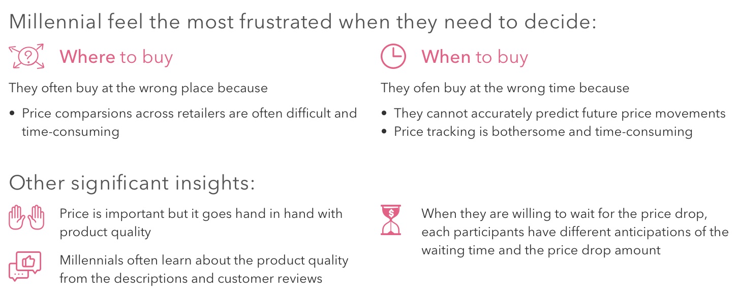
Price comparisons tools in the market help users to discover the best place to buy but many of them do not compare products across Google and Amazon
Price history analysis fails to foresee future price movements. They cannot tell users whether they should buy now or wait for a better price
No companies currently offer future price predictions in the market
Define
Hypothesis
Based on the qualitative and quantitative insights from the research phase, I hypothesized that offering price comparison and price prediction can arise millennials interests in using Finn.
Success metrics:
An increasing number of monthly active users (MAU)
An increasing number of Finn’s deposit accounts
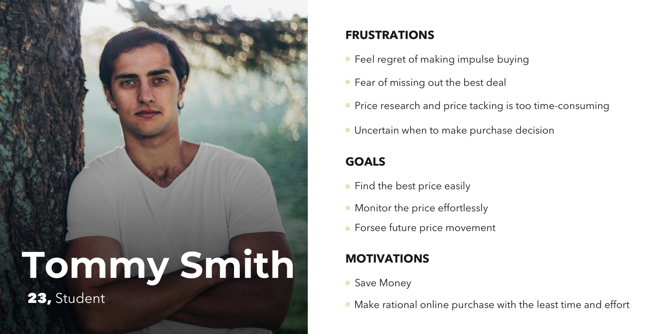
Persona
Based on what I learned from the user interviews, I created Tommy, a millennial who wants to make rational online purchases with the least time and effort. By examining his pain points and desires, this persona helps me to ideate the essential features for the project and the necessary components for the user flow. (View complete persona)
User Flow
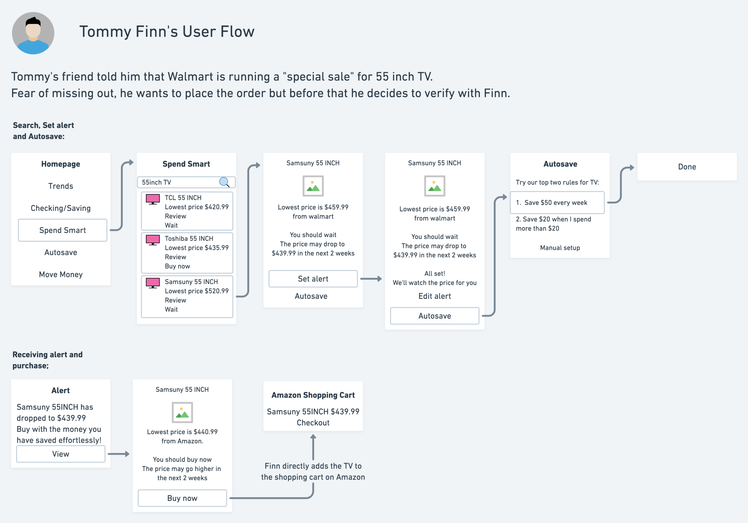
I created a user flow to illustrate how Tommy would start product search, obtain pricing insights, set up a price alert, create autosave rules and place on order.
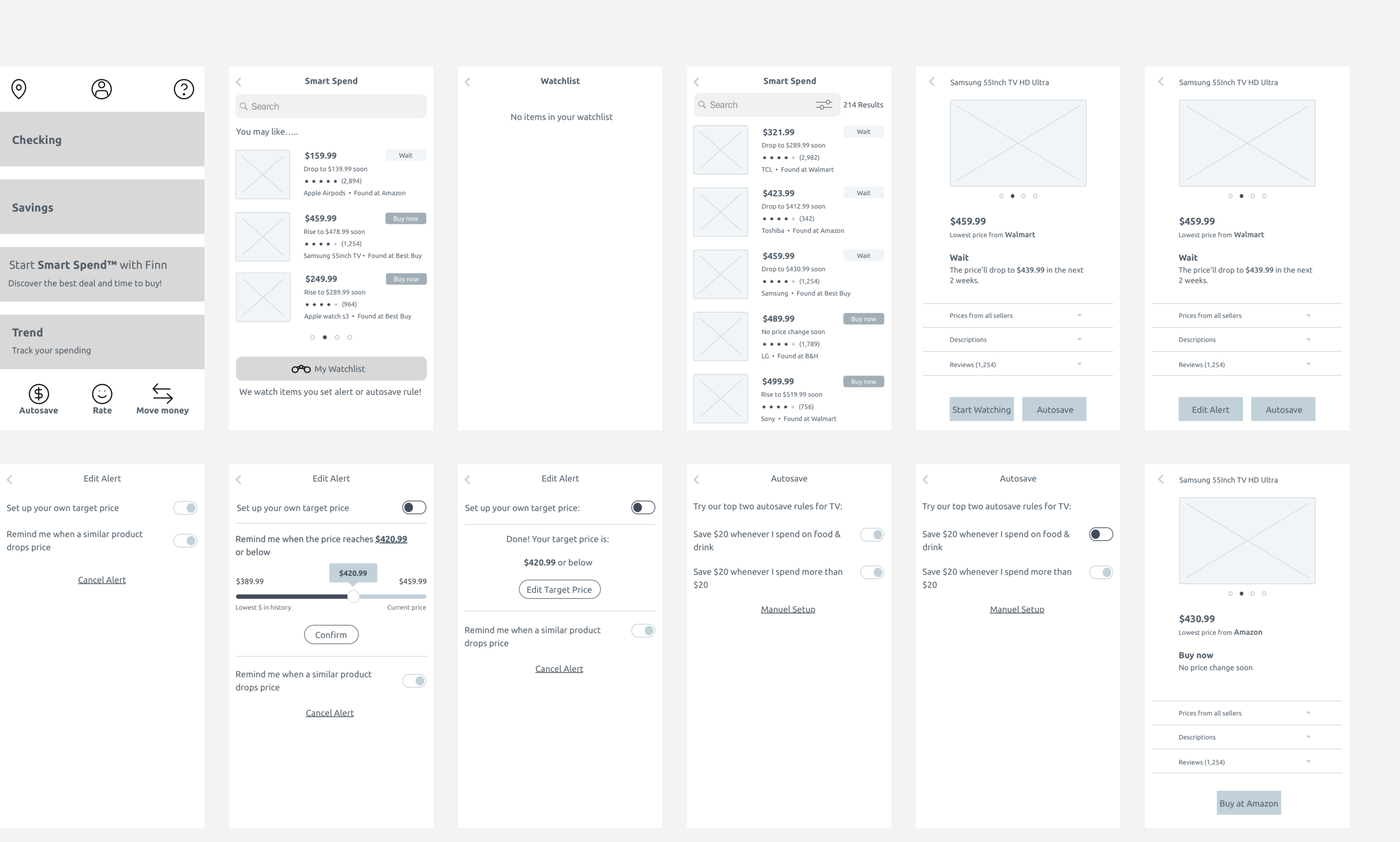
Mid-Fidelity Wireframe and Prototype
I created below wireframes for exploring different hierarchies, visual treatments and navigation pattern. Afterward, I built a prototype on Figma for testing purpose.
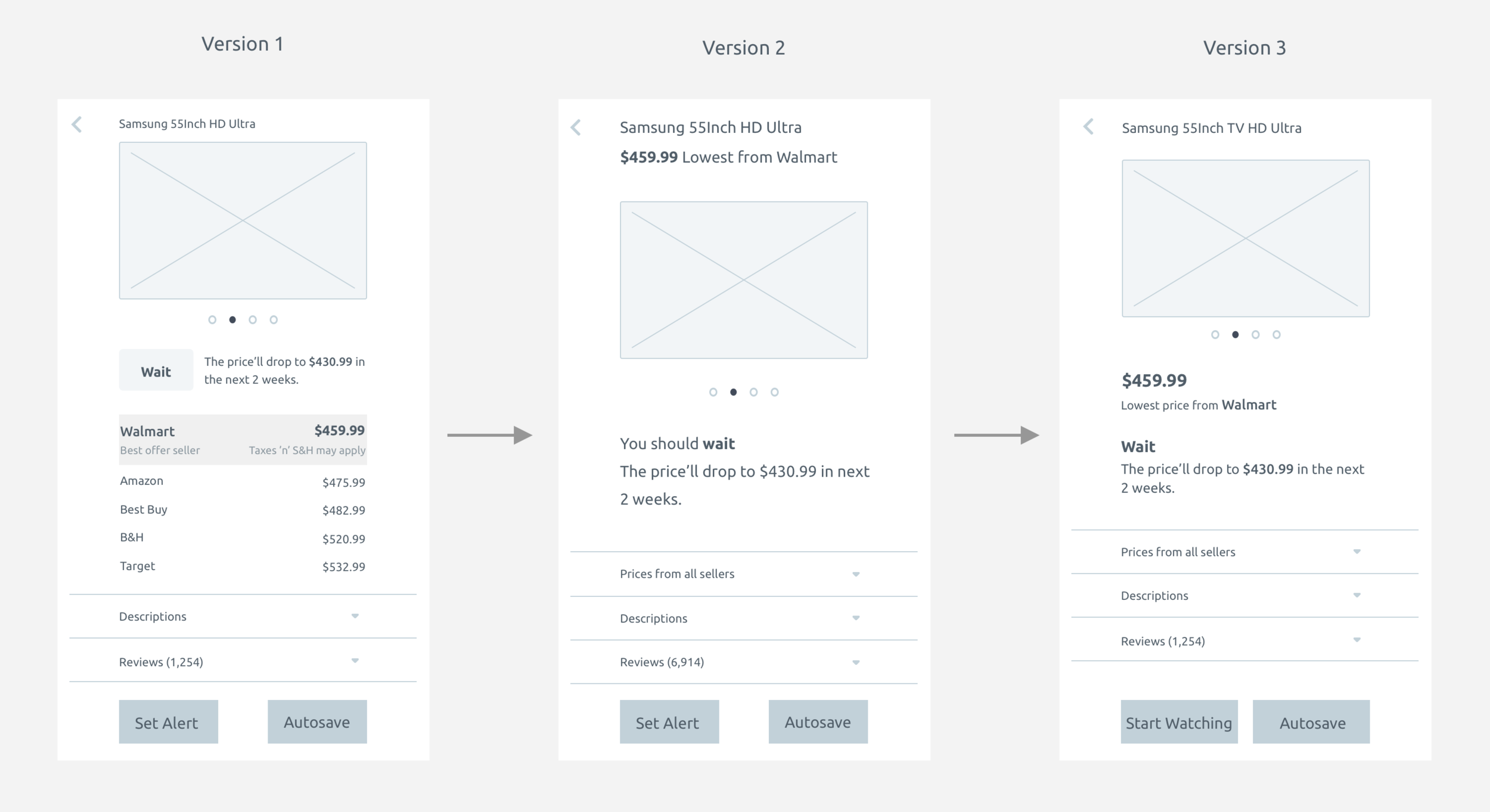
For the product detail page, I did three rounds of iterations to ideate the best information hierarchy for highlighting the most important pricing information of each products while maintaining simplicity and clarity.
Testing and Iterations
User Testings
I created three tasks on Maze to identify critical areas that would improve usability, critical findings include:
60% bounce rate when the users are asked to set a price alert
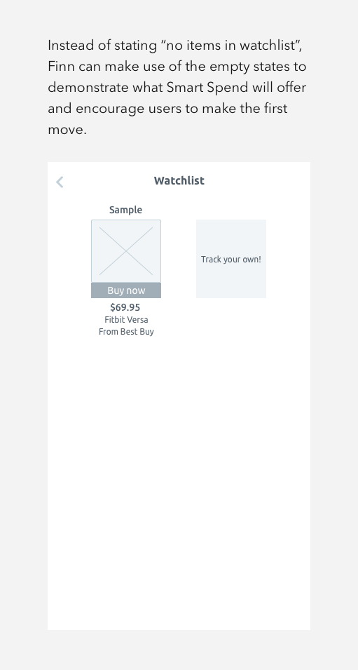
40% of participants clicked “My watchlist” even they have not set up price watching for any product
To measure customer satisfactions of their experiences using Smart Spend, I found out:
All the participants would like to download Finn for using Smart Spend
Earned 80 Net Promoter Score
When I asked them what’s missing:
40% of participants think instructions highlighting the functions of Smart Spend can boost their confidence in completing the tasks
Iterations
The Improved Finn
Usability
After iterating the wireframe and running the second round of testing, usability has been significantly improved as the bounce rate of setting price alert has dropped to 0%.
User Interface
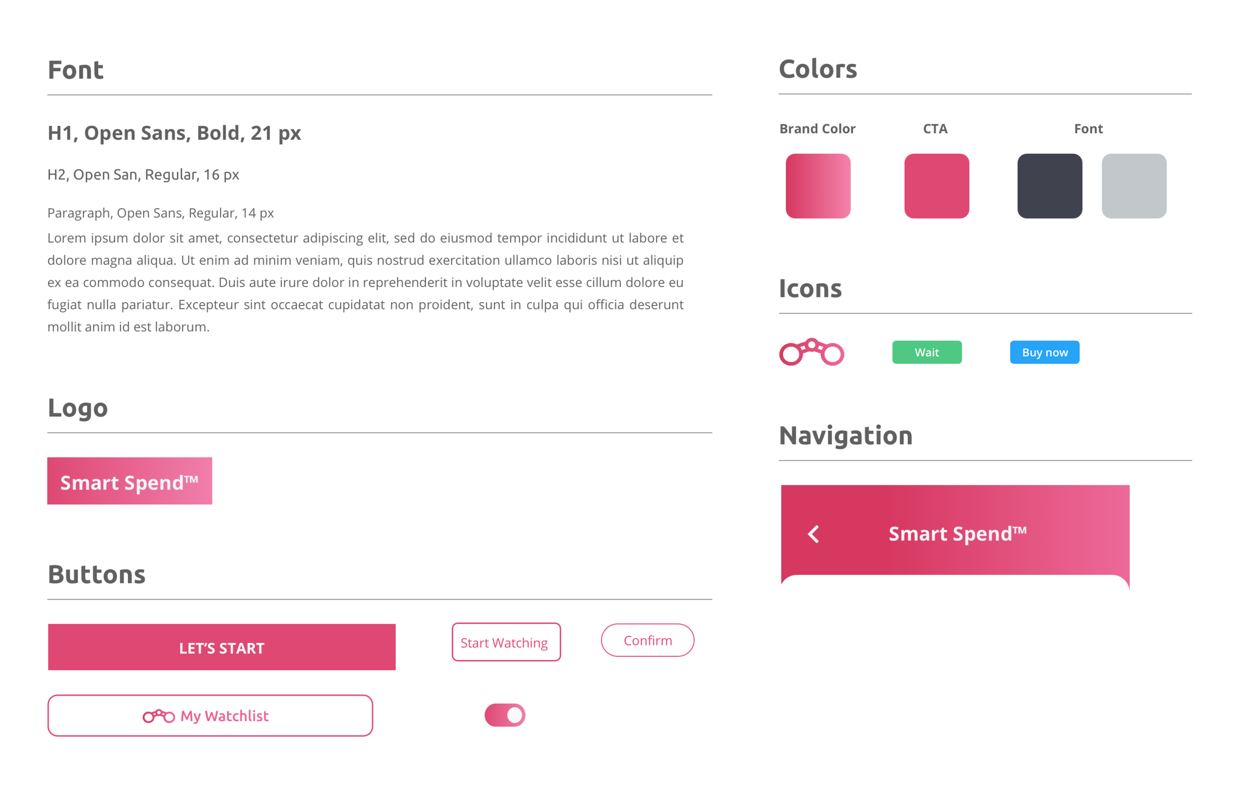
Finn has a specific color for each feature. Since blue, green and purple have been used, I decided to select hot pink as the color for SmartSpend. I also uplifted their design by adding gradients to their brand to attract the younger audiences and to create a sense of sophistication.
High Fidelity Mockups
Lessons Learned
It is not easy to add a new feature for a “dying” product. This project led me to view design in an innovative way to save the apps from discontinuations. Thorough market and user research allow me to identify the unmet users’ needs and support my idea of adding a rare and fascinating feature, price prediction.
I also learned:
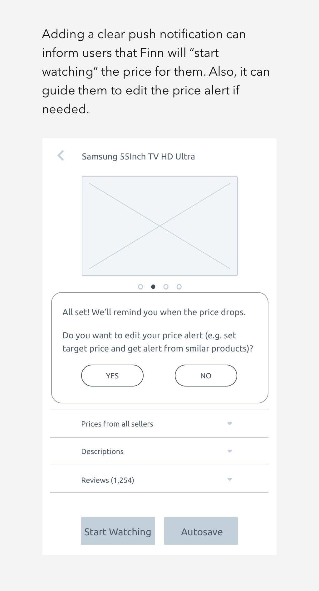
The importance of keeping user informed to avoid apps abandonment and promote engagement
The importance of iterating and experimenting with the structure of wireframes to avoid crucial changes in the later stage
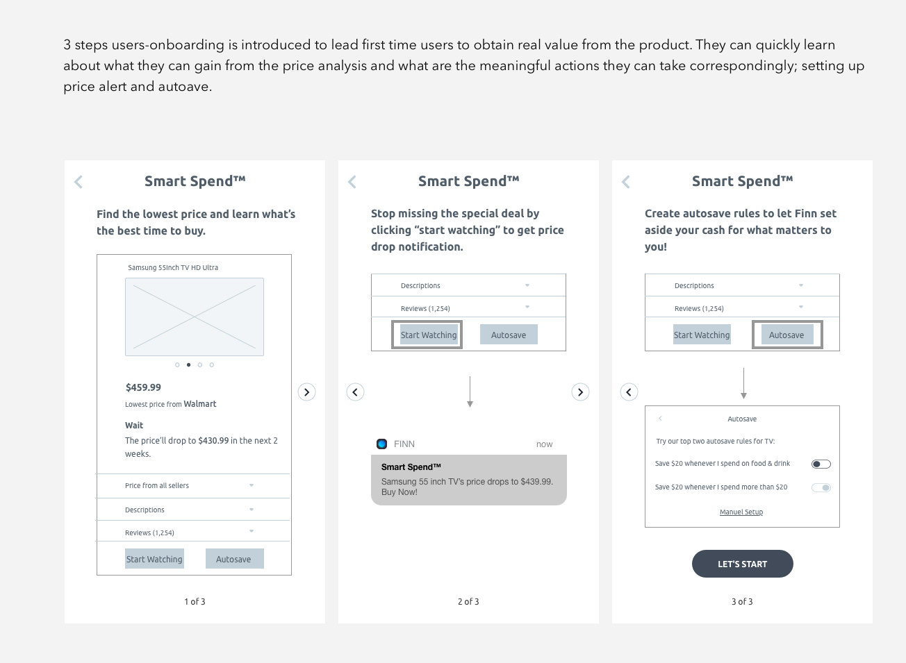
On-boarding is essential for making users feel rewarded for trying out the new feature, also, help them to ease into the product’s experience.
More Case Studies
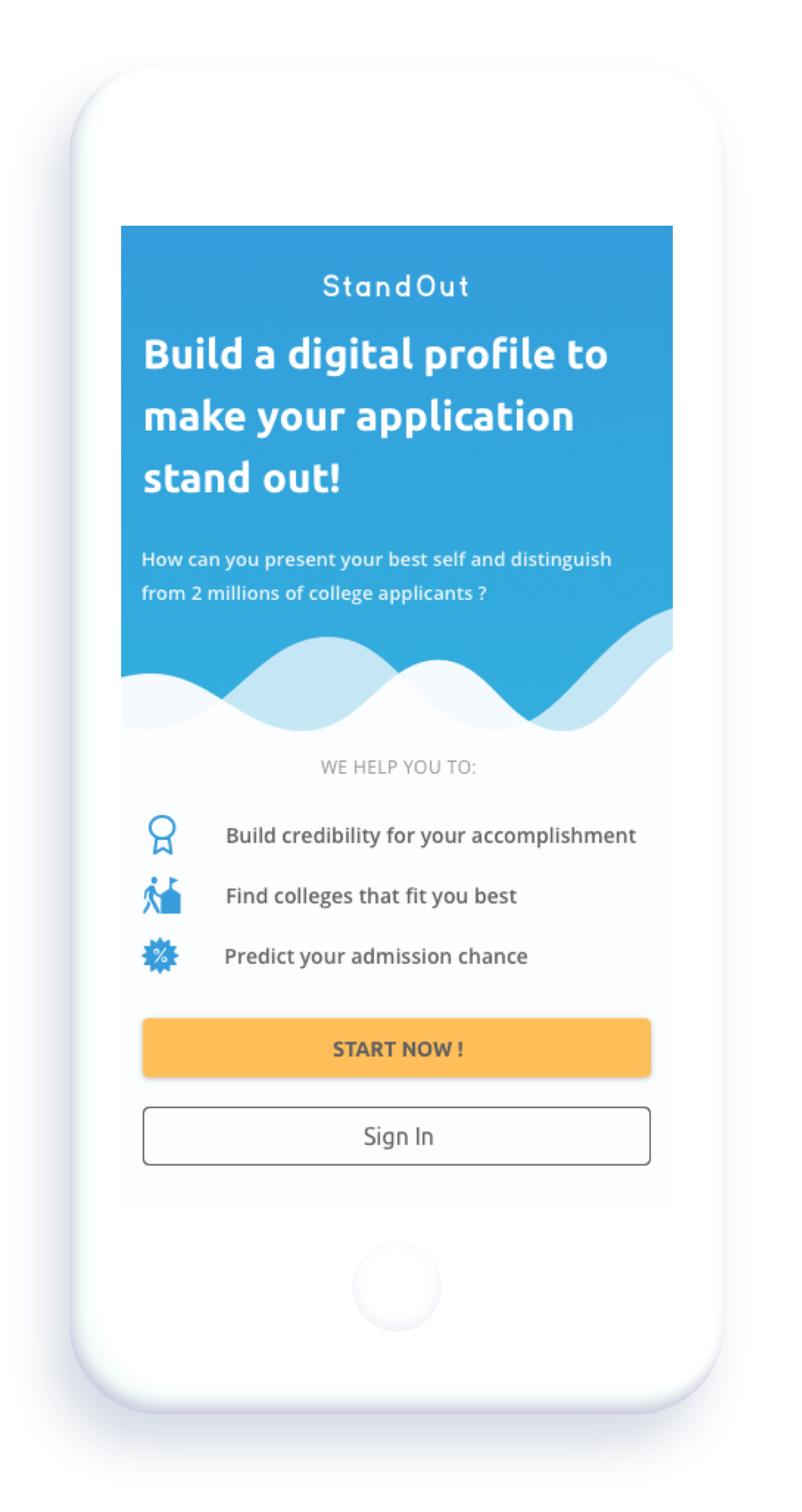
Standout
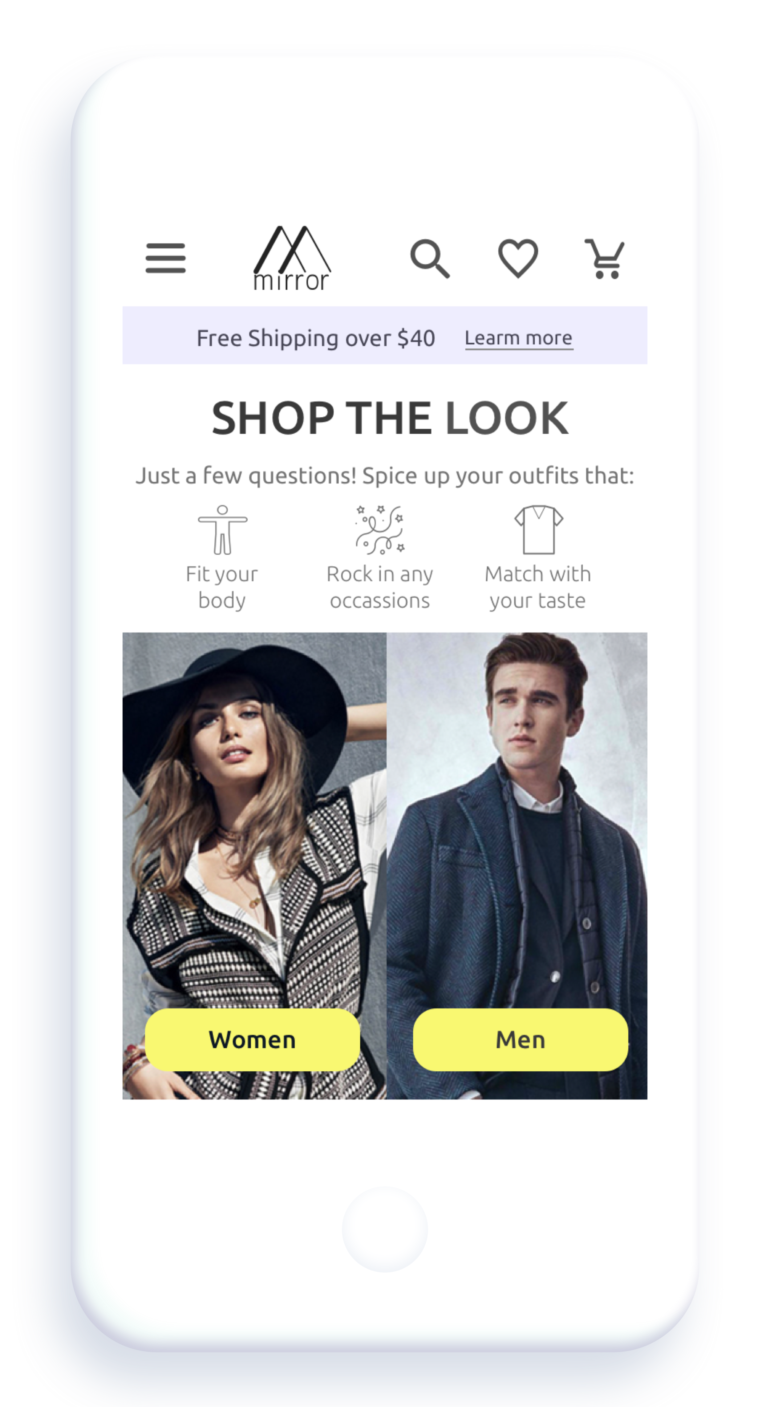
Shop the Look